Line Ripper · Working record
Design Decisions
77 product and design calls from Line Ripper’s iOS and iPad app, each with the reasoning at the time and the options that lost. Published as it was written. Most were logged before launch, so their outcomes still read as pending. The case study built on it is Line Ripper, from Idea to App Store.
Screens you choose between flash; screens you step through slide — and the sign-in card holds still while its contents move
The mobile auth screens stopped sliding sideways into one another. Sign in, sign up and reset password now cut to a brief dimmed cover with a loading spinner — about a third of a second, gone before you've resolved it as a state — and back. The one exception is sign in ↔ forgot password, which does slide, but only the contents of the card slide: the Line Ripper logo, the wordmark and the card itself never move. Forgot password stopped being a separate page and became a second panel inside the sign-in card.
Context
All four screens were sliding in and out like steps in a wizard. They aren't a wizard — you pick one and go. Removing the slide in favour of a gentle dissolve (a cross-fade) fixed the wrong impression and immediately created a new one: it looked broken. Three passes to land it — slide, then fade, then the cover — with the slide earned back afterwards by the single pair that deserved it.
Reasoning
A sideways slide is the phone's way of saying "you went one step deeper, and back is where you came from." Sign in and sign up aren't that — they're two doors to the same room, so the motion was describing a relationship that doesn't exist. The dissolve failed for a reason worth keeping: these screens share a layout, so fading one into the other leaves most of the screen sitting still while a few words dissolve in place. Nothing moves, so it reads as a rendering glitch rather than a change of place. The cover works because it gives the eye a clean break — and it isn't purely decorative: it's a real loading indicator, so on the rare occasion a screen is genuinely slow, the cover simply stays up until it's ready. Sign in ↔ forgot password was then the one pair that genuinely travels — forward to recover a password, back to the form you left, landing where you were — which is exactly what a slide describes. But sliding the whole screen would carry the logo out only to have an identical logo slide in behind it, which is the motion of an app assembled from screens rather than designed as one surface. Pinning the chrome means forgot password can't be its own page during that move; it's a panel that shares the card.
The part worth recording is what happened next. Reviewing it, I couldn't read the code but could see something off in the behaviour — the second form seemed to be there the whole time, waiting, rather than arriving when asked for.
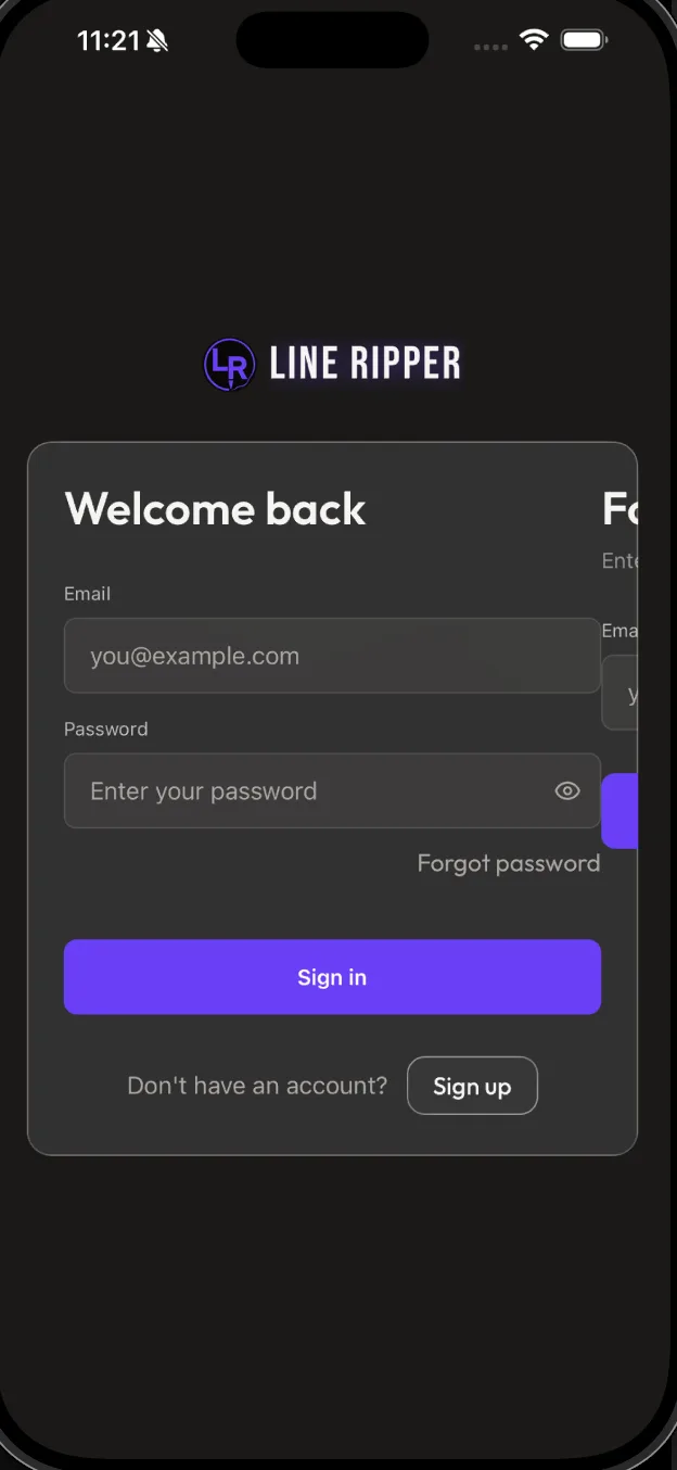
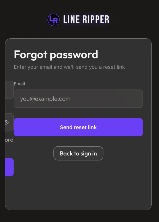
That instinct was correct and had found a real problem: the forgot-password form was being built in advance for every single person who opened sign in, including the overwhelming majority who never tap the link. Beyond the wasted work, it meant a real, invisible email field sitting in the screen where password managers can still find it. It's now built the first time it's asked for, and kept afterwards so the slide back has something to slide and a half-typed address survives the round trip. Two honest caveats: this wasn't the cause of the visible sliver above — that was a separate positioning error, the panels stopping just short of the card's edge — and some overlap is unavoidable, because any transition needs both things to exist while it runs. But "should this be loading before it's needed" was the right question, and it was asked by the person who couldn't read the code.
Rejected
Sliding all four screens (rejected: it claims a sequence that isn't there — you don't pass through sign up to reach sign in). A plain cross-fade between them (rejected: built and replaced — screens that share a layout dissolve into themselves and read as a glitch). Keeping forgot password as a separate page and getting the pinned look by drawing the same logo and card on both (rejected: it doesn't hold up in motion — the whole screen still travels, so you'd watch one logo slide out as an identical one slides in; and it wouldn't have avoided the overlap, since a page transition has both pages on screen anyway). Letting the card resize to fit whichever panel is showing (rejected: resizing the frosted-glass card flattens its blur, so the material would visibly die on every tap — the card stays at the taller panel's height and the shorter one takes the slack).
Outcome
⏳ pending — backfill once shipped & in real use
Quote
"(again, as a non-developer) feels like they should load and render only when needed"
Everything about who you are moves to its own Profile page — and Delete Account goes with it, while Sign Out stays behind
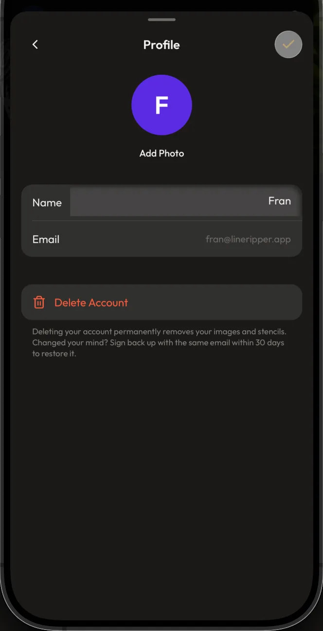
Settings gains a Profile page as the first row of the Account section, above Plan & Usage. It holds the avatar, the button to add or change your photo, your name, your email, and — set well apart at the bottom — Delete Account, which moved off the main Settings screen. Sign Out deliberately did not move; it stays on the main screen. The identity block at the top of Settings goes back to being read-only: avatar, plan badge, name, email, nothing tappable.
Context
The Add/Edit Photo button had been built directly into the identity block at the top of Settings, sitting between the avatar and the name. It didn't land — the block had been a quiet header and now it was a control panel, and there was nowhere sensible to put the name and email fields that would logically follow it.
Reasoning
The identity block at the top of Settings is a label, not a workspace: it tells you which account you're in, the same way a page header does, and hanging an editable control off it makes it read as neither. Pulling every identity concern into one page gives all of them somewhere to live at once — the photo control gets to sit directly under the avatar it changes, and the name and email get to be real rows in a real list rather than orphans wedged into a header. What decided Delete Account is the distinction between an account and a session: deleting acts on the identity, which is what this page is about, while signing out ends a session, which is something you do to the app on this device and has nothing to do with who you are. That rule is worth having written down because it answers where the next row goes without another debate. Delete also gets a full step more breathing room than the standard gap between sections, because an irreversible action shouldn't sit a normal thumb-length below a field you were just typing in. On the main Settings screen, the row that leads here is first in the Account group on the same logic: it's the "who am I" row, and everything below it — plan, email preferences — is about what that account has.
Rejected
Keeping photo editing in the Settings header where it was first built (rejected: it turns a page header into a control surface, and leaves name and email with nowhere to go). Moving Sign Out to the Profile page alongside Delete for a single "account actions" cluster (rejected: it collapses the account/session distinction, and buries the most-used exit inside a sub-page). Leaving Delete Account on the main screen (rejected: it's the one row that acts on the identity, so it belongs with the identity — and on the main screen it sat directly under Sign Out, where the two most destructive-looking rows were adjacent and easy to confuse).
Outcome
⏳ pending — backfill once shipped & in real use
The page, top to bottom — identity first, the irreversible thing last and set apart:
The name field saves itself as you type — then it didn't. The page is always in edit mode and a ✓ in the corner commits it
The Profile page has no "tap to edit" step and no edit/done toggle: the name is a live, editable field from the moment the page opens. A checkmark button in the top-right corner is the only thing that saves, and it stays greyed out until something actually changes. Trying to save an empty name shows the reason underneath the field itself rather than in a pop-up. An earlier version that saved silently as you typed was built in full and then removed.
Context
The brief was to remove friction: get to the field, change it, get on with your day. Saving-as-you-type is the obvious end point of that — it removes the last step entirely — so that was built first, with three safeguards, and then rejected on review.
Reasoning
The friction worth removing is the ceremony, not the commit. Almost all of the cost in a traditional edit screen is the ritual around the change — find the row, tap to enter edit mode, tap the field, change it, find Done — and a page that's simply always editable deletes nearly all of that while keeping the one step that's actually worth something. That step is worth keeping because the name is not private scratch space: it's the letter on your avatar, the name in the Settings header, and the name on every email we send, so the moment a change becomes real is a moment worth choosing. Saving-as-you-type also has a failure that only shows up in use — selecting all and retyping means the field is briefly empty, which is ordinary typing rather than an attempt to erase your name, so the "obvious" version has to be taught not to believe what it's being told. Building it that far is what made the trade legible: three safeguards (never write an empty value, batch the writes so a burst of typing is one save, and always state the outcome since there's no button to imply it) is a lot of machinery to make a save you didn't ask for feel safe, when one always-on field and one deliberate tap gets the same speed with none of it. The greyed-out checkmark carries its own message: nothing to commit reads as nothing to press, which is how the button teaches that edits are what turn it on. And rejecting an empty name puts the complaint under the field it's about, where you can act on it, rather than in an alert you have to dismiss before you can even see the problem.
Rejected
Saving automatically as you type (rejected: built, then removed — it needs three safeguards to be trustworthy and still commits changes the person never asked to commit, on a value that shows up in their emails). A conventional edit/done mode where the field is inert until you tap Edit (rejected: that ritual is the actual friction; the field being live costs nothing and removes a whole step). Rejecting an empty name with a pop-up alert (rejected: an alert covers the field it's complaining about and has to be dismissed before you can fix anything).
Outcome
⏳ pending — backfill once shipped & in real use
Quote
"the main experience i had in mind is really removing the friction between being able to quickly access the field, change what you need to, and then \"get on with your day\""
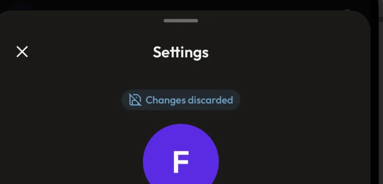
Backing out with unsaved edits just discards them and says so afterwards — the "are you sure?" pop-up was built and deleted
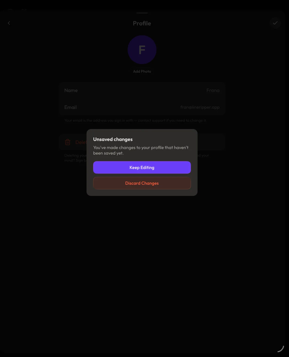
Leaving the Profile page without tapping the checkmark throws the edit away, no questions asked. Instead of a confirmation, a small status pill (a "chip") slides in afterwards reading "Changes discarded," tinted with the informational colour. The two-button pop-up that had been built for this — Keep Editing / Discard Changes — was removed. The pill sits just under the page header at the top, not at the bottom.
Context
With an explicit save button, leaving with pending edits needed some answer. The first pass was the conventional one: intercept the back button and ask. Seeing it in place made the mismatch obvious — a full-screen interruption with a dimmed backdrop and two buttons, guarding one line of text you could retype in four seconds.
Reasoning
A confirmation is a tax you charge everybody to protect the few who'll regret it, so it's only worth it when the thing being protected costs more to recreate than the interruption costs to read. One name you already know how to spell doesn't come close — it's cheaper to let the discard happen and simply say it than to stop the person and make them adjudicate. What makes that safe rather than sloppy is the message itself: the failure mode of silent discard isn't losing the edit, it's walking away believing it saved, and one line of text closes that gap entirely while a pop-up would have cost a decision every single time. That's also what earns the message a real status colour rather than plain chrome — by the test already written down for this palette, missing it would cost you something, which is what separates it from the copy-confirmation that deliberately claims no colour. The pill moved from the bottom of the panel to the top because that's where the change happened: you tapped back, the header is where your eye already is, and the message belongs next to the thing it's reporting on rather than at the far end of the screen. It's also deliberately untappable, so a message about something that already happened can never swallow a tap meant for what's underneath it.
Rejected
The two-button confirmation pop-up (rejected: built, then deleted — an interstitial costs more attention than the mistake it prevents when the stakes are one retypeable field). Discarding silently with no message at all (rejected: that's the genuinely bad version — you'd leave assuming it saved, which is worse than either asking or telling). Keeping the edit alive so it's still there when you come back (rejected: a draft that survives you deliberately backing out is its own surprise, and it makes the checkmark's greyed-out state lie the next time you open the page).
Outcome
⏳ pending — backfill once shipped & in real use
Quote
"i think it's \"overkill\". it's pretty lowstakes in this scenario, so we don't need that modal at all"
The decision it used to demand, and the sentence that replaced it:
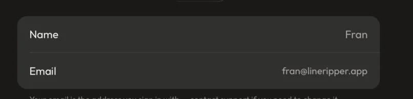
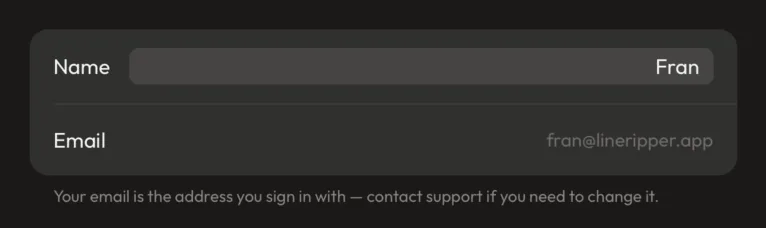
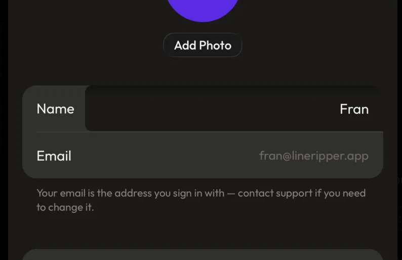
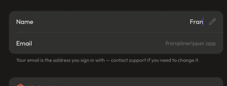
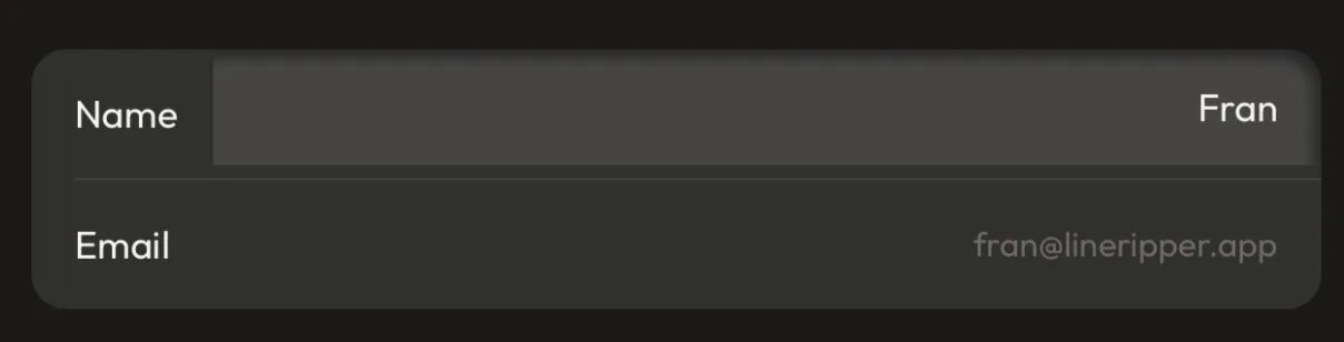
Making the editable field look editable took four goes — the answer was a recessed area running to the card's edges, with a gap left only at the bottom
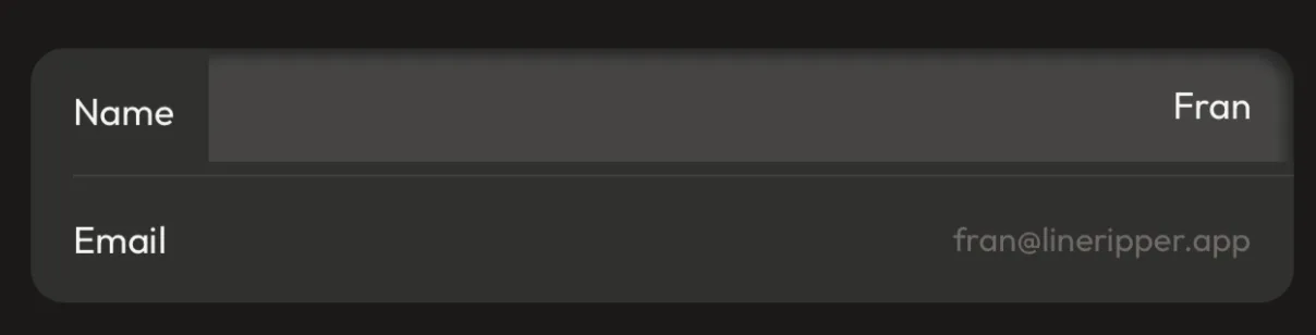
On the Profile page, the name row's right-hand side is a recessed, slightly lighter area that runs the full height of the row and bleeds off both the top and right edges of the card, with a deliberate gap left along the bottom only. The read-only email below it gets no container at all and its value is dimmed. Three earlier treatments were built and rejected first.
Context
The first version separated the editable name from the read-only email using text colour alone, and both ended up the same muted grey — so the one you could change looked the least alive on the page, and neither looked different from the other.
Reasoning
The mistake repeated across three attempts was reaching for a container to say "editable," when the card's entire visual language is label on the left, value on the right, hairline between — so any box dropped into that grammar reads as a foreign object rather than as a field. What finally worked was letting the editable area take over its whole half of the row instead of sitting inside it: a region that reaches the card's own boundary reads as a field, where the same fill inset on all sides reads as a value trapped in a box. The direction of the shading mattered as much as the shape — the second attempt made the area darker than the card on the theory that "recessed" means carved in, and it read as a hole punched clean through, so the fill stays a shade lighter and the sense of depth comes from a soft shadow along its top and right edges instead of from the colour. The gap along the bottom is the one piece that isn't decoration: at full bleed the fill ran straight into the hairline that divides Name from Email and swallowed it, so a sliver of card showing underneath is what hands the divider back. Two quiet signals now separate the two rows rather than one loud one — the editable value is full-strength text where the read-only one is dimmed, and the editable row has the recessed area where the read-only row has nothing — which is also what makes "this one is locked" legible without anyone having to tap it to find out.
Rejected
Distinguishing the two rows by text colour alone (rejected: it fixed which row was brighter but gave no positive signal that the row could be tapped at all). A rounded inset pill floating inside the row (rejected: reads as a value in a box, not a field — the container floats rather than belonging to the row). The same shape filled darker than the card as a truer "recess" (rejected: at that contrast it reads as a hole punched through the card and, as the note at the time put it, sticks out against every other row on the screen). A small pencil glyph at the end of the row, borrowing the card's existing trailing-accessory grammar (rejected: genuinely the most restrained option and briefly the front-runner, but it says "editable" as a footnote where the field treatment says it as a shape — and once the field returned, both together were two answers to the same question).
Outcome
⏳ pending — backfill once shipped & in real use
Quote
"it sticks out like a sore thumb and not subtle at all"
Four attempts, and what each one got wrong:
The inner shadow is one built-in setting, not three stacked gradients — caught by asking why a drop shadow was turning into an engineering problem (small implementation note)
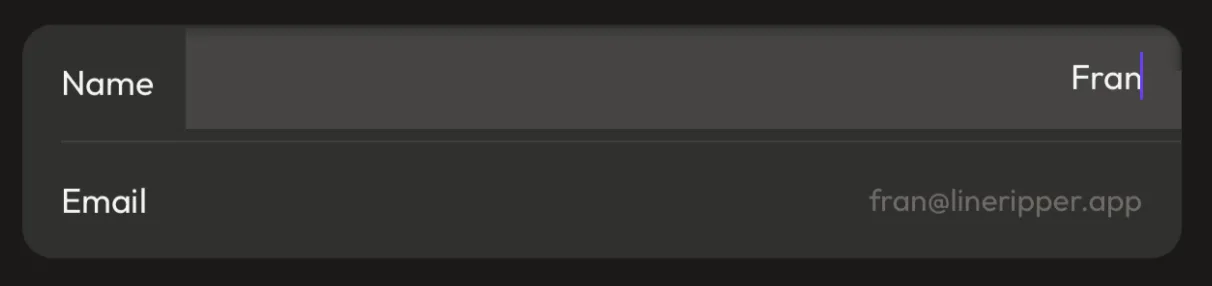
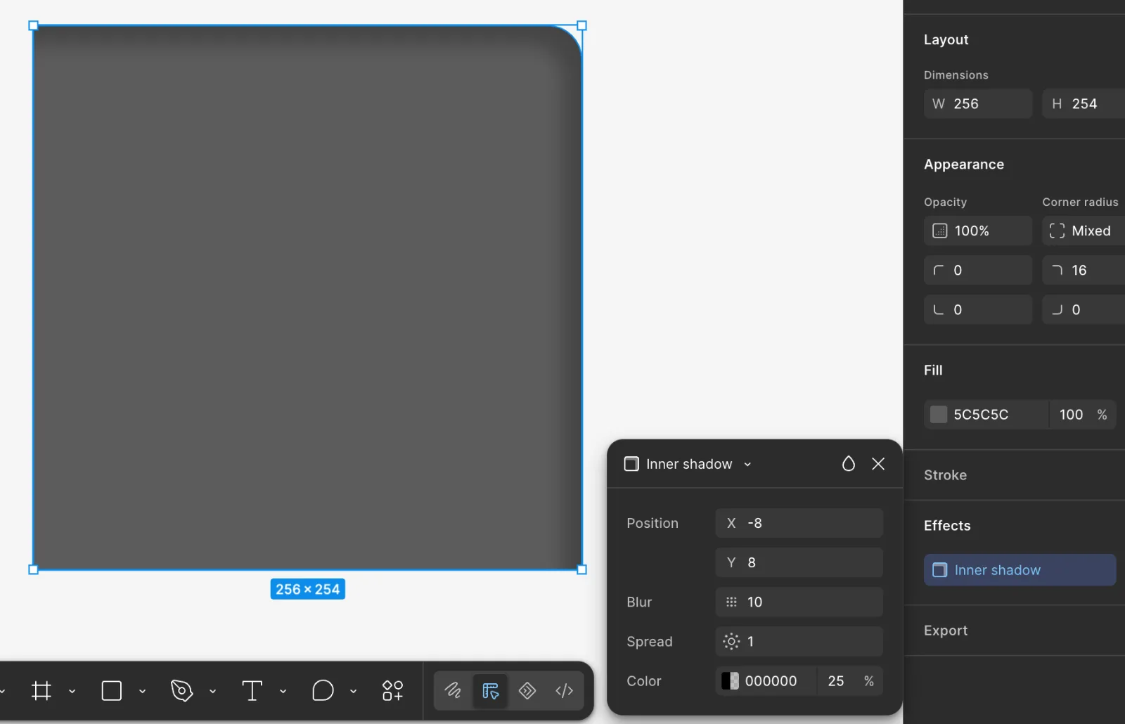
The soft shading inside the editable field is drawn with React Native's own built-in inner-shadow setting (boxShadow with inset), which takes the same four inputs as Figma's Inner Shadow effect — offset, blur, spread, colour — and follows the shape's rounded corners by itself. It replaced a hand-built stack of three overlapping gradients.
A minor call with a transferable lesson: the design tool's feature list is a reasonable prior for what the platform can do.
Context
The shading had been built as layered gradients: one along the top edge, one along the right, and then a third diagonal patch added specifically to fill the corner where the first two — being plain rectangles — failed to meet cleanly. Each round of tuning added another number to adjust. The push-back came from outside the code: a designer's read that a drop shadow is a setting, not a build, backed by Figma offering exactly this effect with exactly these controls, and by having watched plenty of engineers implement shadows over the years without any of them ever describing it as hard.
Reasoning
When a routine visual effect starts needing bespoke machinery, the likeliest explanation isn't that the effect is hard — it's that the wrong tool is being used, and a design tool exposing it as four sliders is decent evidence that the platform underneath exposes it too. That turned out to be exactly the case: the built-in setting had shipped in React Native 0.76 and this app is on 0.86, so the gradient stack was a workaround for a gap that had already closed. The tell was the corner. Three overlapping rectangles can only approximate a curve, which is why a third layer existed purely to patch the seam, where the built-in version traces the shape's own corner radius and turns the corner for free — the patch layer didn't get simpler, it stopped existing. Ten tuning constants collapsed into four, and those four are now the same four visible in Figma's panel, so the effect can be adjusted by reading values off the design tool instead of translating them. The general lesson is worth more than the fix: matching the patterns already in a codebase is usually right, but those patterns were written against whatever the platform offered then, and "this is how we've always done it here" quietly outlives the constraint that caused it.
Rejected
Continuing to tune the three-gradient stack (rejected: each pass added constants to a structure that couldn't ever turn the corner properly, because rectangles can't follow a curve). Copying Figma's own numbers as the spec (rejected: a misread on the way — the panel was shown to prove the capability existed, not to hand over a value; the settings were dialled back to match what had already been signed off visually).
Outcome
⏳ pending — backfill once shipped & in real use
Quote
"my hunch was that if they offer it, it should be available to code \"easily\"/no workarounds"
The workaround, the evidence that prompted the question, and the result:
Moving between Settings and its sub-pages slides instead of fading — and gets its own named speed rather than borrowing the app's general one
Opening Profile, Plan & Usage or Email Preferences from Settings now slides the new page in from the right, and backing out slides in from the left, so a push and its return are the same movement reversed. The pages had been cross-fading. The timing is 350ms, roughly iOS's own navigation speed, held in a new named motion setting for whole-view movement rather than by adjusting the general-purpose one the rest of the app shares.
Context
The fade was doing two jobs badly. It gave no sense of direction, so going deeper and coming back looked identical; and it was quietly breaking the frosted-glass button on the Profile page, because animating a surface's opacity stops the blur material behind it from composing and the button rendered as bare text. First pass at the slide was too quick and read as a flinch.
Reasoning
A slide answers the question a fade can't: where did this come from, and where does it go back to. Direction is the whole point of a stack, and once it's there the return trip is legible without a label. It also sidesteps the glass problem entirely, because a slide moves a surface without touching its opacity — the exact property that was breaking the blur — which is a rare case of the better-looking option also being the more robust one. The speed is the part that needed a real decision. A whole page replacing another is not the same kind of motion as a chevron rotating or a button tinting on press: those want to be quick because you're meant to barely register them, while a full-surface move is one you're meant to follow, and at the general speed it registered as a twitch rather than as travel. Making it a new named setting rather than slowing down the shared one is what stops that from becoming collateral damage — the shared value is used by toggles, presses and disclosure indicators all over the app, and slowing every one of those to fix a page transition would make the whole interface feel sluggish to fix one screen. The motion system is set up so each named speed has to be given a value on every platform before it will build, which means a new name is a small, safe addition rather than a loose end.
Rejected
Keeping the cross-fade (rejected: no direction, so the way back looks the same as the way in — and it was actively breaking the frosted-glass button on the page it was fading in). Slowing the app's shared general-purpose speed to 350ms (rejected: that value drives toggles, press states and disclosure chevrons everywhere; slowing all of them to pace one transition trades a snappy interface for a sluggish one). Animating both pages at once — old sliding out as new slides in (rejected: two overlapping surfaces in the same slot needs the outgoing page kept alive to animate, for a refinement nobody would name; the incoming slide alone already carries the direction).
Outcome
⏳ pending — backfill once shipped & in real use
Quote
"it's way too quick. can you slow it down (across the board)?"
Settings nearly fills the screen so it can't be dismissed by accident — the image picker keeps its gap on purpose
The Settings panel that slides up from the bottom now covers 99% of the screen, leaving a hairline of the app visible beneath the status bar. It used to stop about a tenth of the way down. The Upload Image panel, which behaves the same way in every other respect, deliberately keeps its full-size gap.
Context
Settings had grown enough sections that the last group was cut off at the bottom, which is what prompted looking at its height in the first place. Using it surfaced the bigger problem: the strip left showing above the panel is a live target — tapping it closes the panel — and it was getting hit by accident.
Reasoning
The strip above a panel does two jobs at once, and which one matters depends on the panel. It's an escape hatch (tap anywhere outside to get out), and it's a reminder of where you came from. For Settings the escape hatch is the problem: a tenth of the screen is an unlabelled target sitting right where the thumb travels, and hitting it throws you out of a screen you were mid-way through reading, with no warning and nothing to undo. Shrinking it doesn't remove the ways out — the X in the corner and the swipe-down are both still there — it just moves the accidental one out of reach, so every exit that actually gets used is one you meant. Stopping at 99% rather than the full 100% is purely a visual call: edge-to-edge butted the panel against the status bar and read as a flat opaque screen rather than something resting on top of the app, and the sliver of backdrop is what keeps that sense of depth. It also buys the room the shorter panel was clipping off the last section. The exact number had to be settled on both an iPhone and an iPad rather than picked once, because the gap is a proportion of screen height while the header sitting behind it is at a fixed distance from the top — so at 98% the iPad was clean but the iPhone showed a clipped sliver of the profile and notification icons through the gap, which read as a mistake rather than as depth. 99% is the last step before flush, and it's the one where both are right. The Upload Image picker keeps its gap because there the other job is the one that counts: a sliver of the photo grid showing behind it is what says you're still in the Gallery choosing something, not somewhere new — and a tap-out is a welcome escape from a picker you opened by mistake. The two were already independent, since each panel states its own height (its snapPoints), so this is a per-panel call rather than a global one. The detail that needed care is that the 99% has to be measured below the status bar (reserving space for it, topInset) rather than from the very top, or the grab handle and title end up behind the clock.
Rejected
Going the full 100% (rejected: visually awkward — with no backdrop showing at all it stops reading as a panel over the app and reads as a plain screen). Leaving it at 90% and only fixing the clipping (rejected: it treats the symptom that got noticed first and leaves the accidental-dismiss target exactly where it was). Keeping the large gap but making it non-dismissable (rejected: the clipped content problem stays, and it leaves a strip that still looks tappable but silently does nothing — worse than either honest option). Making every panel full-height for consistency (rejected: the picker's visible strip is doing real work; consistency would cost the signal that you're still in the Gallery).
Outcome
⏳ pending — backfill once shipped & in real use
Quote
"i found i was accidentally tapping in the 10% above the sheet which then caused the sheet to go away when i wasn't ready to dismiss it"
Which language the app speaks is remembered per device; which language we email you in is remembered per account
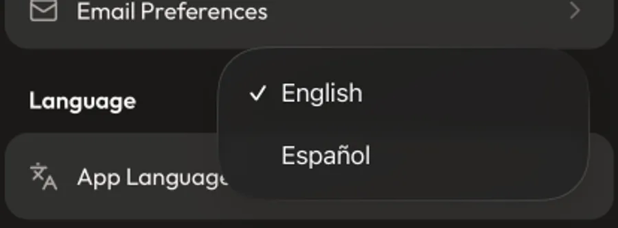
Settings now carries two separate language controls that look almost identical. "App Language" — what language the app itself speaks — is saved on the device, in a small file on that install. "Email Language" — what language we write to you in — stays on the account, travelling with the person to every device they sign in on. The app-language slot is left genuinely empty until someone picks, rather than pre-filled with English.
Context
The web app has had an English/Spanish switcher for a while; the phone app never got one. The plan is for it to, so the setting was built now and given its own section, even though the app's own text isn't translated yet. That immediately raised the question of where it lives, because the account already stores a language — the one used for emails.
Reasoning
The two settings answer different questions, so they belong in different places. The emails go to the person, so their language follows the account. The app is used on a device, and the same tattoo artist might reasonably want the shop iPad in Spanish for a Spanish-speaking apprentice while their own phone stays in English — one shared account, two right answers, which only works if the device holds it. The device is also the only option that resolves early enough: the app has to know what language to draw before it knows who's signed in, and reading it from a local file (rather than waiting on a network request for the account) means the first screen is never briefly wrong. Leaving the value empty until it's chosen is what lets the phone's own language decide: written as English on first launch, "we defaulted you" would be indistinguishable from "you chose English," and a Spanish-speaking user would be stranded in English with nothing to detect. Two settings this similar will get mixed up, so the caption under each one is doing real work — the app-language caption explicitly points at Email Preferences for the other one, rather than describing only itself.
Rejected
Putting the app language on the account alongside the email language (rejected: it forces one answer across every device the person signs in on, and it can't be read before sign-in, so the first screen would flash the wrong language). Saving "English" as the starting value (rejected: it's indistinguishable from a deliberate choice, so nothing downstream can fall back to the phone's own language). Folding the app language into the existing Email Preferences screen (rejected: the app's own language isn't an email preference, and burying a whole-app setting inside a sub-screen hides it).
Outcome
⏳ pending — backfill once shipped & in real use
Two controls that look the same on purpose, stored in two different places:


Note (updated 2026-08-07): translations have landed — the app's UI is now fully localized (en/es via use-intl, the same engine as the web's next-intl), so this setting drives the whole app's language plus the Follow Us default, and the caption now describes what actually happens.
The language setting is a pull-down, but the social accounts stay as visible tabs — the same-looking choice, two different controls
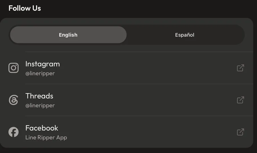
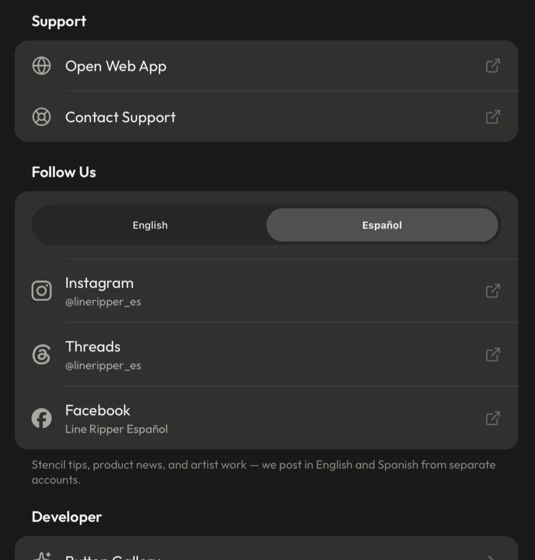
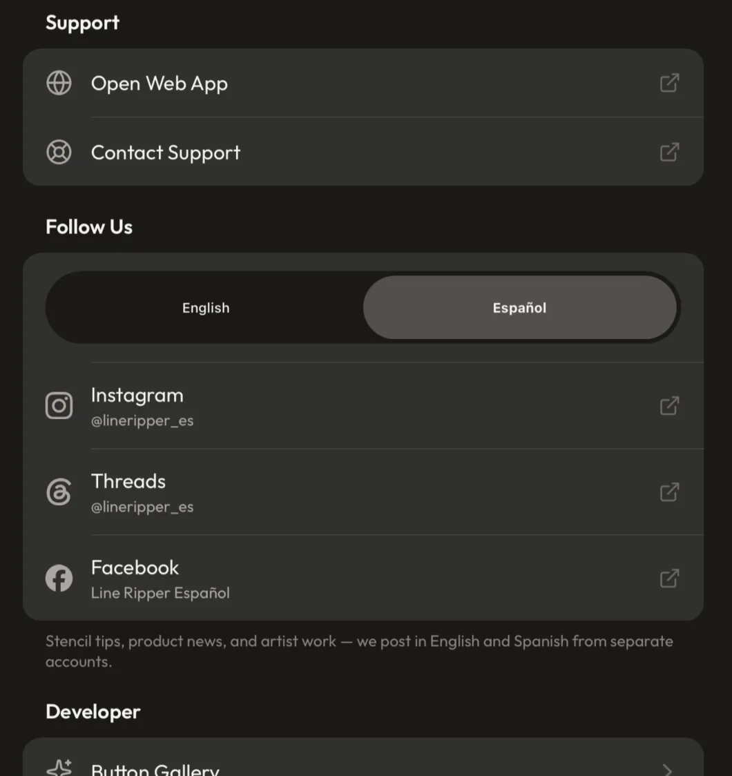
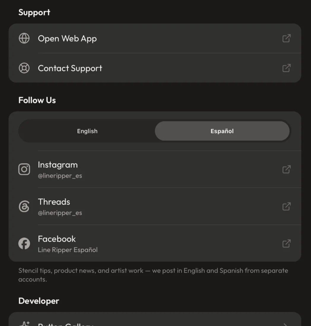
Picking the app's language uses a pull-down menu that collapses to a single line. Picking which language's social accounts to view — directly below it, an apparently identical English/Spanish choice — deliberately stays a row of side-by-side tabs with both options permanently on screen.
Context
Both controls were originally the same segmented tab row. The language setting was moved to a pull-down because that list grows with every locale we localize into. The obvious next step was to make the socials match.
Reasoning
They look like the same choice but they're doing different jobs, and the tabs earn their space by advertising. Someone who reads Spanish has no way of knowing we run Spanish social accounts at all; seeing a "Español" tab sitting there is how they find out, and a collapsed menu hides exactly that. For the language setting, nobody needs advertising — they already know what language they want — so the pull-down's real advantage wins instead: side-by-side segments split a fixed width between them and stop fitting past about four, while a menu is the same size at two options as at twelve. That asymmetry holds because the two lists grow at completely different rates: we'll localize the app into more languages than we'll ever staff social accounts for, so the socials list is capped near where tabs still work by the shape of the business, not by a UI constraint. The trade is written down with its expiry: past roughly four sets of accounts this needs rethinking as a piece of UX, not a silent swap to a dropdown that quietly drops the affordance.
Rejected
Making the socials a pull-down too, for consistency with the setting above it (rejected: it hides that a Spanish account exists, which is the one thing the control is there to communicate — consistency would cost the actual function). Showing only the language you're currently set to (rejected: the same problem, harder — it removes the other language entirely rather than just collapsing it). Deriving the tabs from the full list of app languages (rejected: shipping a translation is far cheaper than staffing a social presence in that language, so a new locale must not imply accounts exist for it — the tabs come from the accounts we actually run, and anything unmatched falls back to English).
Outcome
⏳ pending — backfill once shipped & in real use
Quote
"the important part is that it does not become like the other language selection versions (the dropdown select) because the context of this is relative to what Social media accounts we have, having all language versions gives that affordance for the user while we know almost 100% we will never have specialty social accounts for every language we offer"
The pull-down that won for the setting → the tabs that won for the accounts:
The tab control sitting on a settings card is our own component restyled — not the iPhone's built-in segmented control
The English/Spanish tabs in Follow Us are the app's existing tab component given a second skin for this context: a sunken groove with a raised chip marking the selection, instead of the frosted-glass capsule it wears in the Studio. Apple's own segmented control was built as a candidate and dropped.
Context
The tabs shipped first by simply reusing the tab component as-is, which meant a floating glass capsule landed in the middle of a flat settings card and looked like it had drifted in from another screen. The instruction for the fix was to reach for something off-the-shelf first, then something we already own, and only then build.
Reasoning
Apple's segmented control was the right first thing to try and genuinely lost on the merits: it renders in cool grey, and this palette is warm neutrals throughout, so it read as a foreign object on the card. More importantly it can't use the two-tone selection surface the design system already defines — the pattern where the selected thing and its surroundings differ by surface tone rather than by an accent colour — so adopting it would have meant this one control expressing selection differently from everywhere else in the app. Against that, "we maintain it ourselves" was the cheaper cost. Extending the component we already had, rather than adding a third tab control alongside it, meant inheriting the parts that were expensive to get right — the spring-loaded chip, the drag-to-scrub gesture, the haptics — and it keeps one answer to "how do tabs work here." The glass had to go because glass needs something behind it to refract and an opaque card gives it nothing; the treatment that reads as floating on the Studio canvas reads as stray on a card. Segment widths flipped with it: the glass capsule hugs its labels because it floats, while the card version stretches to fill its row like any other row — which, as a bonus, removed a long-standing alignment trap where the chip could drift out of step with the labels.
Rejected
Apple's built-in segmented control (rejected: cool grey against a warm palette, and it can't express selection using the app's two-tone surface pattern, so this one control would have looked and behaved unlike every other selection in the app). A third, purpose-built tab component for cards (rejected: it would duplicate the gesture, spring and haptics that were hard to get right, and split the answer to how tabs behave). Keeping the glass capsule and only changing its colours (rejected: glass with nothing behind it to refract is the actual problem — no recolour fixes a material that has no job to do).
Outcome
⏳ pending — backfill once shipped & in real use
Quote
"use Expo for anything out-of-the-box for this grouped tab button, or if we already have something like this in our design system, definitely use that first. if you need to make a new one so that it matches our existing design system, build it using our design system where you can"
Three states, in the order they were built:



Sub-decision 3.b — toning this control down — is logged directly below.
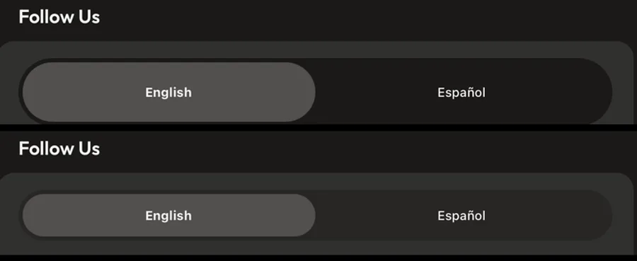
3.b — The groove is kept deliberately shallow and the control drops a size: maximum separation was too loud (small tuning note)
The groove behind the tabs is sunk only partway toward the app background rather than all the way down to it, and the control itself steps down to a smaller size than the one it inherited. Both moves reduce how much attention it pulls, without giving up either contrast relationship that has to hold.
Filed as sub-decision 3.b of "The tab control sitting on a settings card is our own component restyled" directly above — a restraint-tuning craft call inside that control. Skim-past by default; both entries carry the #segmented-control-on-card tag so they filter together.
Context
Once the control was correctly using the design system's selection tones, it was still the loudest thing on the card — a full-width slab with a near-black trough under a light chip, for a control holding two short words.
Reasoning
Two separate causes, both traceable. The size was inherited from the Studio, where the same component sits in a toolbar and carries an icon stacked above a label — a taller box than a settings row needs. Kept at that height on a card, a two-word toggle stood as tall as a two-line row and simply out-measured every row around it; dropping it a step brought it back in line, and losing height costs nothing here because the tappable segments are hundreds of points wide. The trough was the more interesting one: the existing rule for separating a selected surface from an unselected one says to push the unselected side darker, because the selected side is the lighter of the pair and its brightness is capped by the contrast its near-white label needs. Applied at full strength that rule is correct and still wrong — sinking the trough all the way to the app's background gave this one control the widest range of light-to-dark anywhere on the card, which is exactly what "attention-grabbing" means. So the rule earns a ceiling as well as a floor: the trough is set where it holds roughly the same gentle lift against the card that the design system already treats as "reads as a real surface," and still roughly twice that under the selected chip. Both numbers were checked rather than eyeballed, because on a warm near-black palette neighbouring tones are genuinely indistinguishable by eye.
Rejected
Leaving the trough at full depth (rejected: technically the safest contrast, but it made a minor control the highest-contrast element on the card). Lightening the trough further to calm it more (rejected: it starts blending into the card, which is the exact failure the trough was introduced to fix — there's a narrow band between "loud" and "invisible" and this sits in it). Darkening the selected chip instead of shallowing the trough (rejected: it's the surface the near-white label sits on, so its tone is the one that's constrained from above — the established rule points the other way). Changing only the colour and leaving the height (rejected: the height was the larger share of the problem — the slab read heavy before any colour was considered).
Outcome
⏳ pending — backfill once shipped & in real use
Quote
"the Language toggle for the Socials still feels a little too much attention-grabbing. So is there something you can do to tone it down, maybe the size, or if we can even tune down the background color just a bit to be lighter?"
Before → after, then the two at identical scale:
Other companies' logos appear only as flat single-colour shapes in our own grey — never as their real, coloured brand marks (small brand note)
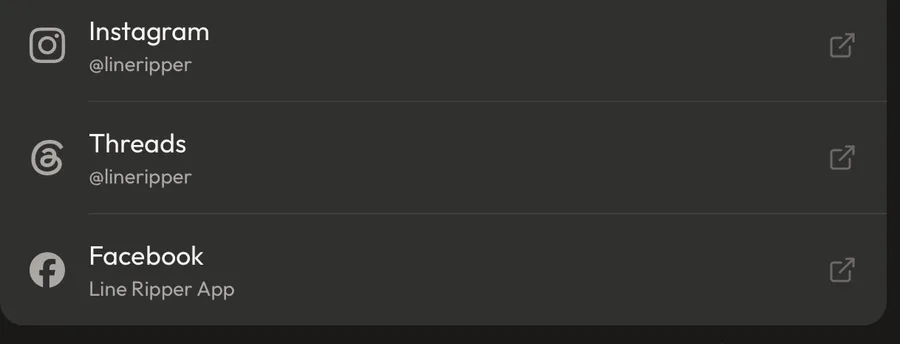
The Instagram, Threads and Facebook icons in Follow Us are drawn as flat single-colour shapes tinted the same grey as the row's own text, not as those companies' real coloured logos. They're never recoloured to imitate the official versions, never distorted or combined with the Line Ripper mark, and always sit beside the plain service name.
Filed as a small decision — a brand-and-legal constraint on how third-party marks are drawn. Skim-past by default, but it binds any future surface that links out.
Context
The section needed recognisable icons for each service, sourced from Simple Icons, and the brief explicitly asked for it to be done within appropriate legal guidelines rather than just dropped in.
Reasoning
The two things you'd assume travel together actually come apart here. The drawings themselves are given away for public use, so copying the shapes is free and needs no credit. The brand names and logos are a separate matter and are not given away — they stay the property of the companies that own them. What makes using them safe is that we're only ever pointing at our own accounts on those services: the mark is labelling a destination, not decorating Line Ripper. So the rules that keep it in that lane are the design constraints. Flat and in the row's own grey means it reads as a list icon rather than a reproduction of an official logo. Never sitting on a paywall, an upgrade screen, or next to our own mark means nothing can imply those companies endorse or sponsor us. Always pairing the icon with the service name spelled out keeps it doing the job of naming where a tap goes. That combination is also just better design here — the rows already use a single grey for every icon, so brand colours would have made three list rows shout while their neighbours whisper. The reasoning is written at the top of the icon file itself rather than in a document, because the person most likely to break it is whoever adds the fourth service.
Rejected
Using each service's official full-colour logo (rejected: it reproduces a protected brand mark rather than referring to it, and three saturated logos in a row of otherwise-grey icons would wreck the section's visual order). Tinting them in the Line Ripper brand purple (rejected: recolouring another company's mark into ours is the version that most looks like a claim of association). Icon-only rows without the service name (rejected: the name is part of what makes this a reference to a destination rather than decoration — and it's how the row states where the tap goes).
Outcome
⏳ pending — backfill once shipped & in real use
Quote
"social media icons must be pulled from Simple Icons; let me know if you need me to download the files themselves or you understand how to do it, use it, and implement with appropriate legal guidelines"
The shapes on their own, then in place:

Contacting support keeps the address on screen instead of handing it to the phone's own pop-up
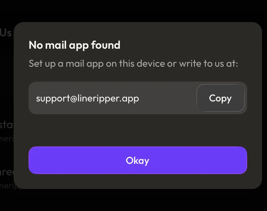
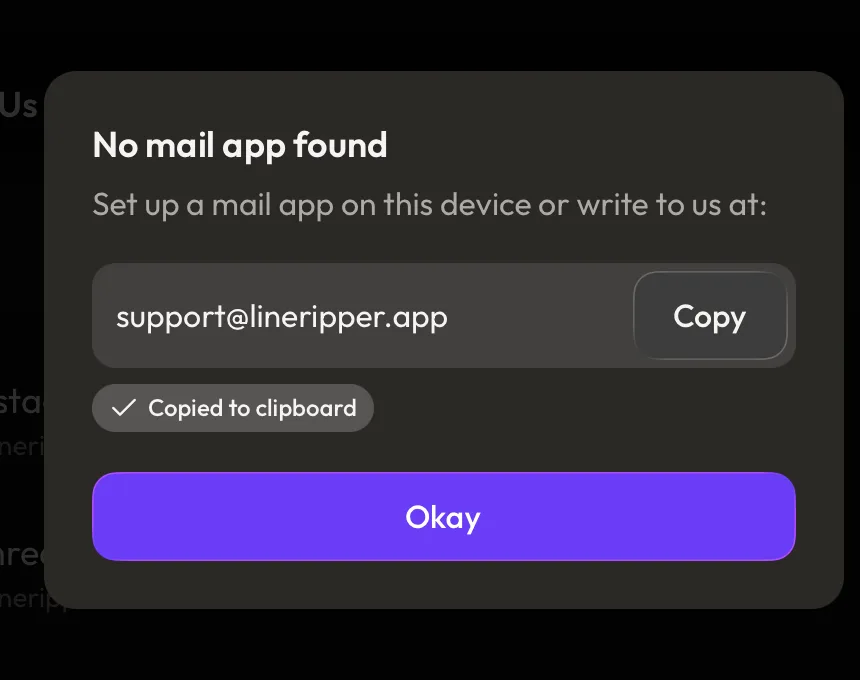
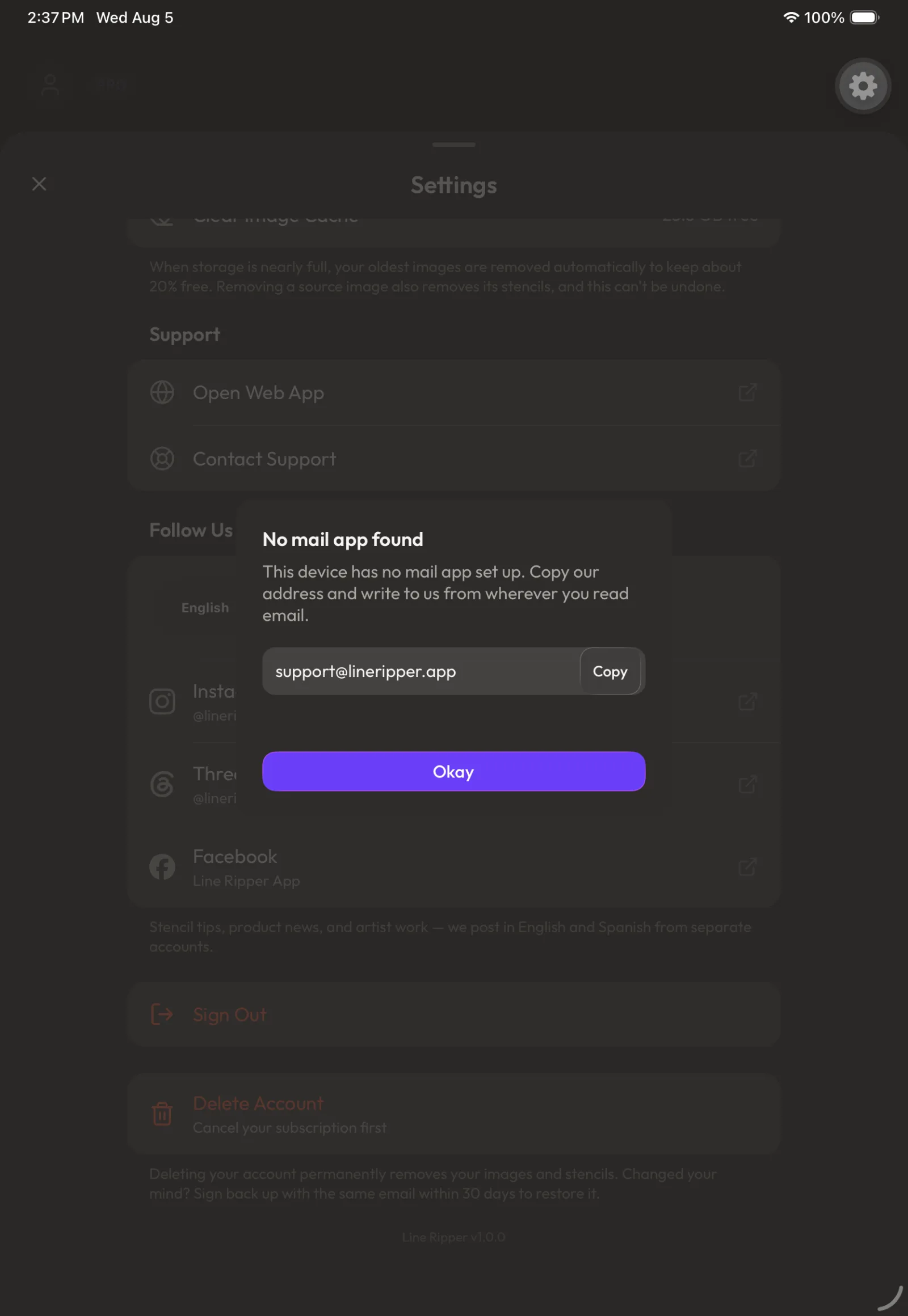
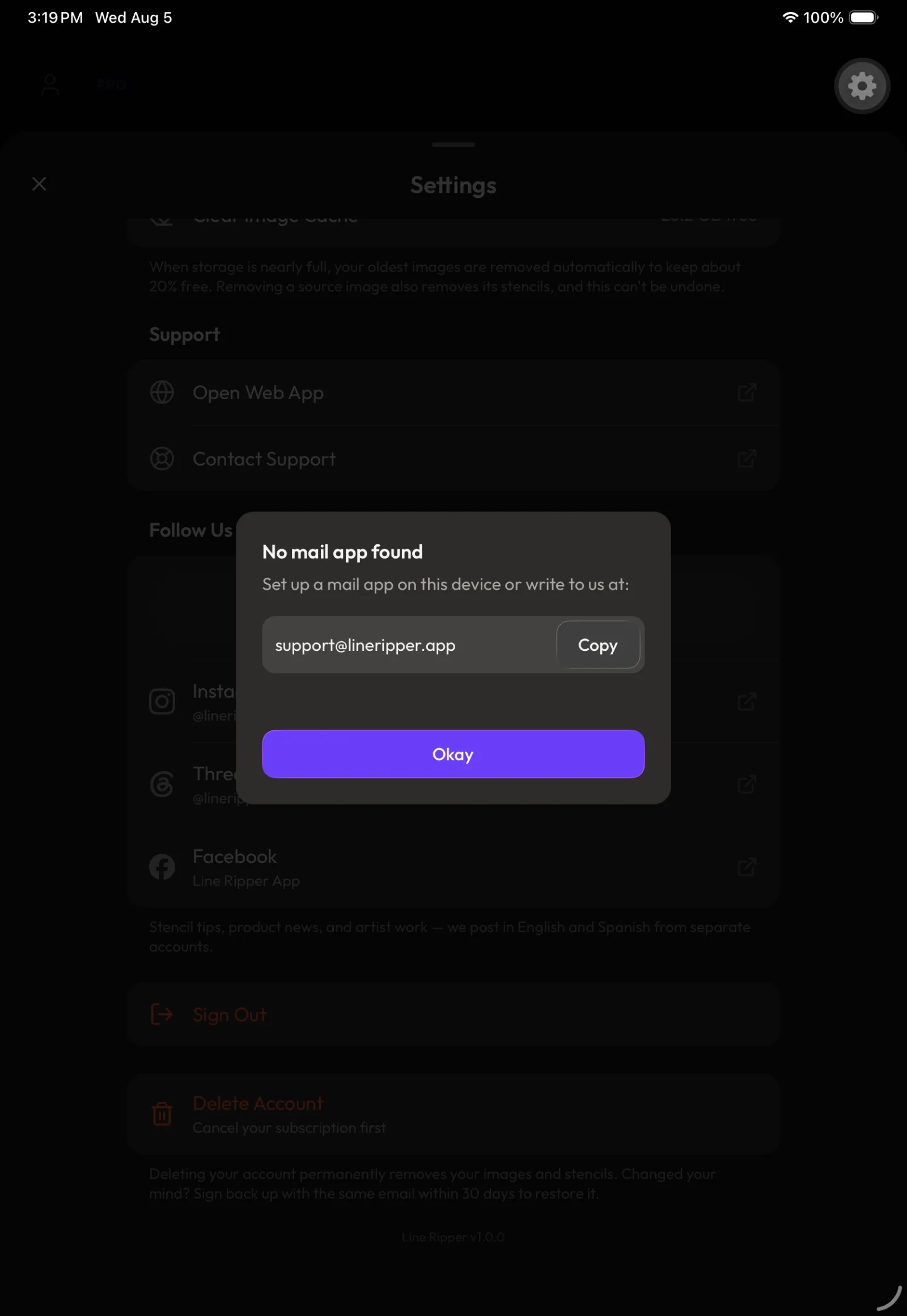
Tapping "Contact Support" on a device with no email set up now opens a panel built from our own pieces: the support address sits on its own line in a read-only field with a Copy button attached to its right, a small tag confirms when it's been copied, and a single "Okay" is the only way out. The phone's built-in pop-up (the system alert, Alert.alert) was dropped entirely.
Context
Tapping Contact Support did nothing at all except throw an error into the developer console. The app asks the phone to start a new email (a mailto: link) and nothing was installed to answer it — always true on the iPhone/iPad simulator, which ships no Mail app, and possible on a real device where someone has deleted Mail. The first fix simply put a "Copy Address" button on the phone's own pop-up, and that's where the design problems started.
Reasoning
Two things pushed it off the phone's pop-up and into something we control. First, that pop-up can't be designed: its capsule buttons, text sizes and spacing all belong to Apple, and nothing from our colours, type or spacing reaches inside it (the operating system draws it itself, as a UIAlertController), so "the buttons are the wrong shape and the text is too small" was unfixable without replacing the whole thing. Second, every button on it closes it — someone who taps Copy watches the address disappear at the exact moment they're leaving for their email app, and if they come back unsure whether the copy took, there's nothing left to check against. Parking the address in a field that stays put means the trip out and back still shows it, and closing is left to one deliberate "Okay" so a stray tap can't take away the one thing they came for.
Rejected
The phone's built-in pop-up with a "Copy Address" button on it (rejected: nothing about it can be styled to match the app, and every one of its buttons dismisses it — so the address vanishes exactly when it's needed). Letting a tap outside the panel close it (rejected: on a surface whose whole purpose is a value the person is mid-way through copying, an accidental dismissal is the one failure worth designing out).
Outcome
⏳ pending — backfill once shipped & in real use
Quote
"it gives the user a chance to copy the address, go to a different app, return to Line Ripper to check if they needed to and the information is still on the screen for them to reference"
The phone's pop-up → the panel that keeps the address:
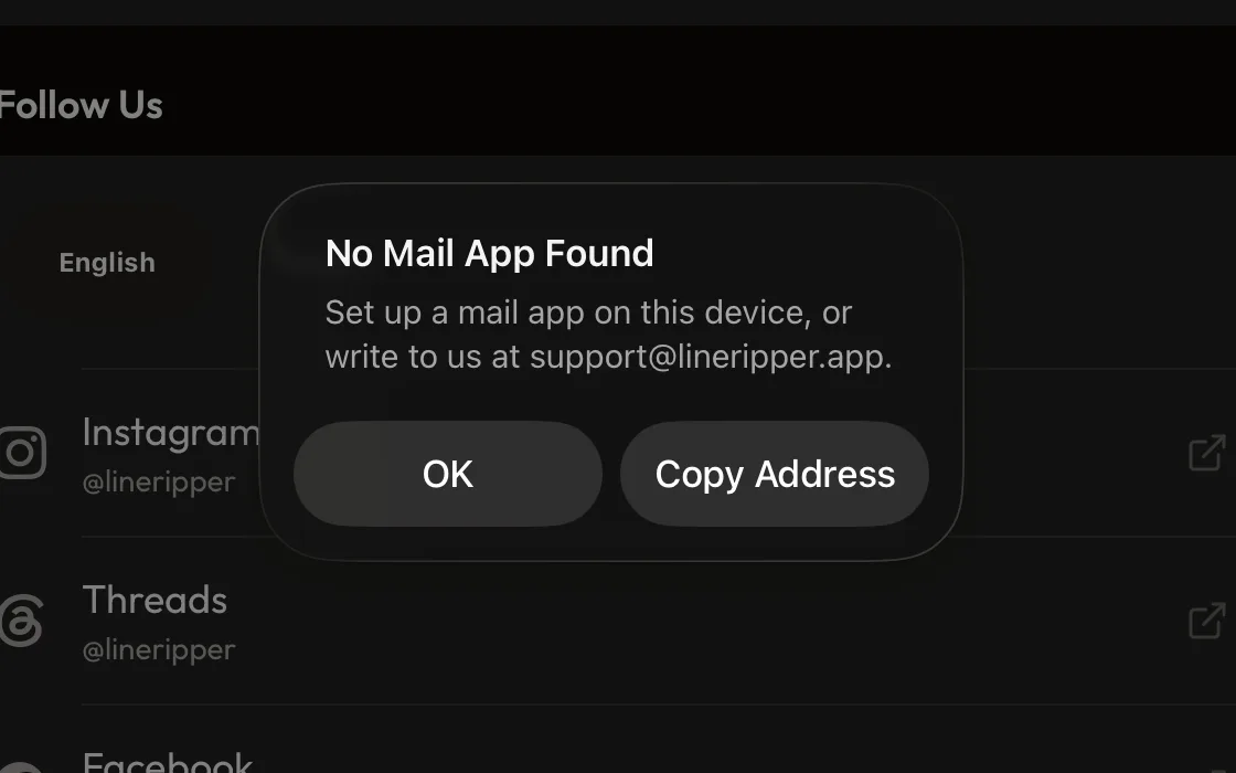
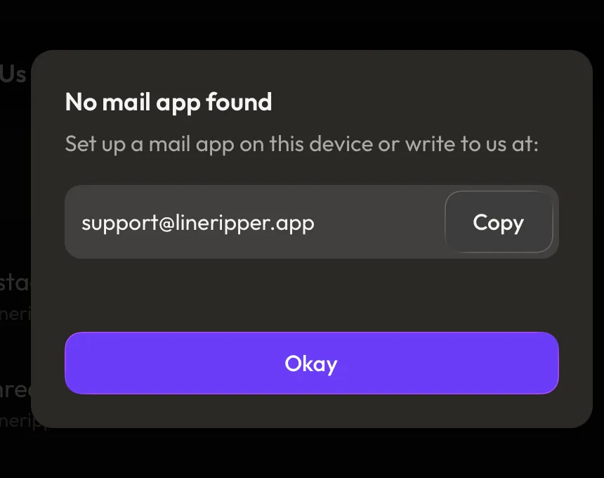
Two sub-decisions came out of this panel and are logged directly below: 1.b — what colour the confirmation tag is allowed to be, and the palette rule that came out of it. 1.c — how long that tag stays up, and the space held open for it.
1.b — A colour that means something is a claim on attention, so a message has to earn one: "it reports a fact" qualifies it, but doesn't earn it
The "Copied to clipboard" tag is plain grey rather than success green, and out of settling that, the palette gained a rule for when a message is allowed a meaningful colour at all: reporting a fact qualifies a message but doesn't earn it, and the test is whether missing the message would cost the person anything. A blue for genuinely informational messages was added at the same time — named info for what it means, not neutral for how it looks — and deliberately left unused, including by the tag that prompted it.
Sub-decision 1.b of "Contacting support keeps the address on screen…" directly above — the confirmation tag inside that panel is what forced the question, but the rule that came out of it governs the whole palette. All three entries carry the #support-contact-dialog tag so they filter together.
Context
The confirmation tag shipped in success green because "it worked" was the obvious reading of a copy landing. Green in the palette is spent on outcomes that succeeded in a way you might need to act on, so the question was whether a copy is one of those — and behind that, whether the palette even had the right colour for "here's a fact, nothing needed from you," which it didn't.
Reasoning
Green is a strong signal and the palette only has so many; spending it on something as ordinary as text landing on the clipboard makes it mean less everywhere else it's used. The sharper version of that is a threshold rather than a category: a copy confirmation is technically a fact being reported back, so on category alone it would qualify as informational — what disqualifies it is weight. Missing it costs nothing, because the address is still sitting on screen and Copy is one tap away, so the tag can be plain raised chrome (the same treatment any lifted pill or field gets) and claim no status at all. Writing the test down as "would missing it cost the person anything?" gives the next person something they can actually answer at the moment they're building, rather than a category argument they might reasonably land on the other side of. Naming followed the same logic: neutral describes what the colour looks like today and would read as a lie the first time it's retuned — and worse, invites use as a general-purpose grey, which is a job plain chrome already does — where info describes the job and survives a retune, the same way the failure colour is called error and not "red." The blue itself was placed well away from the brand purple so an informational panel is never mistaken for brand chrome, and held muted enough to sit with the app's warm palette without going so grey that it stops reading as a colour at all. It was built with the same set of parts every other status colour has — a surface, an edge, a dot, a text colour — because that shared shape is what lets a component be told "you're informational" or "you're an error" and pick up the right set by name, instead of being taught each one individually. Nothing uses it yet, on purpose: the toast and chip components arriving next get to be built against a real colour rather than inventing one under deadline.
Rejected
Green for the tag (rejected: it claims a "this succeeded, take note" reading that a copy doesn't warrant, and every ordinary use spends down what green means elsewhere). Naming the new colour neutral (rejected: names the appearance rather than the job, so the name goes stale the moment the shade moves, and it reads as an invitation to use it as the house grey). Adding no colour at all and leaving the palette as-is (rejected: the messages coming next genuinely need one, and a component built without it will invent a colour that then has to be unpicked). Building the machinery for components to swap between status colours right now (rejected: with nothing consuming it, its shape would be guesswork — it gets designed alongside the first real components instead).
Outcome
⏳ pending — backfill once shipped & in real use
Quote
"it just doesn't carry enough weight for it to be displayed as info"
The rejected green → the landed grey → the rule that came out of it → the blue that rule now governs:
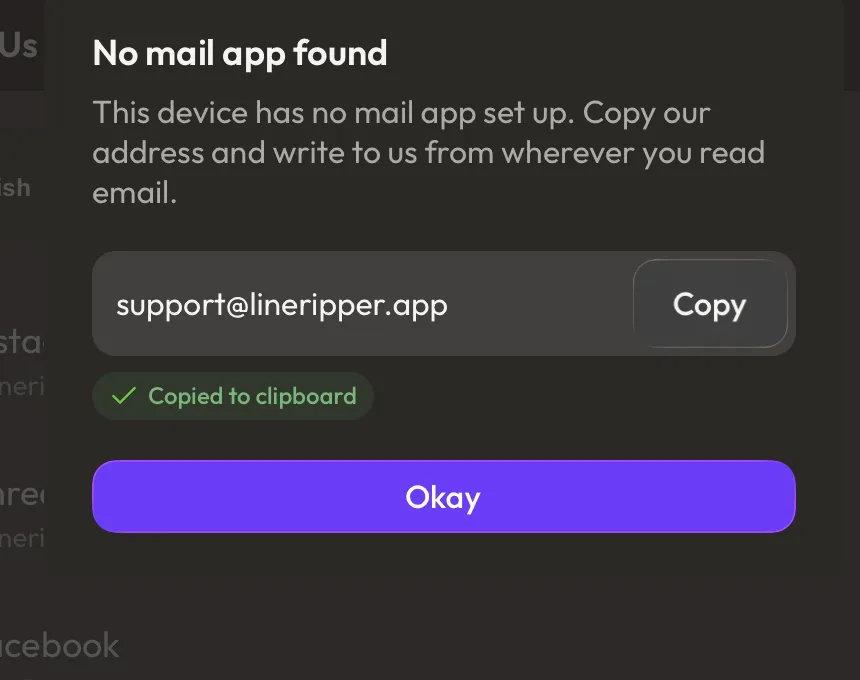
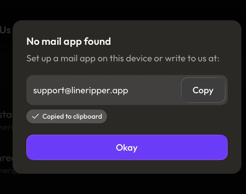
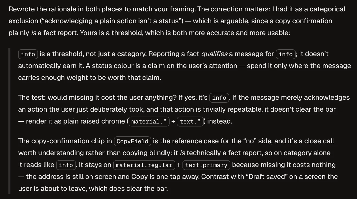
info; it doesn't automatically earn it. A status colour is a claim on the user's attention." This wording is what went into the design system itself, so it lives on in colors.ts and design-system.md rather than only here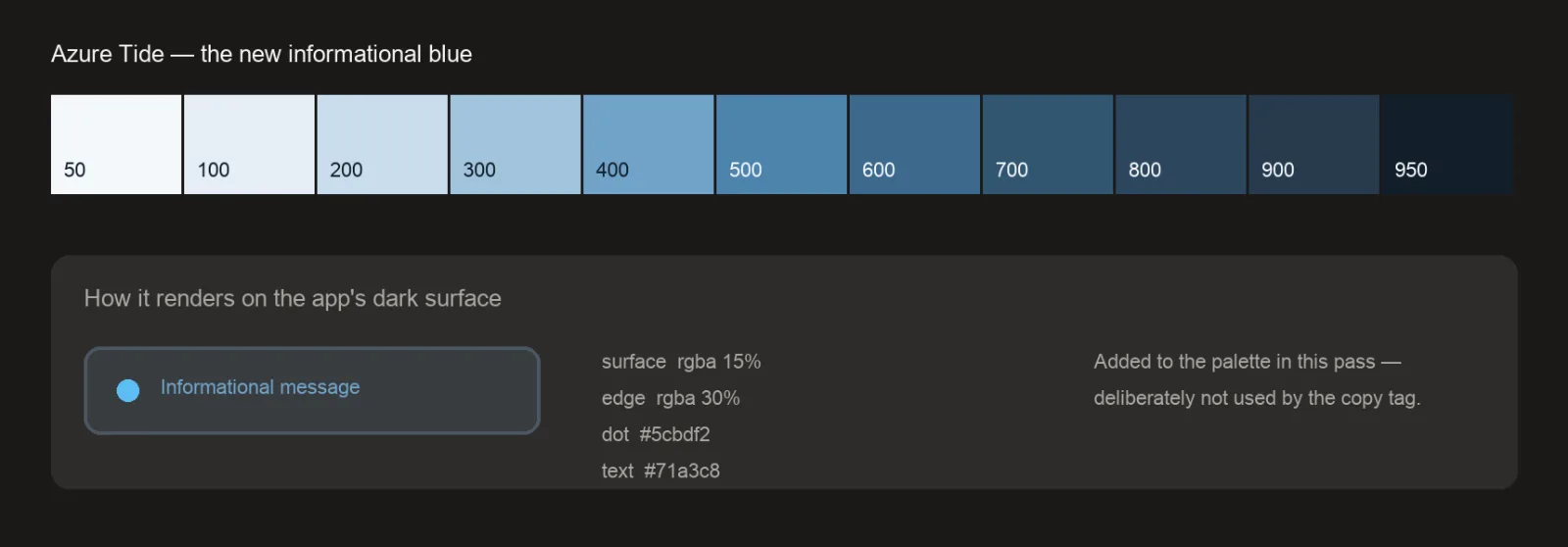
1.c — The copy confirmation is timed to being noticed rather than read, and the space it needs is held open whether or not it's showing (small interaction note)
The "Copied to clipboard" tag stays up for four seconds before fading, and the strip of space it occupies is reserved permanently — so nothing on the panel shifts when it appears or goes.
Filed as sub-decision 1.c of "Contacting support keeps the address on screen…" two entries above — a timing-and-spacing craft call inside that panel, sibling to 1.b. Skim-past by default; all three entries carry the #support-contact-dialog tag so they filter together.
Context
The tag was first set to clear after two seconds, which felt abrupt in use.
Reasoning
Two seconds is enough time to read three words but not enough to notice them: someone watching the Copy button they just pressed hasn't moved their eyes to the line below it yet, and anyone listening to the screen reader announce it hasn't heard the end of the sentence. Timing it to being noticed rather than read puts it in the four-to-five second band most confirmation messages sit in, and four was the more comfortable end in use. Separately, holding the tag's slot open whether or not it's filled means confirming a copy never nudges the "Okay" button out from under the thumb already heading for it — a panel that rearranges itself in response to a tap makes the person doubt what they just did, which is the opposite of what a confirmation is for.
Rejected
Two seconds (rejected: gone before it's noticed, let alone announced). Never fading at all (rejected: correct for this panel, since it closes on "Okay" anyway, but the field is meant to be reused on screens that stay put, where a permanent tag would be wrong). Letting the panel grow and shrink around the tag (rejected: the shift lands right where the closing button is).
Outcome
⏳ pending — backfill once shipped & in real use
The reserved slot, empty and filled — the "Okay" button doesn't move:
Pop-up panels now dim the screen behind them to near-black, because the shade we were dimming with was lighter than the screen itself (small visual note)
Panels that sit on top of a screen — the support panel, the delete confirmation, the upload progress card — now darken everything behind them with near-black, matching the amount the Settings sheet already dimmed by. The warm grey previously used for it is kept for its original job: shading photographs.
Filed as a small design decision — a one-token fix to how the background behind pop-ups is darkened. Skim-past by default.
Context
The support panel looked washed out rather than in focus. The background behind it wasn't reading as pushed back — the Settings sheet, one layer down, still competed for attention. The Settings sheet's own dimming was already correct, so it became the target to match.
Reasoning
The shade being used to dim was a warm dark grey, chosen originally to sit behind captions on photographs, where a warm tint keeps a bright image looking like it belongs to the rest of the app. The catch is that the app's own background is darker still — so laying that warm grey over an app screen doesn't push the screen back, it lifts it toward a mid-grey. Dimming was making things lighter, which is why the result read as washed out rather than out of focus. Splitting the one shade into two — a warm one for photographs, a near-black one for the background behind pop-ups — lets each do the job it's actually good at, and pointing the pop-ups and the sheet at the same near-black means a panel and a sheet now push their background back by the same amount instead of drifting apart.
Rejected
Simply making the warm shade heavier (rejected: no amount of it darkens a screen already darker than the shade itself — the problem is which colour, not how much). Copying the number the Settings sheet uses into each panel by hand (rejected: three surfaces had already drifted to three different values that way, which is what let this go unnoticed).
Outcome
⏳ pending — backfill once shipped & in real use
Quote
"the background is not contrasted or "blacked out" enough"
The same screen, before and after:
Which item is selected is shown by the item and its controls sharing one lighter surface — not by a colour accent or an outline
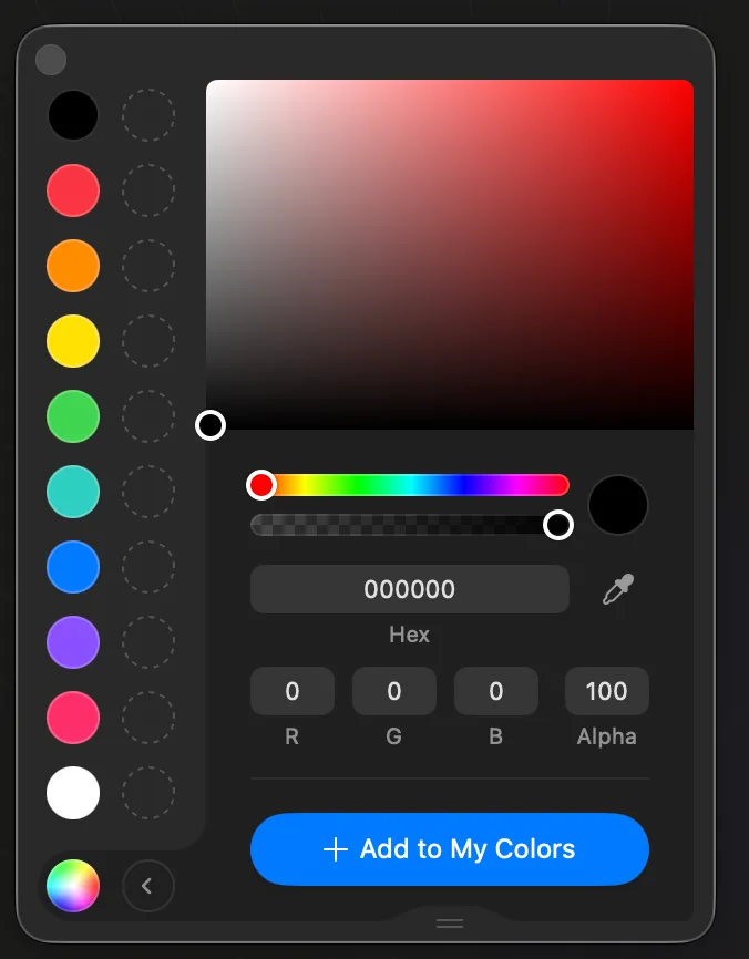
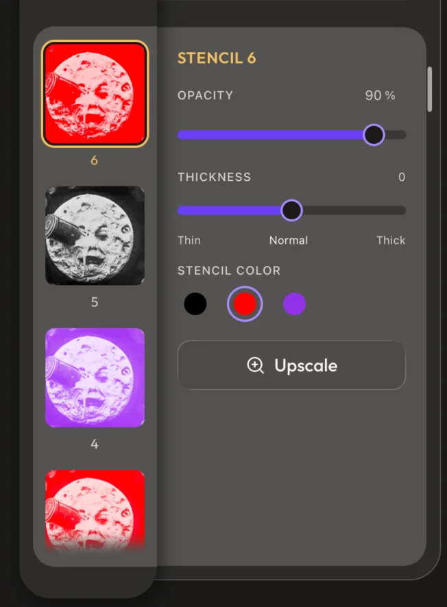
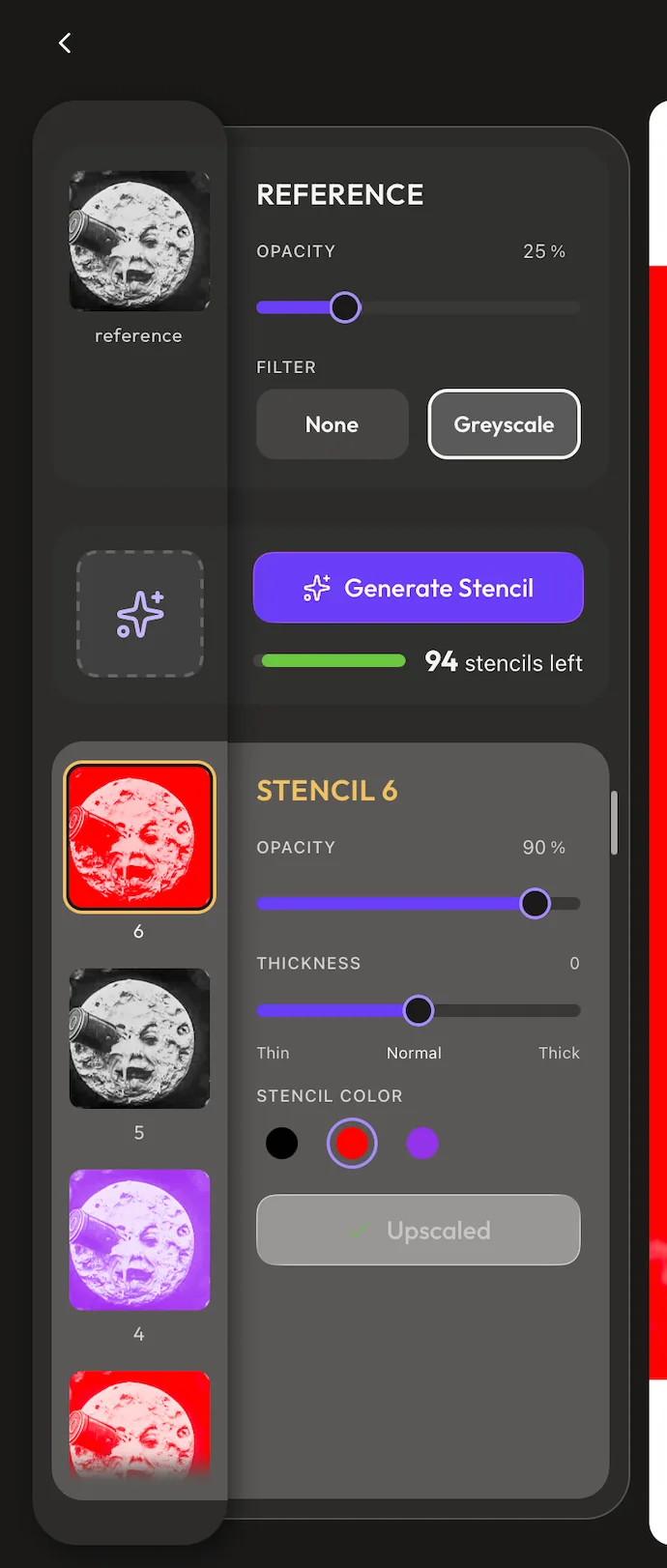
Pick a stencil (or the reference) and its thumbnail plus its controls both lift to the same slightly-lighter fill and read as one connected panel that runs from the left rail across into the controls, while every unselected card sits a step darker — so which item is active is carried by the shared surface itself, a lighter figure sitting on a darker ground, rather than by a coloured highlight or a drawn outline.
Context
The landscape Studio pairs each thumbnail in the left rail with its controls card on the right, so the panel has to make clear which pair is currently live. The exact treatment was already decided going in; the macOS colour-picker — where the active swatch and the picker sit on one continuous lighter panel — came up only as a happy incidental example the Designer happened across that matched the idea, shared because it was quicker to point at a real-world instance than to mock the idea up from scratch, not as outside inspiration the design was reverse-engineered from. An accent-colour version (a golden-yellow ring on the thumb plus a matching heading) was built and lived with first.
Reasoning
The thing the design has to make obvious is that a given thumbnail and a given set of controls are the same thing, and a colour accent alone doesn't say that — it marks the item but leaves the controls looking like a separate panel next to it. Giving the selected item's rail cell and its controls card one shared lighter opaque fill, butted flush across the shelf seam so the two halves read as a single slab, ties them together the way the picker reference does. Everything unselected then drops to a darker "resting" fill so the one lifted slab is unmistakably the active pair — the figure against the ground — instead of every card reading as the same grey.
Rejected
A colour accent as the connection cue — the golden-yellow ring + matching heading (rejected: it flagged the selected item but read as the only thing linking it to its controls, which "wasn't the ask"; the connection had to be the shared surface, so the yellow was dropped and the thumb kept only a quiet near-white ring). A lit border on the selected controls card echoing the thumb's ring (rejected: an outline frames a card as its own object, the opposite of fusing it with the thumbnail into one surface). A single mid-grey for every card with only the accent differing (rejected: with no darker resting tone behind the unselected cards, the "selected" surface never stood out — the whole panel read as one flat grey).
Outcome
⏳ pending — backfill once shipped & in real use
Quote
"the only indicator that connects the selected stencil/image to the controls is the yellow ; that wasn't the ask."
The reference cue → the rejected accent-only pass → a rough in-process mockup → the landed shared surface:
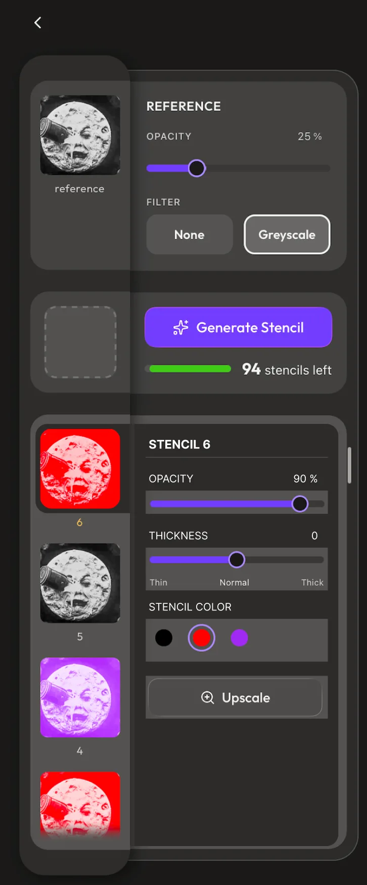
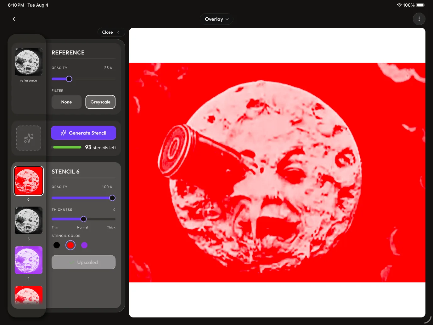
When the two selection tones read too close, open the gap by darkening the unselected cards — never by brightening the selected one (small accessibility note)
When the lighter "selected" fill and the darker "resting" fill read too close and blur into each other, the fix always pushes the resting cards darker rather than making the selected one lighter — because the selected surface is the lighter of the pair and its brightness is capped by the contrast the near-white text on it needs to stay legible.
Filed as a small design decision — a contrast-tuning craft call downstream of the selection-surface decision above. Skim-past by default.
Context
The two-tone selection surface (entry above) has a lighter selected fill and a darker resting fill, and a couple of tuning rounds landed the two tones too close together; an earlier round had over-corrected the other way, dropping the resting cards so dark they read as invisible against the shelf.
Reasoning
The instinct, when you want the selected slab to stand out more, is to brighten it — but that backfires: light text (the near-white labels and heading) loses contrast as the surface behind it lightens, so the selected fill hits a hard ceiling before it fails the minimum contrast ratio for accessibility (WCAG AA). The unselected fill has the opposite, always-safe property — darkening it only raises the contrast of its light text — so widening the gap by darkening the resting cards is the move that never risks legibility. The only limit in that direction is a floor: pushed too dark, an unselected card stops reading as a card and vanishes into the shelf, so it's held a visible step above the surface behind it.
Rejected
Brightening the selected surface to open the gap (rejected: it's already the lighter tone, and its lightness is capped by the AA of the near-white text sitting on it — going lighter risks failing contrast). Leaving the resting cards as light as they were (rejected: the two tones read as one, so the pair had no separation).
Outcome
⏳ pending — backfill once shipped & in real use
Before → after (the resting cards step darker to open the gap):
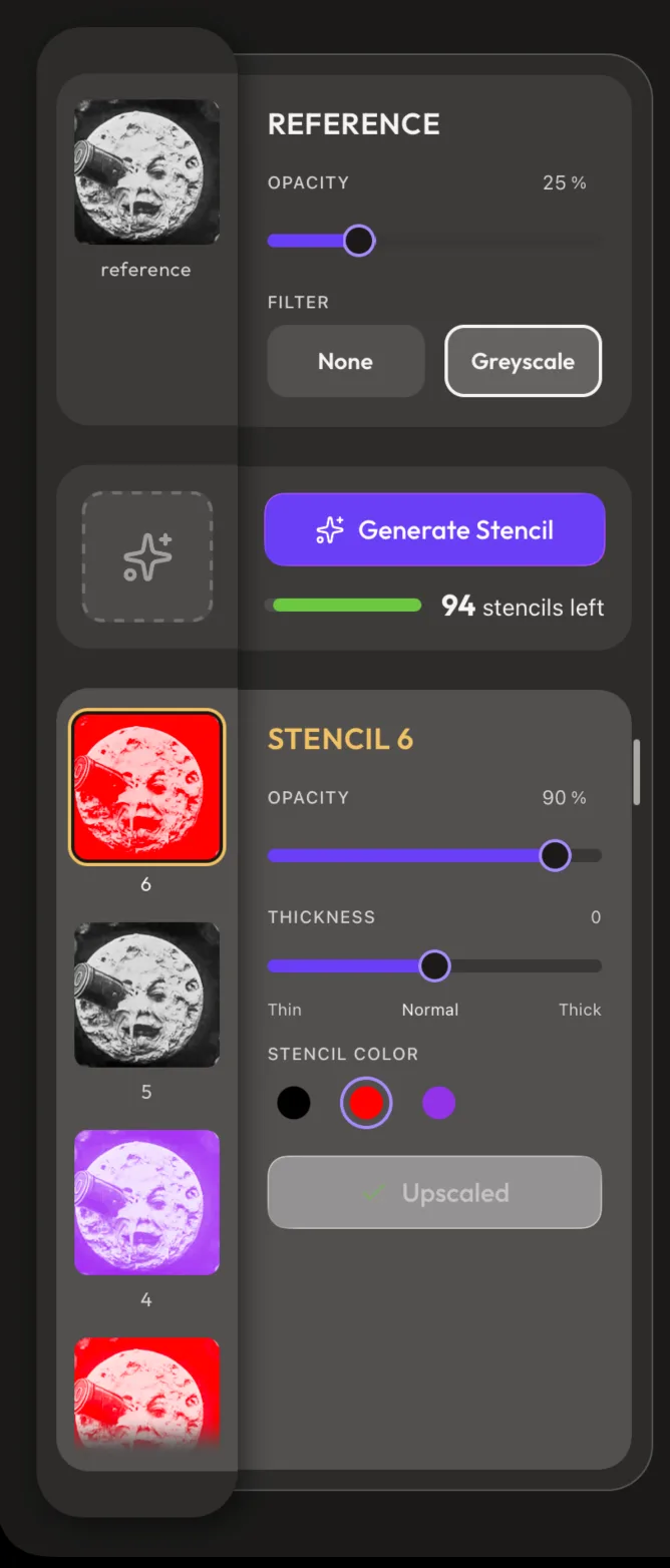
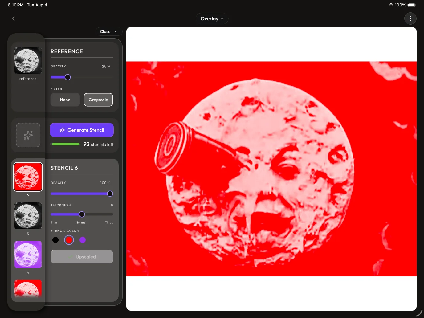
With the selection accent gone, the card title goes quiet and a hairline divider splits it from the controls — and the kept ring is portrait's exact thin "matted frame" (small typographic note)
Once the yellow accent stopped carrying selection (the shared-surface decision above), two smaller things followed. The controls-card title — which used to turn that same yellow when its item was picked — now holds the plain near-white it shows at rest in both states, and because that colour was the only thing setting the title apart from the controls under it, a thin hairline divider now sits beneath the title with the controls nudged a step further down (more gap below the rule than above it) so they read as sitting under a titled section rather than pressed against it. Separately, the near-white ring the selected thumbnail keeps is the portrait picker's exact "matted frame" — a pale ring held off the image by a thin dark gap so it reads as a frame around the thumbnail, not a highlight fused to it — held at that thin width rather than a heavier one, so portrait and landscape match.
Filed as a small design decision — a typographic and structure tidy downstream of the selection-surface decision above (which is the load-bearing call). Skim-past by default.
Context
With selection moved onto the shared lighter surface, the title's old job (turning yellow to flag the active card) went away, leaving it plain but with nothing separating it from the first control. The Designer also pointed at the existing portrait treatment as the ring to match, asked for it thinner than that reference example, and asked for the divider and the extra breathing room below it.
Reasoning
A still-yellow title would be a stray accent pointing at nothing now that the surface carries selection, so it drops to the resting near-white — but that removed the one thing visually splitting the title from the controls, so a hairline divider takes over that split, and the controls sit below it with more space under the rule than above so the divider reads as belonging to the title rather than floating loose between the two. Matching the thumbnail's ring to portrait's thin matted frame (rather than a thicker one) keeps the two orientations reading as the same component.
Rejected
Dropping the title to its resting colour but adding no divider (rejected: without the old yellow the title had no separation from the controls beneath it). Matching the portrait reference's thicker frame (rejected: it doesn't need that weight; the thin ring reads clearly on its own).
Outcome
⏳ pending — backfill once shipped & in real use
Quote
"change the title colour to match the inactive state one ... then add a thin divider below the title, and make sure the rest of the controls panels (within each card) gets pushed further down slightly"
Reference, before → after:

The landscape panel's collapse control is a pill that travels with the drawer — not a header button, not a side-edge grabber
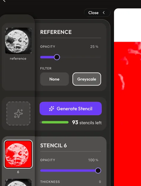
The control that collapses the landscape Studio's side panel (handing its width to the canvas) is one small pill button living on the panel itself, which slides between two homes as the drawer opens and shuts: right-aligned at the panel's top saying "Close ‹" while open, and tucked onto the shelf saying "Open ›" while collapsed. It stays a single mounted element the whole time — never cross-faded or swapped — gliding on the drawer's own motion curve and very nearly its own distance, so it reads as travelling with the controls rather than hopping after them.
Context
Landscape Studio has a fixed-width controls panel beside the canvas; collapsing it gives that width to the image, so the collapse needs a trigger. Three placements were built and lived with across the session before this one settled. The collapsed "+ Stencil" tile also reopens the drawer, so the two states have to feel continuous.
Reasoning
The trigger has to be findable without being loud, and — because tapping to reopen can happen from the "+ Stencil" tile too — the open↔closed transition has to feel like one thing moving, not two things trading places. Making it a single button that physically travels between the states means there's nothing to "jump": the same element you pressed to close is the one that slid to where it now says open. Matching the drawer's exact easing and travel distance is what sells it as one gesture — the button lands as the controls do.
Rejected
A grip-bar "grabber" on the panel's right edge (rejected: sitting on the side edge next to dense content it read as stuffy and easy to miss — "it felt stuffy and seemingly easily-missable since it's near so much content"). Hosting the toggle in the screen header (rejected: it shoved the Back button out of its home in the top-left, trading one navigation affordance for another). A chevron that swaps in place between two static buttons (rejected: a swap reads as a jump, and continuity was the whole point).
Outcome
⏳ pending — backfill once shipped & in real use
Quote
"i don't want the buttons feeling like they're jumping from one place to the other."
Progression (rough in-process work → rejected alternative → the two landed spots):
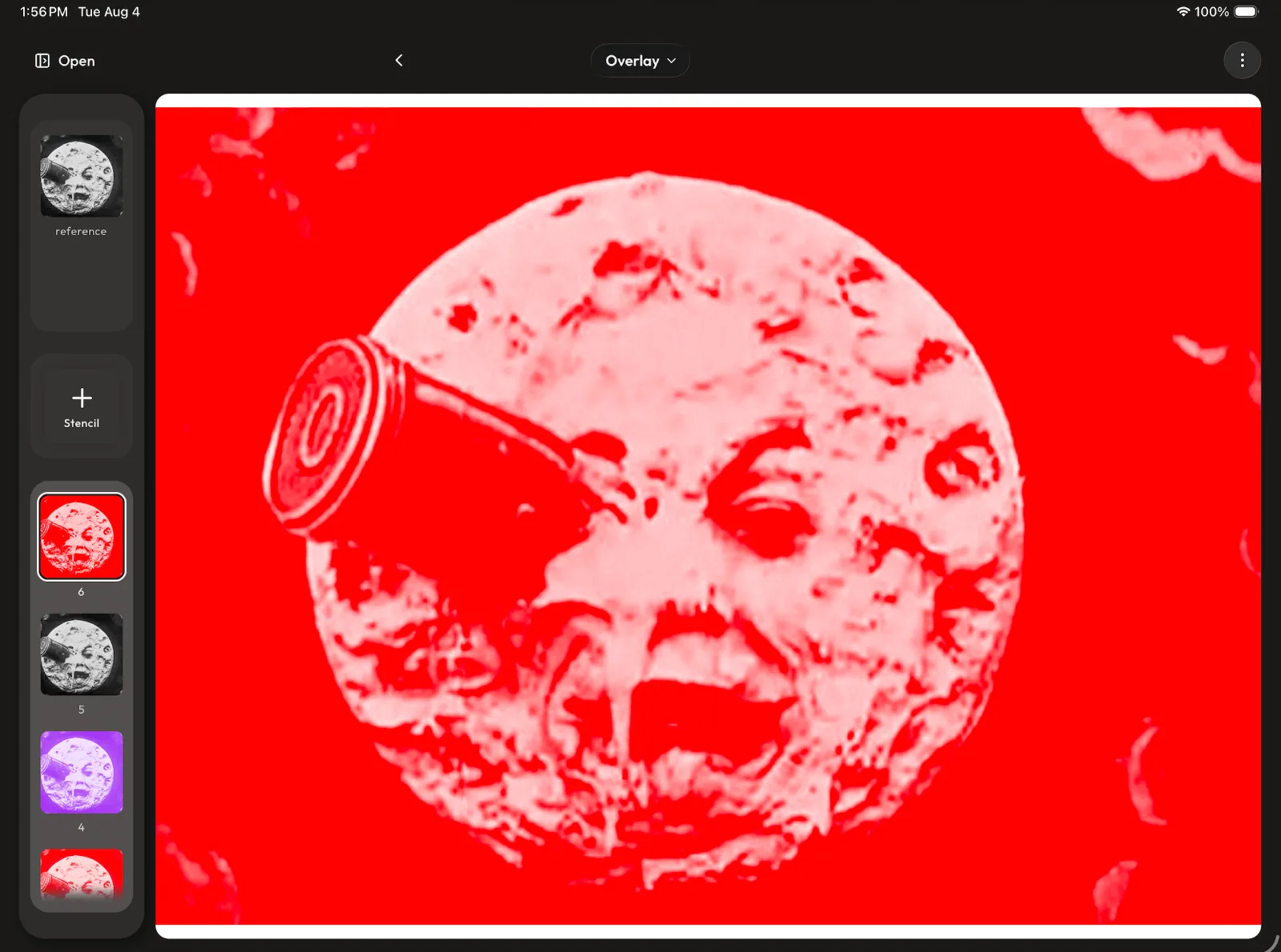
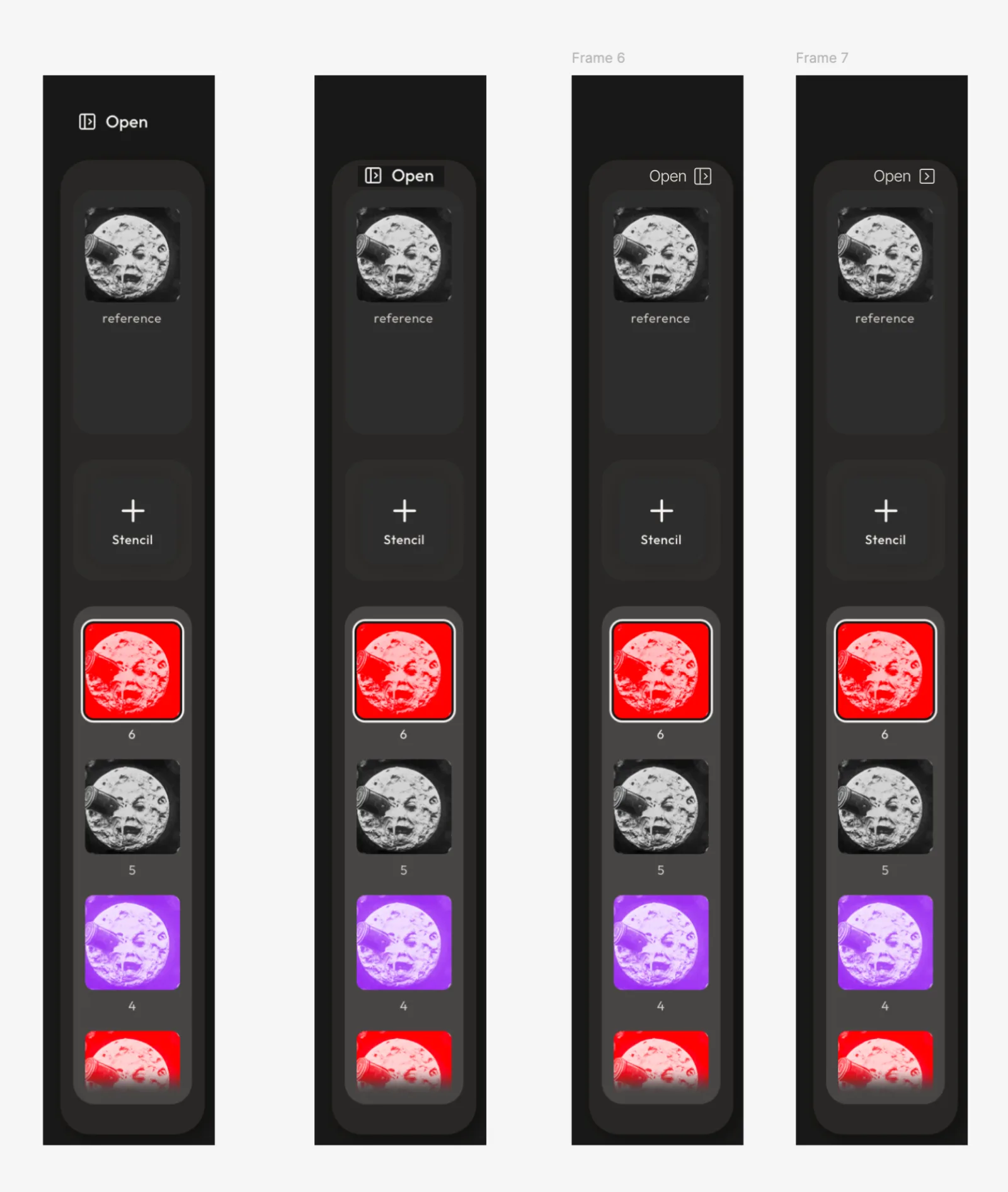
The first three images below are very rough, behind-the-scenes process work — early sketches and options played with in between the "before" and the landed treatment, kept here to show the process rather than as design specs in their own right.
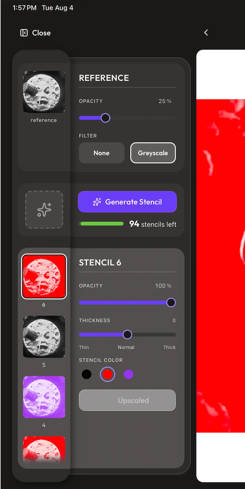
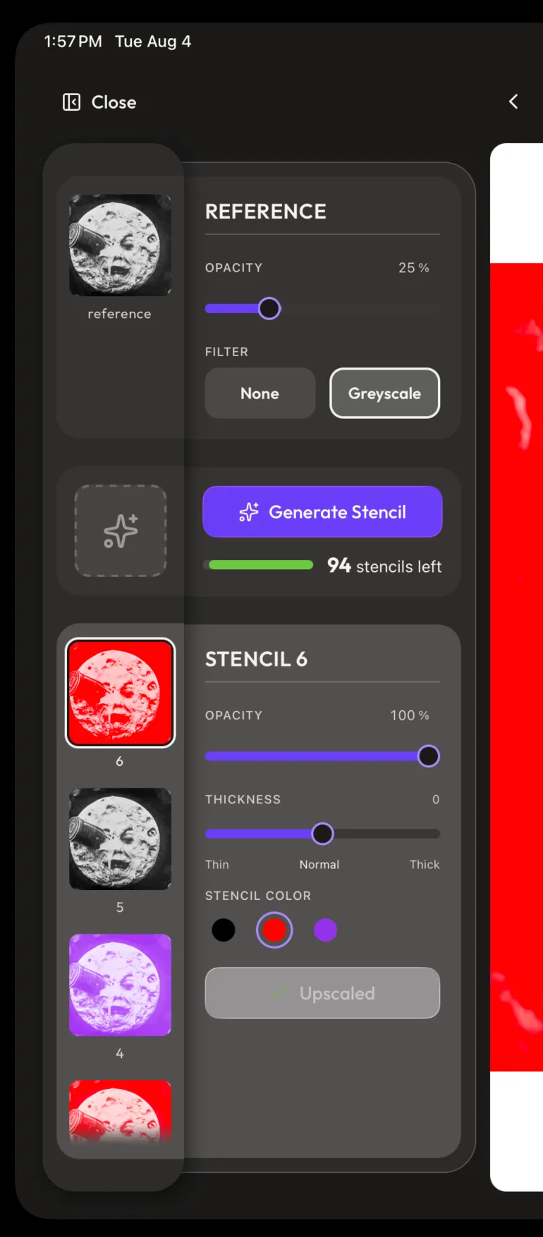
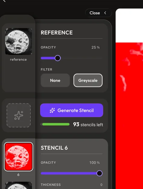
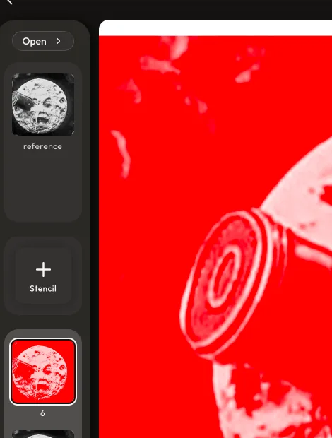
Making room for the toggle can't resize the controls panel — it aligns to the canvas top and the columns duck under it
Finding vertical room for the drawer toggle at the panel's top must not change the controls panel's size or where it lands against the shelf beside it. The rule that settled it: the toggle aligns to the top edge of the canvas, and the panel's two columns (the thumbnail shelf and the controls) start just far enough below that line to clear the toggle — so the panel keeps its exact proportions and seam, and only its start-point drops a little.
Context
The toggle needed room at the panel's top, and several ways to find it were tried in turn: pushing only the controls column down, overlapping the toggle onto the controls' corner, and insetting the whole panel and the canvas by a reserved strip.
Reasoning
The one relationship the design can't give up is the controls panel sitting flush against the shelf at the right ratio — that's what makes the two halves read as one unit (logged in the shelf-panel entries below). Every other alignment is negotiable, including the shelf's own top edge lining up with the canvas top, so the fix sacrifices exactly that one: the toggle uses the canvas top as its baseline and the shelf-plus-controls duck a computed distance beneath it — derived from the toggle's height plus its clearance, not picked by eye — so nudging the clearance slides the whole assembly together with its proportions intact. The canvas keeps its full height because nothing insets to match a reserved strip.
Rejected
Pushing only the controls column down (rejected: it broke the shelf-to-controls alignment the "one unit" read depends on). Overlapping the toggle onto the controls panel's corner (rejected: the Designer wanted the panel untouched, not sat on — "i don't want the size of the control panel to be effected"). Reserving a full-width strip that both columns and the canvas inset below (rejected: it opened a wide dead gap under the toggle and shortened the canvas). Shortening the header to buy the room (partly taken — the header did tighten a step — but not the load-bearing fix on its own).
Outcome
⏳ pending — backfill once shipped & in real use
Quote
"as long as the controls panel maintains its ratio size against the shelf as well as where it lands against the shelf, it should be fine"
Progression (before → after):

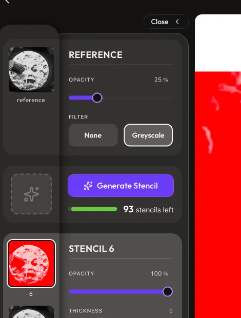
When the drawer closes, the rail cards hold their height so "+ Stencil" lands where the Generate card will appear
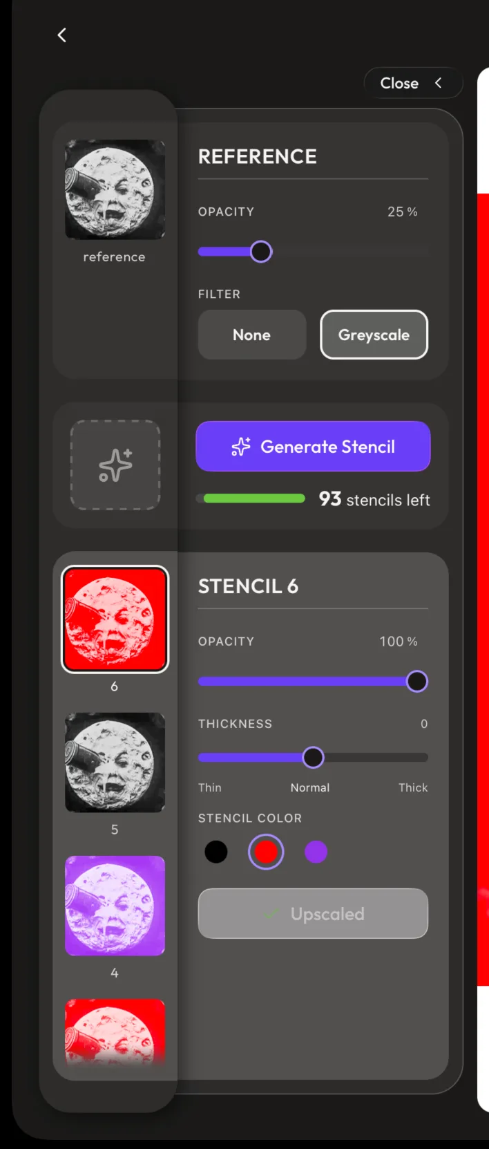
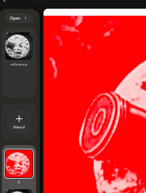
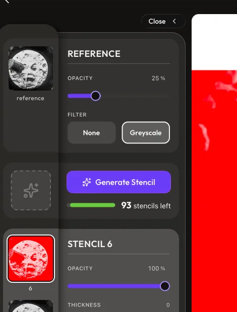
The pickable cards down the shelf (reference thumbnail, "+ Stencil" tile, stencil strip) keep the same height whether the controls panel is open or collapsed. In particular the "+ Stencil" tile barely moves between states, landing within ~12pt of where the full "Generate Stencil" card appears once the panel opens.
Context
The collapsed "+ Stencil" tile is itself the button that reopens the panel, where it becomes the "Generate Stencil" card. An earlier change (made two turns before, at the Designer's own request) shrank the reference card when the panel collapsed to reclaim its unused space — which pulled every card below it up the shelf, so opening the panel sent the Generate section leaping ~100pt down.
Reasoning
Because the same tile you tap to open the panel turns into the Generate card, the two have to appear in nearly the same spot or the link breaks — a long jump reads as two unrelated things instead of one becoming the other, the visual continuity Gestalt principles rest on. Holding every rail card's height means the only shift left is the ~12pt the collapsed shelf drops its content to clear the toggle — small enough that the tile essentially transforms in place. This deliberately reverses the earlier space-reclaiming shrink and accepts the cost it had been added to solve: the collapsed reference card now shows visible empty space below its thumbnail.
Rejected
Shrinking the reference card when collapsed to reclaim its dead space (rejected here after being tried: every card below it moved, sending the Generate section on a ~100pt jump that broke the tile→card continuity the Designer had flagged). A partial shrink was left on the table as a dial — every point the card sheds is a point the tile travels — if the empty card ends up bothering more than a small shift would.
Outcome
⏳ pending — backfill once shipped & in real use
Quote
"it's a long way to travel of where the '+ Stencil' goes to where the open version is."
Progression (before → after — each state shown collapsed then open):

A completed secondary action stays deliberately gray; the app’s dark appearance is a separate native guarantee (small design-system note)
A completed secondary action such as Studio’s disabled Upscaled button keeps its prominent muted-gray frosted surface, while the app itself remains dark-only through the native userInterfaceStyle: "dark" setting; the two behaviours are documented as separate concerns.
Filed as a small design decision — a state/appearance distinction that prevents an easy visual misdiagnosis. Skim-past by default.
Context
Both a deliberately disabled secondary button and light-trait Liquid Glass can look pale on the dark Studio. The latter is a platform appearance failure, not a Button palette choice: the splash plugin’s seemingly harmless dark: variant made the built iOS plist follow the device appearance again.
Reasoning
Completion should remain easy to find and read as a spent action, so the disabled secondary surface stays present and its foreground carries the inactive signal. Separately, locking the OS trait to dark prevents passive Liquid Glass from choosing its light rendering path over the app’s dark tokens; no Button colour adjustment can repair a system-trait mismatch. Removing the duplicate splash variant preserves one dark splash without sacrificing that native guarantee.
Rejected
Making completed secondary actions nearly invisible (rejected: users lose the clear “this was done” state). Keeping an identical dark: splash variant (rejected: it adds no visual value but makes the splash plugin write Automatic to the iOS appearance setting). Retuning Button material tokens to compensate for light-trait glass (rejected: the trait, not the token, selects that rendering path).
Outcome
⏳ pending — backfill once shipped & in real use
The toggle stays a small pill and borrows its 44pt touch target from an invisible wrapper, rather than growing to reach it (small accessibility note)
The toggle is kept as small as it can be (a compact pill echoing the header's pull-down chip) while still meeting Apple's 44pt minimum touch target, by centering it inside an invisible 44pt-tall pressable that shares its tap — so the visible button reads as discreet while the tappable area stays full size.
Filed as a small design decision — a discreet-control craft call, not a load-bearing one. Skim-past by default.
Context
The Designer wanted the control "as small as possible that accessibility will allow." A small glass button can't reach 44pt on its own: on iOS 26 these buttons render inside a native glass shell, and the padding trick that's meant to enlarge a small button's tap area (hitSlop) is silently clipped by that shell — so its real target is only its visual size.
Reasoning
A discreet control shouldn't have to be visually big to be reachable, so the visible pill and the touch target are separated: the pill sizes purely for looks, and a same-handler wrapper supplies the 44pt. That keeps the control quiet without dropping below the accessibility floor. (The underlying glass-shell hitSlop gotcha — which quietly leaves several existing small glass buttons under-target — was written up in the Button component docs, since it's a platform trap rather than a one-off.)
Rejected
Growing the button to 44pt so it meets the target directly (rejected: it stops reading as discreet). Trusting the Button's own hitSlop (rejected: the glass shell eats it — verified on an iPad simulator, taps just outside the pill did nothing).
Outcome
⏳ pending — backfill once shipped & in real use
Quote
"make the as small as possible that accessibility will allow."
The toggle's emphasis follows what's behind it — filled on the dark shelf, clear glass over the app background (small visual-language note)
The one travelling toggle uses two button styles depending on where it currently sits: the more-present filled "secondary" style when tucked onto the dark shelf ("Open"), and the lighter clear-glass "tertiary" style when floating over the app background at the panel's top ("Close").
Filed as a small design decision — a visual-language nicety. Skim-past by default.
Context
The single button travels between two backdrops. In clear-glass form it looked right over the app background but nearly vanished once parked on the shelf.
Reasoning
Clear glass needs something behind it to refract, and the near-black shelf gives it almost nothing, so on the shelf the button all but disappears — stepping it up to the filled secondary style there restores a findable edge. Over the app background the clear style already reads well and the extra weight would be louder than this minor control deserves, so it stays tertiary. The style tracks the backdrop, not the button.
Rejected
Keeping one fixed style in both spots (rejected: clear glass disappears on the shelf, while a fixed filled style would be heavier than needed over the open-state background).
Outcome
⏳ pending — backfill once shipped & in real use
Quote
"let's also change it from Tertiary to Secondary style (default colour still) when sitting inside the shelf"
The stencil rail's fade and the controls-card fade share one bottom edge, dropped toward the shelf's corner but held a hair off it (small craft note)
In the stencil row, the soft dissolve at the bottom of the scrolling thumbnail strip and the soft dissolve at the bottom of the selected stencil's controls card now end at the same height, so the two ramps read as level. Both are pulled down toward the shelf's rounded bottom corner rather than stopping short of it — but lifted a few points off the very bottom so the strip's ramp clears the curve instead of poking into it.
Filed as a small design decision — a fade-alignment craft nicety, not a load-bearing call. Skim-past by default.
Context
The strip's fade sat higher than the controls card's, because the strip's card carried an extra band of bottom padding the controls card didn't, so the two ramps ended at visibly different heights. Bringing the strip's fade all the way down to match then overshot: flush with the bottom, a thumbnail spilled into the shelf's rounded bottom-left corner.
Reasoning
The strip and its controls are a pair, so their two fades ending at different heights makes the row look misaligned the same way mismatched card heights would; anchoring both dissolves at one bottom edge squares the row off. That edge is pushed down toward the shelf's corner because a ramp that dissolves into the curve reads as part of the panel's shape, where one stopping short reads as a hard ledge floating above it. The small lift off the bottom is the compromise that keeps that low, into-the-corner look without letting a square thumbnail edge bleed past the rounded corner — so both fades move together by that same hair to stay level.
Rejected
Leaving the strip's fade higher than the controls card's (rejected: the two ramps end at different heights and the row reads as misaligned). Dropping the strip's fade flush to the very bottom (rejected: a thumbnail then spills into the shelf's rounded corner). Lifting only the strip's fade to clear the corner (rejected: it would climb back above the controls-card fade and reopen the misalignment — both have to rise by the same amount).
Outcome
⏳ pending — backfill once shipped & in real use
Quote
"the bottom fade ramp for stencils should be lower and more in line with the curviture of the corner near it"
Progression (before → after):
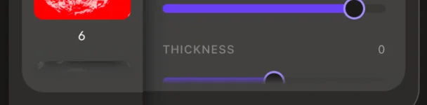

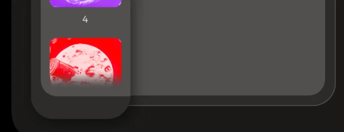
The landscape side panel becomes a shadowed "shelf" of thumbnail cards beside a bordered controls panel — read as one unit
The panel stops pairing each thumbnail with its controls on its own row-tray. The three things you can pick down the left — the reference thumbnail, the empty "next stencil" slot, and the stencil strip — now sit as small rounded cards on one dark bar that runs the panel's full height and lifts off the canvas with a drop shadow (the "shelf"), while every adjustment control groups on the right inside a single outlined panel. The two are tuned to read as one rounded panel: the cards all carry the same faint glass tone, and the shelf's rounded left corners line up with the controls panel's rounded right corners. Supersedes the per-row "tray" grouping logged directly below.
Context
The panel is a fixed-width column beside the canvas, with a rail of pickable thumbnails on the left and the controls for whatever's selected on the right. The earlier pass gave each thumbnail-and-controls pair its own quiet background tray, so the panel read as three stacked pairs; this pass regrouped it — the thumbnails as one group, the controls as another — while keeping the rows aligned and the two halves visually joined.
Reasoning
Collecting the three pickable items onto one shelf makes "everything you can select" read as a single object, and setting a separate outlined panel beside it makes "everything you can adjust" read as another — two clear regions (Gestalt's common region) rather than three loosely-paired rows. To stop that split from fracturing the panel into two disconnected boxes, the shelf is drawn as a raised bar carrying the cards, lifted by a real dark drop shadow rather than a faked light glow, and each thumbnail gets its own rounded background card in the same translucent glass tone as the controls cards — so the controls' surface appears to "spill" back onto the shelf and the whole thing reads as one continuous panel. Matching those tones took care: a card sitting on the shelf's fill reads lighter than the same card on the bare app surface, so all the surfaces were pinned to one shared flattened tone (the opaque flatten of the glass) so no card looks out of place.
Rejected
Keeping the per-row trays (rejected: they read as three separate pairs, not "the things you pick" versus "the things you adjust"). Collapsing each row into one continuous card that removes the shelf bar and the panel's outline (rejected: a too-literal take on the "spilling" look that erased the two grouping cues the design leans on — the shelf's raised shadow and the panel's border — so the fix kept both and only matched the tones between them).
Outcome
⏳ pending — backfill once shipped & in real use
Quote
"i want it to feel like the shelf is kind of 'spilling' onto the control group panel."
Progression (before → after):
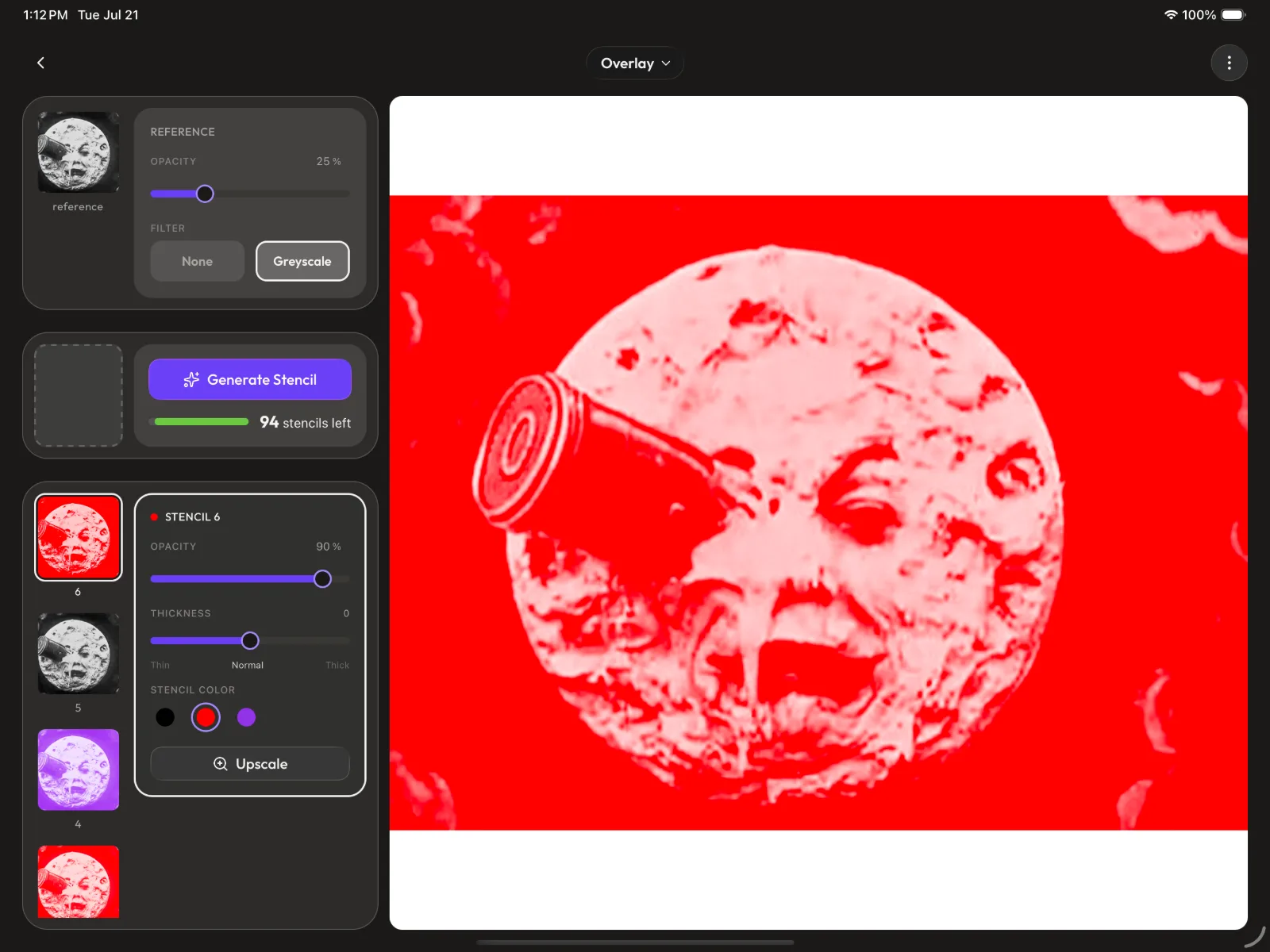
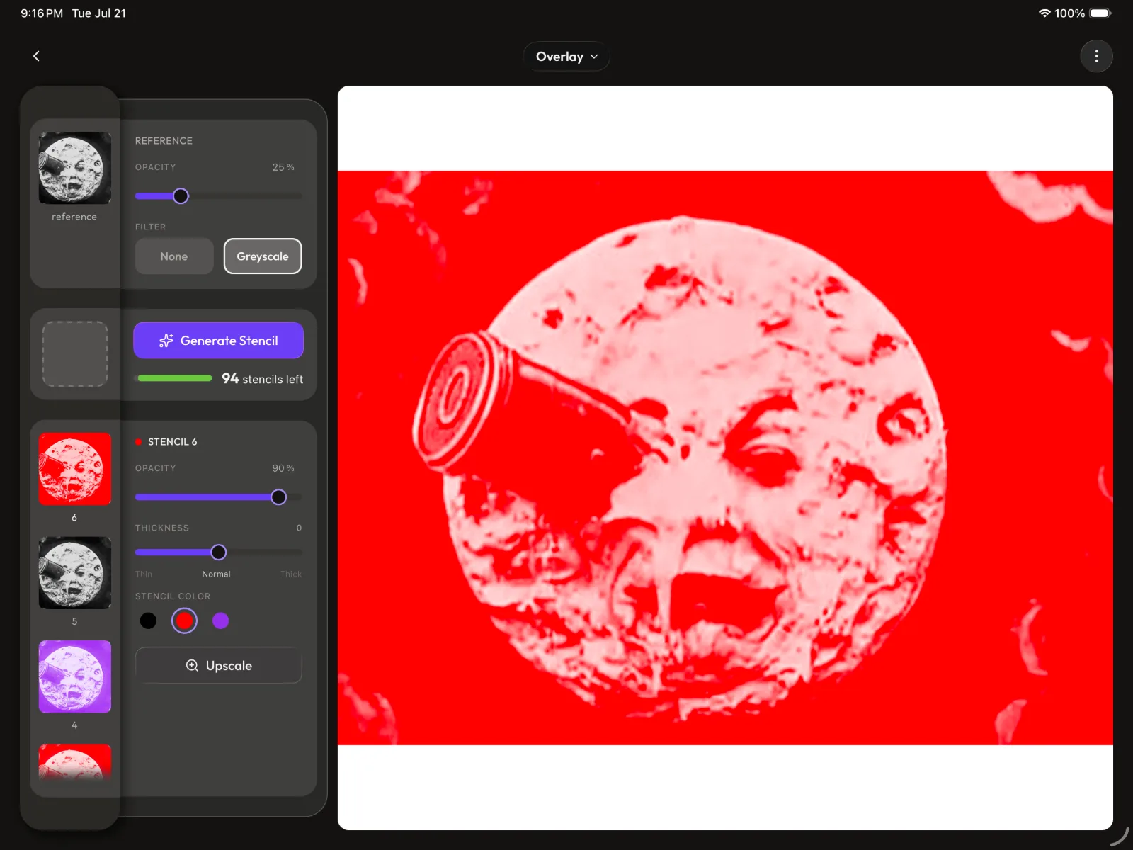
The controls panel connects to the shelf by tucking under it — the shelf's rounded corners are never squared
Where the controls panel meets the shelf, the panel's edge slides one corner-radius underneath the shelf, and the opaque shelf sits on top and hides the overlap — so the panel's fill and border reach right up to the shelf's curved edge with no gap. The shelf keeps its full rounded corners throughout; the seam is closed by moving the panel, never by changing the shelf.
Context
Once the controls panel was pulled up so its rounded corners sit near the shelf's rounded corners (rather than only spanning the shelf's straight middle stretch), a small triangular gap opened at the seam where the panel's squared corner met the shelf's curve. Several ways to close it were tried across the session.
Reasoning
The shelf's rounded corners are the panel's signature shape, so the rule that settled it is that the shelf is untouchable and the seam gets closed by hiding the panel's edge behind it. Because the shelf is a solid, opaque bar sitting on a layer above the panel, extending the panel's edge under it lets the shelf mask the overlap while the panel's visible fill and border emerge exactly at the shelf's curved edge — seamless, with the shelf's curve fully intact. How far up the panel rises is a separate tunable value; keeping its top just below the shelf's topmost point is what lets the tuck fill only the little notch without ever covering the shelf's rounded corner.
Rejected
Squaring the shelf's right corners so the panel meets a flat edge (rejected: it flattens the shelf's signature curve — "i didn't want the shelf curvature to change at all"). Running the panel the full height of the shelf and tucking it under (rejected: at full height the panel's fill creeps up into the shelf's corner and makes the shelf look shorter — "you shortened the shelf"). Leaving the small notch (rejected: a visible gap at the seam breaks the "one panel" read).
Outcome
⏳ pending — backfill once shipped & in real use
Quote
"i didn't want the shelf curvature to change at all. put the curves back on the shelf."
Progression (before → after):

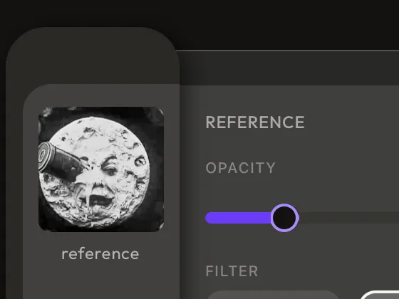
The stencil controls panel stretches to match the height of the thumbnail strip beside it (small alignment note)
The selected stencil's controls card now fills the whole stencil section, so its bottom lines up with the bottom of the scrolling thumbnail strip next to it, instead of ending at its last control. The controls stay pinned at the top of the card and the card surface simply extends down to meet the strip.
Filed as a small design decision — a layout-alignment nicety, not a load-bearing call. Skim-past by default.
Context
In the stencil row, a vertical strip of stencil thumbnails scrolls on the left and the selected stencil's adjustments sit in a card on the right. On a tall window the adjustments don't fill the height, so the card stopped at its content (the Upscale button) while the thumbnail strip kept going well past it.
Reasoning
The thumbnail strip and its controls are a pair, so ending them at different heights makes the panel look ragged — the controls card should read as the same-height partner of the strip, not a short block floating beside a long one. Filling the card to the section height (with the controls held at the top) squares the two off so the row reads as one unit; the card's internal scroll on a short window is unaffected.
Rejected
Leaving the card at its content height (rejected: it ends short while the thumbnail strip runs past it, so the two columns read as mismatched heights).
Outcome
⏳ pending — backfill once shipped & in real use
Quote
"the stencil controls panel needs to be the same size as how many stencils there are ... the stencil control panel stops only the height of its content while the stencils continue past it."
Progression (before → after):
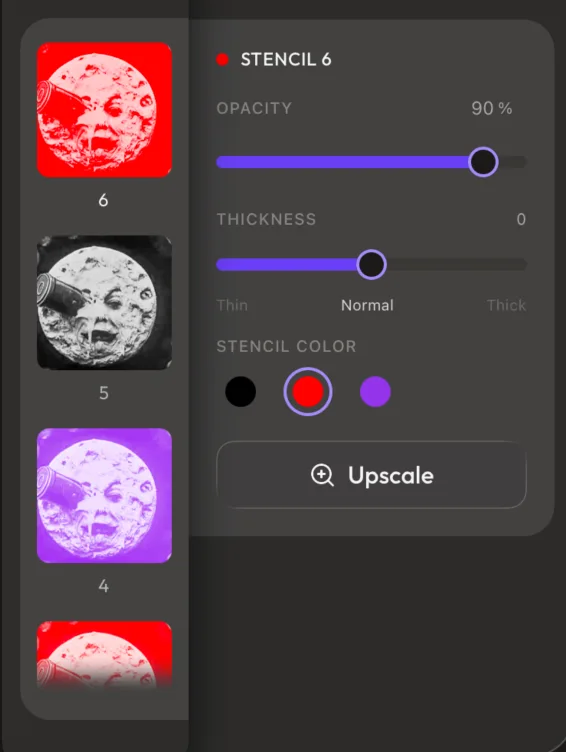
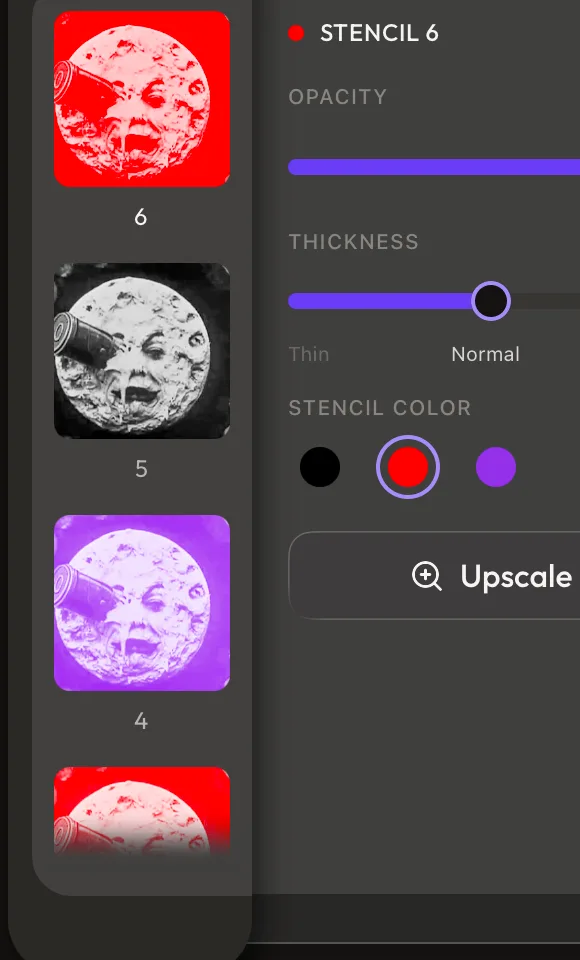
The landscape Studio side panel groups each thumbnail with its controls on a shared "tray"
Each of the three rows in the landscape side panel — the reference image + its adjustments, the empty "slot" + the Generate Stencil card, and the stencil thumbnails + the selected stencil's adjustments — now sits on its own softly-outlined background card (a "tray"), instead of a thumbnail and its controls floating as two separate tiles with a gap between them. The stencil thumbnail rail also gained the same soft top/bottom dissolve the controls cards already use, so thumbnails melt into the tray as they scroll past its edges rather than hard-cutting.
Context
The panel is a fixed-width column beside the canvas, built as two aligned columns: a rail of selectable thumbnails on the left, and the controls card belonging to whatever's selected on the right. Everything floated directly on the dark panel, so a thumbnail and the card it drives read as two loose objects rather than one paired unit.
Reasoning
Putting a tray behind each pair binds the thumbnail to its controls into a single object (a Gestalt "common region"), so the panel reads as three tidy pairs — reference, generate, stencils — instead of a loose grid of tiles. The tray is kept deliberately quiet: a barely-there translucent fill under a hairline border (material.ultraThin), dimmer than the controls cards it holds, so it groups without competing with the cards or the canvas. Landing on the rule took a few passes — first grouping too much (wrapping the whole lower half, Generate card and all, under one big card, which blurred the line between "make a stencil" and "the stencils you've made"), then only the slot + thumbnails — before settling on "one tray pairs one rail item with its one controls card," matching how the reference row already worked. The trays add padding, so that width is reclaimed from the controls column and the panel — and the canvas beside it — stays exactly the same size; the three rows stay aligned so every thumbnail shares one edge and every controls card shares another. The rail's edge fade reuses the app's shared eased-fade curve, dissolving into an opaque match of the tray surface (warmAsh[900]) so there's no dark seam where the ramp meets the tray.
Rejected
Wrapping the entire stencil half (the slot, the Generate card, and the stencil rail) under one big tray — rejected because it merged the act of generating with the resulting stencils into one block and lost the per-pair rhythm. Trays that widen the panel — rejected because a wider panel shrinks the canvas, so the tray chrome is budgeted out of the controls column instead and the canvas never moves. A bold or opaque tray fill — rejected because a strong tray competes with the controls cards sitting on it; the tray's whole job is to sit underneath and group, so it stays a whisper.
Outcome
⏳ pending — backfill once shipped & in real use
Quote
"let's group the stencils and its control panel instead ... like the reference image with its control panel."
The landscape Studio marks where the next stencil will land with an empty "slot," not a button
Left of the Generate Stencil card in the landscape side panel sits a hollow, dashed-outline frame: an empty placeholder that shows where the stencil you're about to make will appear. It's purely a visual cue — nothing to tap, no icon inside it, no label — and it holds the Generate card's normal height even when that card grows a "you're out of stencils, upgrade for more" line beneath its button.
Context
In the panel, every stencil you've made is a thumbnail in a vertical rail, and the Generate card sits at the top with an empty gap in the rail beside it. That gap read as unexplained dead space, and a fresh stencil pops into the rail with no hint beforehand of where it'll show up.
Reasoning
Filling the gap with a ghost frame does two jobs at once: it explains the space (a thumbnail belongs here) and it previews the outcome (the new stencil drops in right below it). The frame borrows the thumbnails' size and rounded shape so the eye files it with them, but it's drawn as a broken dashed line so it reads as an empty thumbnail — a slot waiting to be filled — rather than a solid thing in its own right (the Gestalt cues of similarity and closure). Keeping it hollow and quiet, with no glyph, is deliberate: the moment you put a "+" or any icon in it, it stops looking like a passive placeholder and starts looking like a second button competing with Generate Stencil — and the whole point is that Generate Stencil is the one action. Pinning it to the card's resting height (rather than letting it stretch when the upgrade message appears) keeps it reading as a steady frame instead of an element that reacts to a billing notice.
Rejected
Putting a "+" or similar icon in the slot (rejected: an icon makes the placeholder look pressable, splitting attention with the real Generate Stencil action). Leaving the gap empty (rejected: reads as an unexplained hole and gives no preview of where the result appears). Letting the slot grow in step with the Generate card when its upgrade message expands the card (rejected: a placeholder that stretches to track a billing message reads as noise, not a stable frame).
Quote
"make sure it doesn't have any icons like '+' that might confuse the user to thinking it's a pressable button -- we want to make sure Generate Stencil is the action, not the slot to the left of it."
Outcome
⏳ pending — backfill once shipped & in real use
In landscape on an iPad, the Studio drops its bottom toolbar and moves everything into a persistent side panel
On an iPad held in landscape, the Studio no longer shows the bottom toolbar at all. Its whole feature set — choosing which image or stencil to view, generating a new stencil (with the monthly-allowance stats), and adjusting each layer — moves into a panel that runs down the left side, with the canvas full-height on the right. Phones and portrait iPads are untouched and keep the bottom toolbar.
Context
The Studio's controls were built into a bottom toolbar designed for a phone's narrow, tall screen, where most features hide behind a preview tile and a long-press magnifier and surface only on demand. A landscape iPad is the opposite shape — far more width than height.
Reasoning
A wide screen has the room to keep everything on view at once, so carrying over a toolbar whose whole job is to hide features (because a phone must) wastes that room and buries actions behind extra taps. Standing the toolbar's contents up vertically as a side panel puts selection, generation, and adjustments all visible together beside a taller canvas. It's kept as its own landscape-only layout file rather than a fork of the toolbar, so the phone/portrait experience can't regress and the toolbar could be restored by swapping a single column.
Rejected
Keeping the bottom toolbar in landscape (rejected: it hides features the wide screen has space to show outright, and steals height from the canvas for a bar the layout doesn't need).
Quote
"i need you to remove the bottom toolbar altogether in landscape view because the real estate is available to not have to hide features"
Outcome
⏳ pending — backfill once shipped & in real use
The landscape Studio shows the reference's controls and the active stencil's controls at the same time
In the landscape side panel, the reference image's adjustments (opacity and a filter toggle) and the selected stencil's adjustments (opacity, thickness, colour, upscale) sit on screen together, instead of a single set of controls that swaps depending on what you've tapped.
Context
On the phone, the adjustment tray shows controls for whatever is currently selected — tap the reference and you get reference controls, tap a stencil and you get its controls, one at a time. The first cut of the landscape panel copied that same selection-driven swap.
Reasoning
With both layers' controls open at once, nudging the reference's opacity or the stencil's thickness never means re-selecting first — the controls you want are already there, the same always-open, side-by-side arrangement the web Studio uses. The landscape width is what makes two cards comfortable rather than cramped, so the tablet can match the web's mental model where the phone can't.
Rejected
One controls card that swaps with the current selection, as on the phone (rejected: forces you to re-select the reference just to change its opacity while comparing it against a stencil — an extra step the wide layout has no reason to impose).
Quote
"instead of hiding the controls for the reference image and selected/active stencil, have both controls open so that the user can see both at the same time and be able to switch easily what they want to change. this is kind of the same mental model as the web version."
Outcome
⏳ pending — backfill once shipped & in real use
In the landscape panel, only the stencil thumbnails scroll — and a controls card scrolls inside itself only when it actually overflows
The single scrolling region in the landscape side panel is the vertical strip of stencil thumbnails; the reference row and the Generate card stay pinned in place. A controls card becomes scrollable — dissolving its clipped controls into the card surface with a soft top/bottom fade — only when its contents don't fit the height available (the shorter iPad-mini window); when everything fits, the card is static, with no scroll or bounce.
Context
The panel stacks the reference and its controls, the Generate card, the stencil thumbnails, and the selected stencil's controls down a fixed-height column. On a 13"/11" iPad in landscape it all fits; on the shorter iPad mini in landscape, the selected-stencil card can run past the bottom.
Reasoning
Keeping the reference and Generate pinned and letting only the thumbnail strip move means the things you act on hold their position, so nothing you're editing slides out from under you. When a card genuinely can't fit, confining the scroll to that one card (rather than scrolling the whole section) keeps everything else put, and the edge fade signals "there's more" instead of a hard cut. Gating that scroll on real overflow matters because a scroll affordance on a card whose controls are already fully visible reads as a bug and lets you rubber-band a card that has nothing to scroll.
Rejected
Letting the whole panel section scroll (rejected: moves the reference, Generate, and controls you're working with). Making every controls card always scrollable (rejected: a card that fits everything shouldn't offer a scroll or bounce — it looks broken).
Quote
"i don't need the control cards to be scrollable if all the controls are visible... this rule for scrollable was only for something like the iPad mini where you mentioned the content might clip."
Outcome
⏳ pending — backfill once shipped & in real use
Tapping the reference to compare keeps the stencil card editing the stencil you were on
When you tap the reference image to view it on the canvas, the always-open stencil controls card keeps targeting the last stencil you had selected — it does not switch to the newest stencil.
Context
Because both the reference and stencil controls are open at once, tapping the reference shows it on the canvas but leaves no stencil "selected" in that moment, so the stencil card still needs a stencil to act on.
Reasoning
Tapping the reference is almost always a quick "let me check this against the original," not "I'm finished with that stencil," so having the stencil card hold onto the stencil you were tuning lets you flip to the reference and back without losing your place. Snapping to the newest stencil instead would quietly change what you're editing every time you glance at the original — the opposite of what a compare gesture should cost you.
Rejected
Pointing the stencil card at the newest stencil whenever the reference is selected (rejected: every compare would jump you to a different stencil, discarding the one you were mid-adjustment on).
Outcome
⏳ pending — backfill once shipped & in real use
Everything scales to proportion on iPad — a tablet in portrait should never look phone-sized
On any iPad, the whole interface steps up in size — padding, type, buttons, the plan badge, gallery tiles — instead of holding the phone's dimensions. This is now a named design principle with a single mechanism: a "scale" helper (useResponsive().scale({ phone, tablet })) that keys off whether the device is tablet-class in either orientation. It's deliberately kept separate from the pre-existing "select" helper, which rearranges a screen's structure (side panels) and stays reserved for landscape only. The Gallery is the reference implementation — grid padding and column count, the "Gallery" title, the header avatar/icons/gaps, the ADMIN badge, and the add-image button all resolve through scale().
Context
The app was built phone-first, and its one tablet switch fired only for an iPad held in landscape; a portrait iPad fell through to the phone layout. So the Gallery on a portrait iPad rendered with a phone's 16pt side padding and phone-sized tiles — a thin, cramped strip of images marooned in the top-left of a large screen. The root confusion was treating "make it bigger" and "rearrange it" as one decision gated on the same landscape test.
Reasoning
A tablet is held and viewed at a larger scale than a phone, so reusing the phone's exact measurements makes everything read as small for no reason — the screen has the room, we just weren't using it. But growing an element and re-laying-out a screen are genuinely different calls: adding a side panel only pays off with the extra width of landscape, whereas bigger padding and type are wanted the moment you're on a big screen, portrait included. Collapsing both onto the landscape test is exactly what left portrait iPads phone-sized. Splitting them into two axes — proportion (any tablet-class device, via scale()) and arrangement (tablet landscape only, via select()) — lets the same screen scale up everywhere while only truly structural changes wait for landscape. Sizes travel as sibling tokens (fontSize.display / fontSize.displayTablet) so a value and its tablet step live together, and leaf components like the badge take a size prop rather than detecting the device themselves, so they stay correct wherever they're placed.
Rejected
Keeping the single landscape-gated switch (rejected: it's what caused the bug — a portrait iPad stays phone-sized). Continuously scaling every value by screen width (rejected: risks runaway type and padding on a 13" iPad, and a raw multiplier carries no phone/tablet intent; a deliberate two-step token pair reads and reviews better). One-off ad-hoc tablet checks per screen (rejected: the FAB and header gap had already grown their own private isTabletClass calls — without a shared, named principle every screen re-derives it and they drift).
Quote
"iPad viewing context is larger, so maintaining a phone-sized layout makes it feel small for no reason on a tablet/iPad"
Outcome
⏳ pending — backfill once shipped & in real use
Progression (before → after):
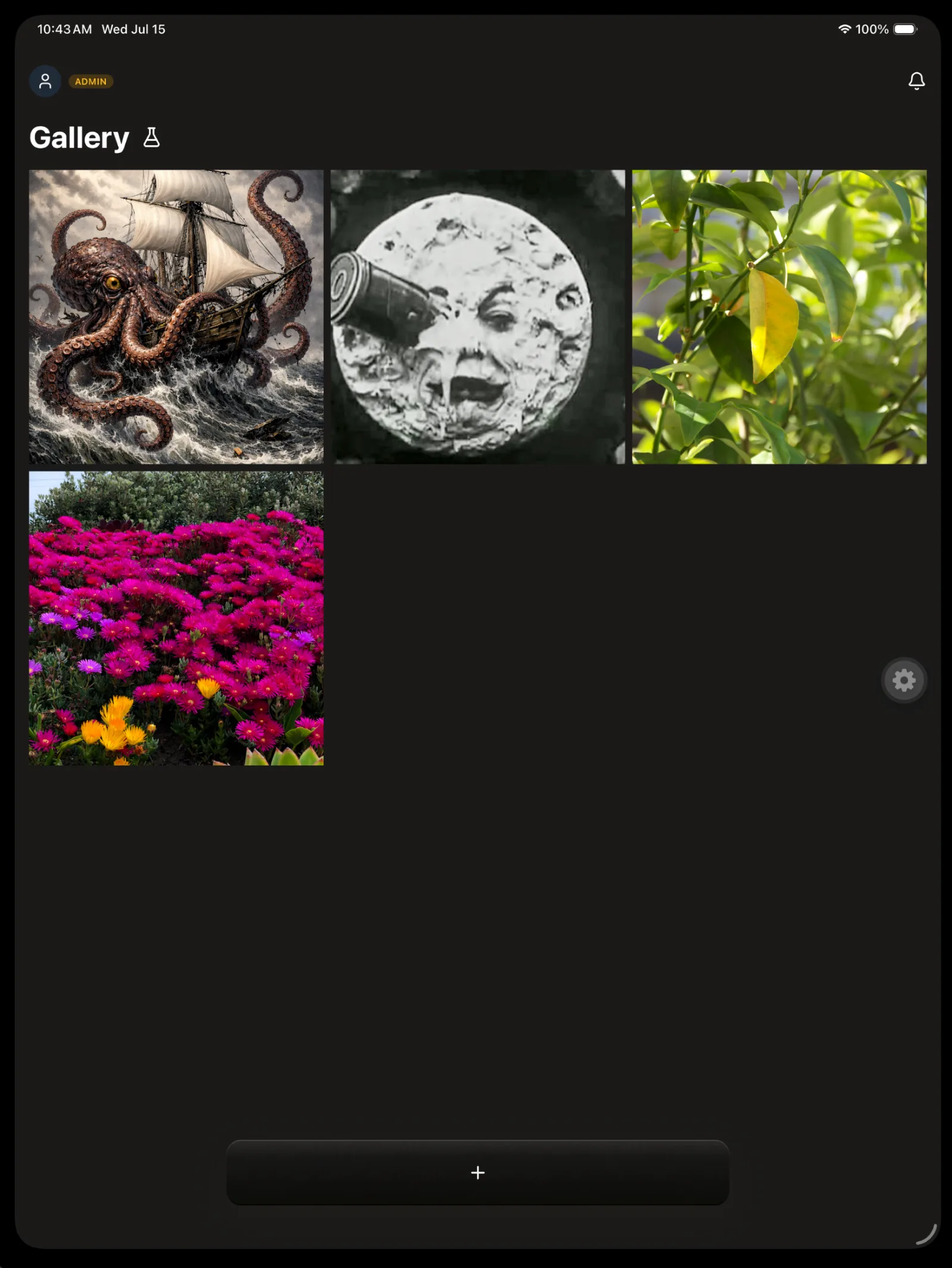
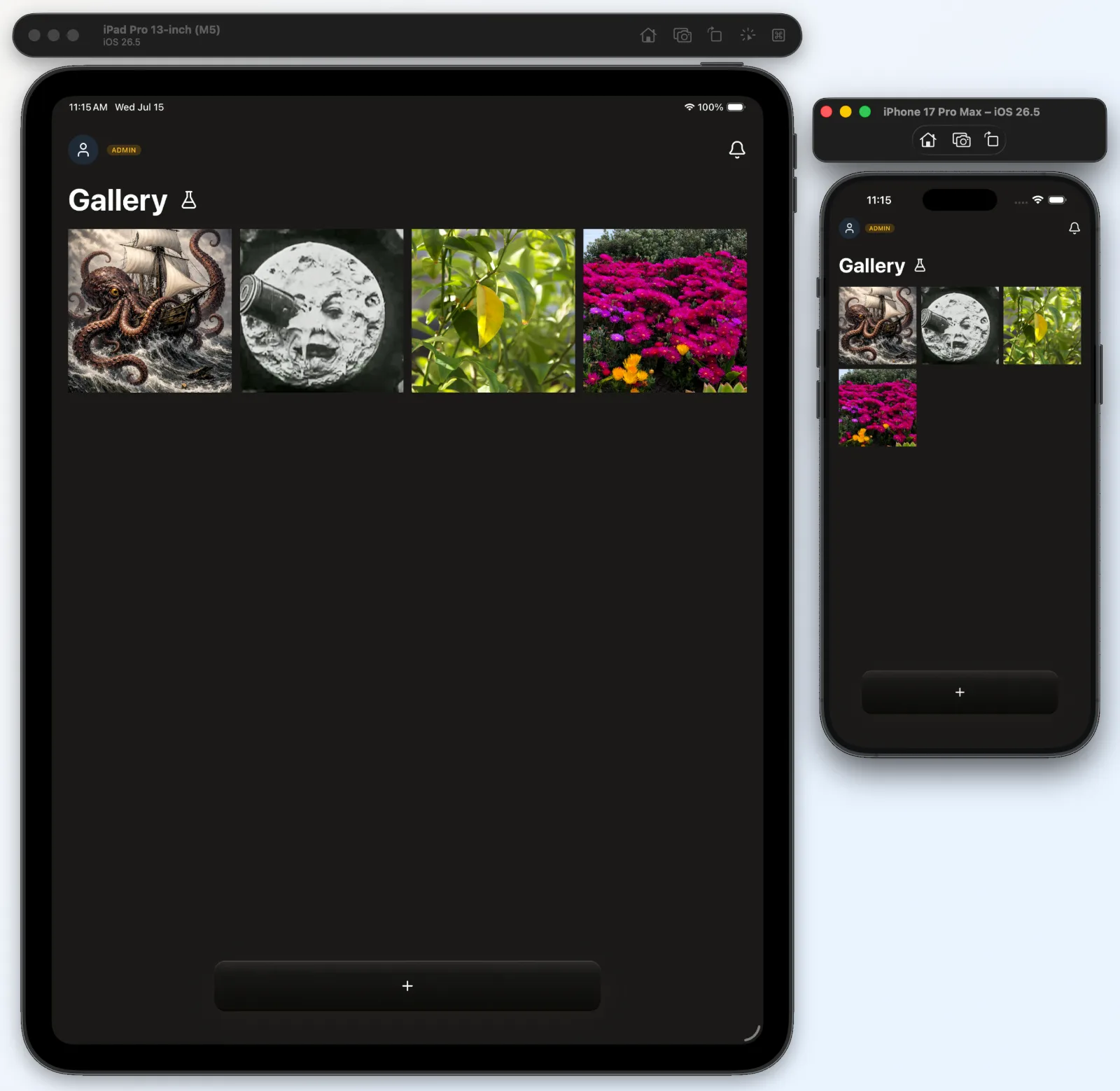
Tapping the loupe lens dismisses the film strip — but a tap anywhere else on the strip does not
When the magnified film-strip selector (the "loupe") is open, tapping the focused frame in the centre — the magnifier lens you're already on — now closes the strip, joining the two existing exits (tap outside on the canvas, or let the idle timer run out). Crucially, this close-on-tap is scoped to the lens only: a tap anywhere else along the strip does nothing.
(small interaction-design note)
Context
The loupe is a horizontal strip of thumbnails that slides under a fixed magnifier; you open it with a long-press and scrub sideways to pick a frame. It could only be dismissed by waiting it out or tapping off to the side, so a quick "I'm done, close it" tap on the thing itself did nothing. The first pass added tap-to-close to the whole strip — which backfired: tapping near another thumbnail to line it up closed the selector mid-aim.
Reasoning
A tap on the frame you're already centred on has no other meaning, so it's a safe, discoverable "done" gesture — but the rest of the strip is reaching-for-the-next-frame territory, where a stray tap is the user aiming, not dismissing. So the close-tap lives on the centre lens alone; the rest of the strip ignores taps. Making the lens its own touch target meant letting it own a tap and a scrub without breaking scrubbing that starts on the lens: the two run as a race (Gesture.Exclusive) where any real sideways movement hands off to scrolling and only a still tap closes, while the lens housing is set to pass non-lens touches straight through (box-none) to the strip-wide scrub underneath.
Rejected
Tap-anywhere-on-the-strip to close (rejected: closes the selector while the user is mid-aim reaching for a neighbouring frame — the exact confusion that prompted the fix). Leaving the strip with only the two original exits (rejected: no quick affirmative "close" on the element itself; you had to wait or aim off-target).
Quote
"it makes it confusing for the user if we close the filmStrip if the user tries to tap on, for example, another stencil option (which is in the filmStrip)."
Outcome
⏳ pending — backfill once shipped & in real use
When an adjustment opens, the preview tile shrinks flush with the toolbar so the control bar nests onto a flat top — with a two-tone bridge closing the gaps
When a trailing-rail tool (Opacity / Colour / Thickness) opens its control bar above the Studio toolbar, three moves happen together. The centre preview tile — normally a raised frosted frame that stands proud of the flanking handlebars — shrinks to the exact height of those handlebars, so the toolbar gains a flat top edge. The control bar's bottom is pulled down to nest against that flat top, overlapping about half of the toolbar's structural "grip" inset rather than leaving the full gap. And a material-filled bridge runs behind the shrunken tile, split into two tones, so no gap opens along the tile's exposed sides and corners. Builds on the panel-grips-the-tile decision (2026-06-16) and the spotlight-dim selection cue (2026-06-23, just below).
Context
Opening an adjustment discloses a full-width control bar (an Opacity slider, a colour picker) in the space just above the toolbar. The toolbar's centrepiece is a preview tile drawn taller than the handlebars on either side, so it pokes up above them — fine on its own, but with the control bar landing right above, the protruding tile left an uneven, too-large gap and the bar read as floating over a bump instead of resting on the toolbar. Shrinking the tile to fix that then created its own problems: because a tile that only scales visually keeps its original layout box, the handlebars stayed put and a gap opened along the tile's shrunken sides and rounded corners — and a first patch (one bridge dimmed to match the tile) left a visibly darker band on the trailing side.
Reasoning
The whole sequence is about grouping (Gestalt's law of proximity): the control bar acts on the tool you just selected, so it should read as one unit with the toolbar, not a separate floating panel. Three threads get it there.
Give the bar a flat top to land on. The tile is the toolbar's visual anchor and is meant to sit proud of the handlebars — but only while it's the focus; when an adjustment takes over, the tile recedes, scaling down to the handlebar height so the toolbar reads as one flat-topped slab the control bar can rest cleanly on. The shrink is a pure visual transform, so the tile's measured centre never moves and the long-press loupe still anchors to it.
Close the distance (proximity). With no padding of its own, the only separation left is the toolbar's own structural inset — the empty grip band above its panels. Pulling the control bar's bottom edge down into half of that band, eased in on the same disclosure timeline so there's no jump, makes the two read as nested rather than merely adjacent.
Fill what the shrink exposes — without flattening the spotlight. A scaled tile leaves its layout box behind, so the handlebars no longer meet it. The obvious fix — collapsing the row into one continuous background bar — was rejected because it would erase the per-side dimming the selection spotlight depends on (the leading side + tile dim back, the active trailing rail stays bright). Instead a bridge plate fills behind the tile and is split at the tile's centre, with the seam hidden under the tile: dimmed on the leading half to match the receding chrome, bright on the trailing half to match the lit rail beside it, so each exposed sliver matches its neighbour and neither side steps in tone. (A rounded tile against a same-height square panel always leaves a corner notch; chasing it by deepening the handlebars' tuck only widens the panels under the tile — shifting the buttons — and pokes the square panel edge above the tile's rounded corner, so the bridge sidesteps the geometry entirely.)
Rejected
Leaving the tile proud of the bar (rejected: the protruding tile makes the control bar read as floating over a bump, and the gap looks uneven). Only zeroing the bar's own padding to tighten the gap (rejected: it leaves the toolbar's full grip-inset as dead space, so the bar still floats — overlapping half the band is what makes them nest). Deepening the handlebars' tuck to chase the shrunken tile (rejected: it widens the panels under the tile, shifting the buttons, and the square panel edge pokes above the tile's rounded corner as a nub). Collapsing the row into one continuous background bar (rejected: cleanest gap-fill, but it flattens the leading-dim / trailing-bright split the selection spotlight relies on). A single, uniformly dimmed bridge (rejected: it matched the tile but read as a darker band where it met the bright trailing rail).
Quote
"can you tighten the gap even more -- referencing Gestalt's principle for reasoning"
Outcome
⏳ pending — backfill once shipped & in real use
Progression (before → after):
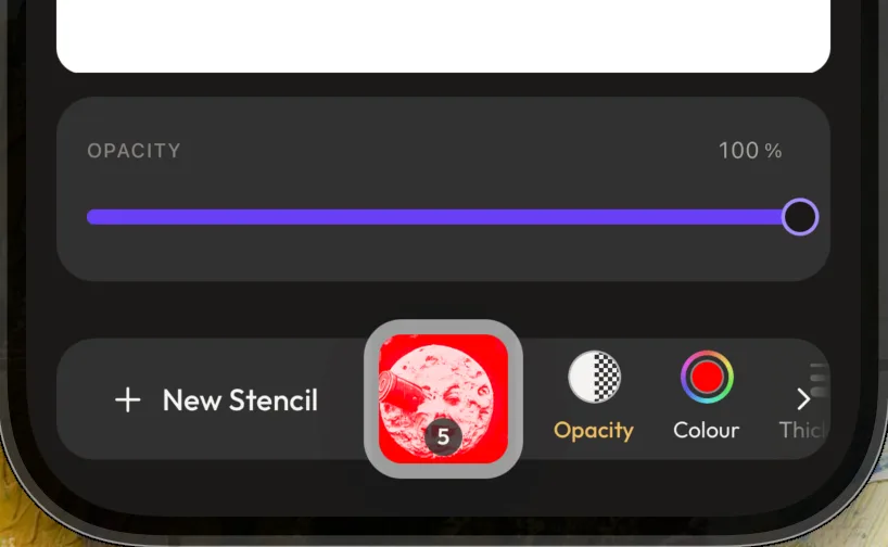
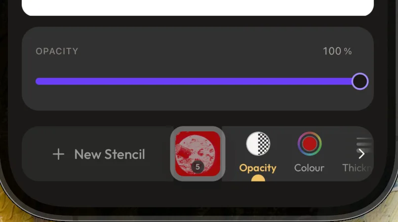
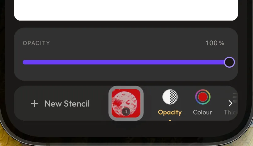
The selected toolbar tool is shown by dimming everything else, not by adding a highlight to it — plus a gliding dome and a heavier gold label
In the Studio trailing toolbar (the Opacity / Colour / Thickness rail), the open adjustment is signalled three ways at once: the rest of the bar fades back so the selection is what's left standing (a spotlight), a small gold half-sphere domes up from the handlebar's bottom edge under the active tool and glides between tools as you switch, and the active label turns gold and a step heavier. This replaced a run of "stick a marker on the selected item" treatments that were tried and dropped.
Context
The rail needed to show which adjustment is currently open. The first instinct was to decorate the selected tool — give it a filled background, or a little indicator dot — and each addition made the small toolbar busier without clearly reading as "selected."
Reasoning
The turning point was flipping the problem from adding emphasis to the selected tool to removing it from everything else: rather than make one item louder, quiet the rest so the selection stands out on its own. Concretely, every non-selected control — plus the bar's chrome (New Stencil, the centre tile) — drops to a reduced opacity (opacity.deemphasized), while the selected tool, its controls, and the canvas stay full strength, so focus lands on what you're actually editing in relation to the image. That dim is a single shared token tuned by eye: it started too murky and was lifted twice (0.4 → 0.6 → 0.7) until the recede read as "backgrounded," not "disabled." But lightening it had a cost — the gentler the fade, the weaker the spotlight — so the selection started to feel under-marked, and that's what earned the dome: a small positive cue added back on top of the now-softer dim to firm up which tool is active. Its small size is the whole point — a half-sphere only a few pixels across, its flat side resting on the handlebar's bottom edge and clipped by the bar's overflow:hidden — so it reads as a helpful extra pointer, not the main indicator (the spotlight still does the heavy lifting). It pins the exact tool and slides between tools on a spring (motion.thumbTravel) when you switch — snapping into place on first appearance so it never streaks in from a stale spot, and following live scrolling so it stays under its tool. The label change (active → golden accent + a jump straight to semibold) is the third, quietest cue; the in-between weight (medium) was tried first and was invisible at caption size, so it skips to semibold to actually register.
Rejected
A filled background behind the selected item — started a circle, became a rounded rectangle (a squircle), then grew to wrap the whole icon-and-label button (rejected: even carefully sized and padded, the block felt heavy on a small toolbar and read as "added chrome"). A small indicator dot — first perched on top of the icon, then moved beneath the label (rejected: awkward above, unconvincing below). A heavier version of the dim, 0.4 across the whole bar (rejected: too murky — dimmed controls read as disabled rather than de-emphasised).
Quote
"instead of trying to add extra things to the selected item to infer that it's selected visually, to reduce something: i want to reduce the colour of the rest of the studioToolbar so that the selected item has the 'spotlight'."
Outcome
⏳ pending — backfill once shipped & in real use
Progression (before → after):
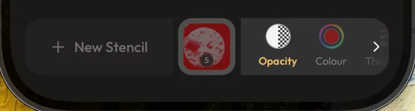
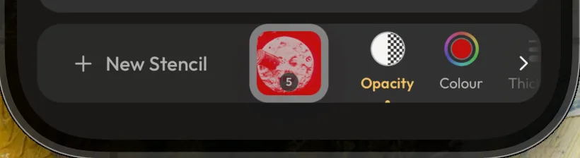
The Generate Stencil sheet opens itself only when generating is the likely next move — a fresh selection, or a never-generated image — not on every Studio entry
When you land in the Studio, the Generate Stencil sheet opens on its own in exactly two situations: right after you pick or upload an image, and when you open an image from the Gallery that has no stencils yet. Every other arrival — tapping a Gallery image that already has stencils — lands with the sheet closed. This is the build-out of the planned follow-on noted in the 2026-06-16 decision that moved Generate one deliberate tap in, behind "+ New Stencil."
Context
That earlier decision put a deliberate tap between the user and a metered, credit-spending Generate, on the logic that most people generate once per image, so the action shouldn't sit always-armed in the bar. Its follow-on note said the sheet should open by itself on upload — handing the user that important first generation for free, paying the extra tap only on the rarer repeats. Building it raised the real question that note left open: how broadly should "open by itself" reach — every time you enter the Studio, or only sometimes?
Reasoning
How present the sheet should be tracks how likely you are to use it right then, not just that you've arrived. The instant after picking an image is the peak of that intent — you brought the image in to do one thing — so meeting the user with the sheet already up collapses the very tap the toolbar decision added, but only where it earns its place. An image that already carries stencils is one you're most likely revisiting to look at or compare, so popping the sheet there covers the canvas in the one moment you opened it to view, not make — an interruption, not a shortcut. A Gallery image with zero stencils is the opposite: it has only one obvious next move, so it's the same most-likely-to-generate moment as a fresh upload, just reached by a different door, and deserves the same head start. The two paths are wired differently because the trigger becomes knowable at different times: a fresh selection is known at the moment of navigation, so it's tagged on the trip into the Studio itself (a fresh route flag), whereas whether a Gallery image has any stencils can't be known until its data loads — so that case is judged once inside the Studio after load, as a one-shot that a dismiss won't reopen and that a later generate-then-delete back to zero won't re-fire.
Rejected
Opening the sheet on every Studio entry (rejected: it interrupts the common case of revisiting an image to view or compare its existing stencils, dropping a sheet over the canvas in exactly the moment you opened it to look rather than generate). Opening only on a fresh upload, as the original follow-on note literally read (rejected: it misses the never-generated Gallery image, which is the same high-intent moment arriving by a different route, and would leave that user to find the tap themselves).
Quote
"after selecting an image, that is the time when it's most apt and highly likely they Generate a Stencil"
Outcome
⏳ pending — backfill once shipped & in real use
When the stencil allowance is spent, Generate demotes from a disabled primary to a disabled secondary
In the out-of-stencils state (0 left), the Generate Stencil button switches from a disabled primary to a disabled secondary. It stays visible and disabled — only its weight drops.
Context
When you've used your whole allowance, the New Stencil sheet disables Generate and surfaces an "Upgrade plan" call-to-action right below it. Generate was a disabled primary — a faded but still full-bleed brand-purple fill — so it kept the visual pull of a main action even though it does nothing.
Reasoning
A control you can't use shouldn't hold onto the page's loudest styling, especially when a real action is sitting next to it: with nothing to generate, the thing that matters is upgrading, and a greyed-yet-still-purple button competes with the upgrade CTA for the eye in exactly the moment upgrade is the point. Dropping Generate to the quieter chrome/glass treatment (the secondary variant, with its icon shifted from brand-white to the chrome foreground to match) lets it read as "not available right now" and hands visual priority to the upgrade call-to-action — without hiding it, so the disabled button still shows what you can't do and the counter beside it shows why.
Rejected
Keeping the disabled primary (rejected: it competes with the upgrade CTA for attention precisely when upgrade is the goal). Hiding Generate entirely when spent out (rejected: leaving it visible-but-disabled is what explains why generation is unavailable; the button and the "0 left" counter together make the limit legible).
Quote
"since it's disabled it no longer has the weight of a Primary action, especially when competing with the CTA on the same page ("Upgrade plan")"
Outcome
⏳ pending — backfill once shipped & in real use
The New Stencil sheet is an in-screen overlay, not a modal route, so the Studio header stays tappable
Stopped presenting the "+ New Stencil" sheet as its own transparent-modal route and render it as an in-screen overlay the Studio screen mounts below the header ({open && <NewStencilSheet onDismiss/>}). FloatingSurface animates its own slide in/out since there's no route transition to ride. Supersedes the route presentation in the 2026-06-16 toolbar promotion and the canvas-lift mechanism in the two 2026-06-16 lift entries below (the lift is now geometry-based in useCanvasSheetLift).
Context
With the sheet open, tapping the header's Back-to-Gallery button didn't go back — it just closed the sheet, forcing a second tap. A full-screen modal route sits in front of the header, so its backdrop swallowed the first tap; the header behind it could never receive touches.
Reasoning
The header is part of the screen the sheet floats over, so for its buttons to stay live the sheet has to sit below the header in the same tree, not in front of everything as a route. An overlay scoped to the body region does exactly that — header outside the overlay, canvas/toolbar under the backdrop. It also unblocks Generate: the sheet now renders inside StudioProvider, so it can call useStudio() directly instead of needing a route param or a relocated provider. The cost — reimplementing the native slide-up as a Reanimated entrance/exit — is small, and the drag-to-dismiss was already custom.
Rejected
Keep the modal route and try to pass touches through to the header (rejected: native modal routes don't reliably pass touches through on iOS, and a partial backdrop "hole" risks a dead strip that neither dismisses nor navigates). Keep the route and accept the double-tap (rejected: it's the exact friction reported).
Outcome
⏳ pending — backfill once shipped & in real use
The stencil counter warms from green to gold to red as the allowance is spent — reusing the brand accent for the warning band rather than a dedicated warning colour
The remaining-stencils bar on the Generate sheet stops being a flat green meter and shifts colour by how much of the allowance is spent: it stays the success green until 75% is used, turns a golden-honey caution tone at 75%+, and goes the coral error tone at 90%+. The thresholds key off the consumed share, not the count left. The gold band is a new, dedicated warning semantic (see the follow-up below).
Context
The counter was a single green bar regardless of how close you were to running out, so "plenty left" and "almost gone" looked identical right up until zero. We wanted the bar itself to start signalling caution as you approach the cap.
Reasoning
A meter that only ever reads "fine" until it's empty wastes the one moment that matters, so the fill escalates as you spend — green, then a caution gold, then an alarm red — to put the pressure (and the natural upgrade prompt) on screen before the wall, not at it. Building it surfaced a real gap: the palette had no colour that means "warning" — the meaning-bearing tokens (semantics) were only success, error, destructive, and an accent — so the band first borrowed the golden-honey accent ("act on this"), which reads fine as caution but is the wrong meaning. We then promoted a proper warning semantic (full light/dark, same shape as the other status groups) that the counter now reads, keeping accent as its own token. The design system sanctions two semantics sharing one primitive (both Golden Honey today) precisely because their intents differ — caution vs. call-to-action — so the bar means what it says and warning can later move toward a truer amber without disturbing the brand accent. Keying the bands on the spent share rather than the remaining count keeps the thresholds phrased the way a limit is actually felt ("you've used 90%").
Rejected
Permanently overloading accent for the caution band (rejected: a distinct meaning earns its own token, or the two can never be tuned apart). Reaching for the raw amber primitive directly (rejected: components consume semantics, not raw palette scales, and amber carries no assigned meaning — though it's the natural binding if warning is ever retuned off gold). Leaving the bar green until empty (rejected: it surrenders the approach-the-limit moment that the upgrade nudge depends on).
Outcome
⏳ pending — backfill once shipped & in real use
Text colour comes from the type ramp; the surface token is for everything that isn't text
Anything that renders as text pulls its colour from the typographic set (text.primary / text.secondary); the near-identical "content on the dark surface" token (surface.foreground) is reserved for non-text chrome — icons, selection rings, the glow effects, borders. A button's label counts as text, so the Button component now takes its label colour from the type ramp too.
Context
The Studio toolbar labels ("New Stencil", "Opacity", "Colour") felt too stark-white, so the first fix dropped them to the muted grey we use for secondary text — and they immediately read as disabled. That surfaced a deeper muddle: two colour tokens that happen to be the same warm near-white were being used interchangeably, some text on one, some on the other, with no rule.
Reasoning
Two things drove it. First, why the muted labels looked broken: in this app "disabled" is signalled by fading a control's text and icon down in contrast — so a low-contrast grey on a perfectly active label lands right on top of the "switched off" cue. The lesson baked into the tokens: quieten an active label with thinner or smaller type, never by draining its contrast. Second, the two-token mess: the type set (text.*) and the on-surface content token (surface.foreground, the background/foreground pairing in the shadcn sense) resolve to the same value today, but they answer different questions — "how should text in the hierarchy look" versus "what colour is content sitting on the app surface." Keeping them apart means text can be retuned later — softened, or given more steps — without dragging every icon and ring along with it. Routing the Button's label through the type ramp makes "an active label can never look disabled" a property of the component itself; because the primitive only colours the label and the loading spinner (icons are handed in by the caller), the change is invisible today but correct going forward.
Rejected
Muting active labels to the secondary grey (rejected: it reads as disabled — contrast is the channel this app already uses for "off"). Collapsing the two tokens into one alias (rejected: they're genuinely different roles; fusing them would stop text from ever being tuned independently of the surrounding chrome).
Outcome
⏳ pending — backfill once shipped & in real use
Quote
"it does read a little like they're disabled buttons against the handlebars's colours"
The colour-picker swatch's two rings split meaning — inner shows what's selected, outer shows the options; greyscale follows with a two-state design
The little colour swatch in the Studio's "Colour" tool — modelled on iOS's colour well, a solid centre disc inside a soft white ring inside a gradient ring — carries two distinct meanings in its two layers: the inner disc reflects what's currently selected, and the outer gradient ring reflects the options available to pick from. The greyscale tool follows the same rule with two states: when greyscale is selected, the black→white gradient shows on both the inside and the ring; when it's not selected, the inner shows a classic red diagonal slash over a white background (the universal "none / nothing" mark). These states aren't wired up yet — the current solid-grey centre is an interim placeholder.
Context
We just built the colour-well swatch and wired it as the Studio trailing-rail "Colour" tool. The stencil version puts the live stencil colour in the centre with a full-spectrum ring; the reference (no-stencil) version got a greyscale ring but a flat solid-grey centre. That grey centre is what surfaced the underlying question: what is the inner disc supposed to say versus the ring around it.
Reasoning
Giving the two rings separate jobs makes the swatch self-explanatory at a glance: the ring is the menu of what you could choose, the centre is the readout of what you did choose. For greyscale that means "greyscale on" should echo the gradient inward, not sit as a disconnected grey chip, and "greyscale off" needs an unmistakable "nothing selected" symbol rather than an empty or ambiguous fill — hence the red slash on white. Logging it now, before the on/off logic exists, so the eventual build matches the intent instead of re-deriving it.
Rejected
The interim solid-grey centre as the finished look (rejected: a fixed grey says nothing about what's selected, which breaks the inner-reflects-selection rule the whole component is meant to follow).
Outcome
⏳ pending — backfill once shipped & in real use
Quote
"the inside circle of the Colour Picker is to reflect what's selected; while the outer gradient is to reflect the options available."
The app's dark background moves onto the warm palette (warmAsh-950), fixing both an off-tone surface and invisible shadows
The whole-app screen background — the dark surface behind every screen — changes from a flat near-black (#0a0a0a) to the warm near-black that belongs to the brand's Warm Ash palette (warmAsh[950], #1a1918). It's a small lightness-and-warmth shift, made at the single design token both apps read (colors.surface.base), so every screen moves together.
Context
The background had been pinned to #0a0a0a with a note in the code flagging it as deliberately "not a palette shade" — a cooler, pure-dark value sitting just off the warm Warm Ash family the rest of the app is built from. Two things brought it to a head: it never matched the warm design language, and it was quietly blocking drop shadows on the floating sheets — a normal dark shadow is invisible against a near-black background, so the New Stencil sheet read as flat. The earlier workaround, a light/white "glow" to fake the lift, tinted the background around the card — a visible discoloration.
Reasoning
Two payoffs from one change. First, alignment: the surface should belong to the same warm family as everything else rather than being a one-off cool outlier — and warmAsh[950] is the palette's darkest shade, so it stays nearly as deep while picking up the warmth. Second, it unblocks honest shadows: a soft black drop shadow only reads when the background behind it is lighter than the shadow, and #1a1918 gives just enough of that headroom (about the background lightness the design references assume), so elevation can be a real dark shadow instead of a faked light glow that discolours what's behind it. Because the value lives in one token, the fix is a one-line change that ripples app-wide; a couple of colours derived from the old background — notably a toolbar edge-fade, computed as a thin 10%-white film over the surface — were recomputed to match.
Rejected
Keeping #0a0a0a (rejected: off the warm palette, and it leaves dark-surface shadows invisible, which forces the light-glow hack that discolours the background). Changing only the Studio screen's background instead of the shared token (rejected: that would split the Studio from the rest of the app's surface — trading one inconsistency for another). A light/white elevation glow in place of a real shadow (rejected: over the dark Studio it blooms into the background as a visible discoloration — the very thing that prompted re-checking the surface value).
Outcome
⏳ pending — backfill once shipped & in real use
Quote
"it's what i've been intending --surface to be this whole time and never got around to checking."
"Delete All" opens a usage-aware confirmation that shows what the deletion does and doesn't change (small design note)
Choosing "Delete All" (remove the reference image and all its stencils) doesn't fire the phone's built-in yes/no prompt (the native Alert); it opens a small custom card. The card leads with the user's live limits — how much storage they've used out of their allowance, and the same stencil-count meter shown in the New Stencil sheet — then a line in bold, "Deleting these won't free up any stencil generations," followed by a restatement of how many stencils they'll still have left.
Filed as a small design decision — a confirmation-surface and copy call that hangs off the Delete All action introduced in "Studio's whole-session Download and Delete fold into one overflow menu, kept apart from per-stencil actions." Skim-past by default.
Context
When someone deletes stencils, the tempting read is that it claws back generation credits — delete a few, free up a few more to make, a way to game the metered limit. It doesn't work like that: a generation is spent at creation and isn't returned on deletion. The confirmation exists to defuse that too-hopeful expectation before the tap, and a plain native prompt can only show a title and a sentence — no room to show the actual numbers that make the point land. [Note for later: deleting a session does free up storage space — it removes real files — so the deletion isn't consequence-free on the usage meters; it just doesn't refund the metered generation credits. The messaging and the freed-space accounting for that storage side aren't built yet, which is why the card only speaks to generations today; the storage benefit is worth surfacing here once it lands.]
Reasoning
Putting the live usage right above the warning makes the warning land against real numbers instead of an abstract claim: you see your stencil meter, then you read that deleting won't move it, then you see the exact count you'll keep — so there's no false hope that clearing the image buys back generations. Building it as a card rather than a native prompt is what buys the room for those meters, and reusing the existing usage bar from Settings and the counter from the New Stencil sheet keeps both the numbers and their look identical to where the user already meets them.
Rejected
The native Alert confirmation (rejected: it can't render the storage bar or the stencil meter, so the "won't free generations" point would be a bare assertion with nothing to anchor it, and there'd be no room to restate the remaining count).
Outcome
⏳ pending — backfill once shipped & in real use
A separate full-screen, zoomable view to inspect stencil detail — not pinch-zoom inside the cramped editor
Added a dedicated full-screen, zoomable view of the Studio canvas, reached by an expand control floating on the canvas, with a single close control as the only way back out.
Context
In the editor the canvas shares the screen with the header above and the action toolbar below, so the image only ever gets a slice of the screen — too small to judge the fine linework of a generated stencil before regenerating or exporting it.
Reasoning
A stencil is judged by its fine detail, and people need to get close enough to actually evaluate the linework, which the boxed-in editor canvas can't show. Rather than letting people pinch-zoom the canvas in place — where it's still hemmed in by the header and toolbar — the image is handed the entire screen in an immersive mode whose only chrome is a way back out, so the moment of inspection (checking a freshly generated stencil's quality, comparing it against the source, or sanity-checking before download) happens on the largest possible surface. Stripping away the surrounding chrome also makes the view distraction-free, centering the whole experience on the image and its stencil rather than the editing tools around them.
Rejected
Pinch-to-zoom on the in-editor canvas in place (rejected: the canvas stays boxed in by the surrounding chrome, so zooming within that small frame doesn't give the linework room to be inspected, and it keeps the editing tools competing for attention with the image).
Outcome
⏳ pending — backfill once shipped & in real use
Studio's whole-session Download and Delete fold into one overflow menu, kept apart from per-stencil actions
The two round buttons that sat in the Studio's top bar — download and delete — are replaced by a single button marked with three stacked dots (an overflow, or "kebab," menu). Tapping it opens a small menu with two choices: "Download All," which saves every stencil in the session, and "Delete All," which removes the original uploaded image plus every stencil made from it. What the "Delete All" choice opens — a confirmation that surfaces the user's live usage before they commit — is its own call, logged in the companion entry "'Delete All' opens a usage-aware confirmation that shows what the deletion does and doesn't change."
Context
A Studio session holds one uploaded reference image and the stencils generated from it. Per-stencil actions (delete a single stencil, and the like) are coming to the same screen. With both whole-package controls and single-stencil controls heading for one view, two loose buttons in the top bar would blur which scope a tap acts on.
Reasoning
The menu groups actions by what they act on, not by what's handiest to reach. Everything inside it operates on the entire session — the image and all its stencils as one package — so the per-image actions read as a set, plainly separate from the per-stencil actions that will live on the stencils themselves. Folding the two behind one control also quiets the chrome (one button where there were two) and gives the destructive Delete a beat of intent: you open the menu, then choose, instead of a bare trash icon sitting always-armed in the header. Download deliberately leaves the reference image out — it's the user's own upload, already on their device — so "Download All" means the generated stencils, the only thing the session actually produced.
Rejected
Keeping the two standalone circular buttons in the header (rejected: once per-stencil actions arrive, two scope-ambiguous buttons in the chrome muddy whole-package versus single-stencil, and a permanently visible one-tap trash icon is easy to fire by accident).
Outcome
⏳ pending — backfill once shipped & in real use
The full-screen close fades once on entry, then stays — it's the only way out, so it shouldn't keep vanishing (small interaction note)
The full-screen close button auto-hides once shortly after the view opens, then — unlike the editor's expand control — never auto-hides again: a tap brings it back and it stays until tapped away.
Filed as a small design decision — an interaction nuance for the fullscreen close, not a load-bearing call. Safe to skim past or filter out.
Context
Both the on-canvas expand control and the full-screen close use the same photo-app pattern: show on entry, fade so the image is the focus, tap to reveal. But in full-screen the close is the only control on screen and the only way out.
Reasoning
An immersive view exists to foreground the image, so the close still fades once on entry as a quiet "the image is the focus now" cue. But because it's the sole exit, re-fading it after someone has deliberately tapped it back reads as the app fighting the user — a control you intentionally summoned shouldn't disappear on a timer. The editor's expand control keeps the re-arming timer (there are other controls there and the canvas is a working surface, so decluttering wins), so the two diverge by context rather than being forced to behave identically.
Rejected
Mirroring the editor control exactly, where every tap-to-show restarts the hide timer (rejected: in the only-way-out context it felt like friction). Never auto-hiding the close at all (rejected: the one-time fade on entry is a useful "this is now immersive" signal worth keeping).
Outcome
⏳ pending — backfill once shipped & in real use
Quote
"it's the only button right now in that view and so if the user taps the screen, doesn't make sense for it to automatically fade out even if no action has been taken."
Keep the cheap cross-fade for full-screen; skip the native "zoom from its spot" transition (small scope note)
Kept the lightweight built-in cross-fade for opening and closing the full-screen view, and dropped pursuing the native "image grows from where it sits" transition — the iOS shared-element zoom (Link.AppleZoom) that the gallery-to-Studio navigation already uses.
Filed as a small design decision — a scope call to skip a heavier transition for now, not a load-bearing one. Safe to skim past or filter out.
Context
Opening full-screen wanted a smoother transition, and the obvious reach was the same Apple zoom used elsewhere in the app, where the image appears to expand from its original position.
Reasoning
That native zoom ties the animation's origin to the element you tap — the thing you press is the thing the zoom grows from — which would force tapping the image itself to expand and re-plumbing the screen into a navigation route (a modal becoming a routed screen), directly conflicting with the model we'd just tuned, where a dedicated expand button triggers it and tapping the canvas toggles the controls. For a polish-level animation that's a disproportionate amount of restructuring and risk, so the existing cross-fade was kept — it already reads as the surrounding chrome dissolving while the same image stays put, which is most of the effect for almost none of the cost.
Rejected
The native Apple zoom transition (rejected: it couples the zoom's source to the tap target, forcing tap-image-to-expand plus a modal-to-route refactor — too heavy for a polish animation). A hand-built Reanimated zoom keeping the current model (rejected: real custom-animation work that still wouldn't be the true native feel — not worth the lift right now).
Outcome
⏳ pending — backfill once shipped & in real use
Quote
"let's just try to have a seamless transition with the easiest build -- don't want a heavy code lift."
Generate Stencil is pulled out of the resting toolbar and placed one deliberate step in, behind "+ New Stencil"
The Generate Stencil action — the thing the whole app exists to do — is deliberately not a permanent button in the Studio bar. It lives one step in: you tap "+ New Stencil," which opens a small sheet holding the Generate button and a count of how many stencils your plan has left. The extra tap is the point, not an oversight.
Context
Generating a stencil is the headline action, so the reflex is to keep it permanently on screen as a big call-to-action. But two facts cut against that: in the current usage data, most people generate only one stencil per image — so the action's weight sits almost entirely on that first generation — and every generation spends a metered credit tied to the user's subscription tier (a free plan gets five). [Planned follow-on: when someone uploads an image and lands in Studio, this sheet opens on its own — so the important first generation is handed to them, and only the rarer repeat generations cost the extra tap.]
Reasoning
Three things line up behind the extra step:
Prominence should track how often something is used, not how important it sounds. The button feels like it deserves to be everywhere because the app is built around it, but the data says it's mostly a once-per-image action — so a permanent CTA overstates its real frequency.
A metered action shouldn't be a hair-trigger. Because each press spends a real credit, an always-present button in the resting bar is easy to fire by accident — a stray tap while scrolling — and that silently burns a stencil, a bad experience and worst of all for a free user with only five. A deliberate tap makes generating intentional rather than a misfire.
Its own surface buys room for context and for selling. Giving Generate a sheet of its own makes space for what belongs beside it — how many stencils remain on your plan — which both informs the decision in the moment and creates a natural spot to nudge an upgrade.
Rejected
Keeping Generate as a standing button in the toolbar (rejected: overstates a mostly-one-time action and invites accidental, credit-burning taps).
Putting Generate beside the reference image inside the picker strip (rejected: no clean home for it once at least one stencil exists, since that's exactly where the generated stencils live. A more deliberate variant was explored — shrink it to a thumbnail sitting between the reference and the stencils, which you grab and drag all the way to the right edge to fire, so generation becomes an intentional swipe rather than a tap — and set aside).
Housing Generate plus the stencil count inside the opened picker strip, below its collapse chevron (rejected: it felt out of place, and the fix for that — tabs to switch views inside the strip — only buried Generate further, three or four steps down).
Outcome
⏳ pending — backfill once shipped & in real use
Quote
"it's not a constant CTA; it seemingly has a lot of weight since our app is centred around what this button can do (generate stencils) but really, based on the data of current users, majority of people generate 1 stencil for an image."
The canvas lift sizes itself from the sheet's measured height, so the gap holds when the content changes (small implementation note)
Instead of lifting the canvas by a fixed amount when the sheet opens, the lift is derived from the sheet's own measured height, so the gap between the image and the top of the sheet stays the same even as the sheet's content (and therefore its height) changes.
Filed as a small design decision — an implementation note on how the lift stays consistent, not a load-bearing call. Safe to skim past or filter out.
Context
The sheet is content-sized, so its height shifts whenever its contents change; a fixed lift meant the gap above it drifted and had to be re-tuned by hand each time. An attempt to automate it from a guessed height was worse — it dropped the image into the sheet, because the real rendered height depends on font metrics that can't be predicted from the layout values.
Reasoning
What the eye cares about is the gap, not the lift distance, so the lift should fall out of the sheet's measured height rather than be a second number kept in sync beside it. The compensation runs at roughly twice any height change, because shrinking the canvas lifts its centered image only half as far as the sheet's top edge rises. The reference height is read from the first real on-screen measurement rather than guessed, since the guess was exactly what dropped the image into the sheet.
Rejected
A fixed lift distance (rejected: the gap drifts whenever the content changes and has to be re-tuned). A formula anchored to a hardcoded height estimate (rejected: the real height depends on unpredictable font metrics, so the guess was off and the image dropped into the sheet — replaced by measuring live).
Outcome
⏳ pending — backfill once shipped & in real use
The canvas lift trails the sheet's slide-up by a hair and settles with it, instead of snapping up early
Tuned the canvas lift to read as paired with the sheet rising: the sheet's slide-up starts first, the canvas follows a fraction of a second later, and both ease to a stop at the same moment. Before, the canvas finished its rise well ahead of the sheet, leaving a beat where the resized canvas just sat there waiting.
Context
The lift ran on the app's standard short disclosure timing (~200ms) while the sheet rises on the operating system's native slide-up (longer, decelerating). Started together, they finished far apart — the canvas snapped to its lifted position, then lingered until the sheet arrived.
Reasoning
The lift only feels like the sheet pushing the canvas if the two move as one gesture, so the lift was lengthened to match the sheet's travel and given the same decelerating curve so they come to rest together; then a small lead delay was added so the sheet visibly starts first and the canvas answers it, rather than both lurching at once — which reads as the canvas pre-empting the sheet.
Rejected
Starting both together on the short timing (rejected: the canvas finishes early and lingers, so the two read as separate events rather than one push).
Outcome
⏳ pending — backfill once shipped & in real use
Quote
"it currently feels out of sync with the slide-up; there's a bit too much time lingering between the canvas reaching its resize state and the sheet sliding up in place."
The overflowing tool rail separates a "peek" gap from a "rest" gap — and never strands you with a chevron when the tool is already fully in view
When the trailing tools overflow the bar they scroll in a rail with two distinct edge gaps: a small "peek" gap that lets the neighbouring tool show a sliver under a scroll chevron while you're mid-scroll, and a larger "rest" gap that gives the first/last tool clear space once there's nothing more to scroll. The two come from using a fixed margin for the peek limit and scrolling content padding for the rest, so no separate on/off state is needed. Left and right behave asymmetrically — the right peeks all the way to the screen edge, the left peek is capped short so tools never slide under the center tile — and the chevrons are tappable, stepping tool-by-tool, tuned so you never rest in a "tool fully visible but chevron still showing" state or waste a tap landing in a near-rest dead zone.
Context
The stencil tool set (three tools) doesn't fit the trailing side on a phone, so it has to scroll, with a chevron signalling there's more. A first cut used a fixed gap on each edge, which walled content off from the edge so nothing ever peeked under the chevron, and a naive "show the chevron whenever scrolled at all" rule left the chevron showing even when the edge tool was completely visible — plus an extra tap that nudged a few pixels to nowhere.
Reasoning
A peek (a sliver of the next tool) is the honest signal that there's more, but a fixed edge margin is a hard wall that blocks the peek, so the rest gap was moved into the scrolling content as padding — it sits only after the last tool and travels with the scroll — while the peek limit stayed a margin, one giving breathing room at the ends and the other letting neighbours peek mid-scroll, with no mode to toggle. The two edges differ because there's something to protect on the left (the tile) and nothing on the right (the screen edge), so the right peeks to the edge while the left stops short of the tile. The chevron and snap logic were then corrected so the affordance only appears once a tool is genuinely clipped and a tap always advances a whole tool — the earlier version's padding created a tiny scroll zone where the first tool merely shifted from rest to peek while staying fully visible, which both lit the chevron falsely and absorbed a wasted tap.
Rejected
A fixed margin on both edges (rejected: it walls content off from the edge so the next tool can never peek under the chevron). A "chevron whenever scrolled" rule with snapping to every tool including the first (rejected: leaves the chevron showing over a fully-visible tool and wastes a tap on a near-rest dead-zone stop).
Outcome
⏳ pending — backfill once shipped & in real use
Quote
"no need for the left side to have a chevron, pretty much the entire button is in view; maybe something where it snaps it so that the awkward 1-too-many-scroll/taps is not needed?"
Trailing tools change with what's selected — the reference gets a grayscale toggle, a stencil gets a real colour picker plus thickness
The trailing side of the experimental Studio bar shows a different set of adjustment tools depending on what's selected: the original/reference photo exposes Opacity and a black-and-white Colour toggle (grayscale), while a generated stencil exposes Opacity, a full colour picker, and Thickness. The tool list is built from the current selection rather than fixed.
Context
The trailing side had been a fixed pair of placeholder buttons. Two kinds of thing can be selected in Studio — the source photo and the line-art stencils generated from it — and they don't support the same edits.
Reasoning
The controls that make sense differ by object: the reference is a photo you only dim or desaturate, whereas a stencil is recoloured line art with an adjustable stroke weight, so showing one tool set for both would either offer edits that don't apply or hide ones that do. Keying the tool list to the selection (reference vs. stencil) means each object only ever surfaces the adjustments it can actually use, and lets the grayscale-vs-true-colour distinction ride on the same Colour slot filled in differently per context. [Behaviour is still placeholder — only the icon/label set changes by selection so far.]
Rejected
A single fixed tool set for both (rejected: it would expose a true colour picker and thickness on the reference, which can't use them, and a grayscale-only toggle on stencils, which deserve full colour).
Outcome
⏳ pending — backfill once shipped & in real use
Quote
"what will be in the Trailing side of the studioToolbar will be context-driven ... Opacity and Colour (Grayscale) will be visible if the 'original'/'reference' image is selected; and then when a stencil is selected the options will be: Opacity, Colour (this one is 'true' colour picker, not just Grayscale), Thickness."
Give the toolbar's side actions a panel that grips the center tile, so the buttons read as one unit instead of floating
Put a frosted panel behind the leading and trailing action zones of the Studio bar, matched to the center preview tile's corner radius, made shorter than the tile so each reads as a small "handle" gripping the tile's mid-section, and tucked a few pixels under the tile so the seam between panel and tile disappears.
Context
The action buttons sat directly on the bar with nothing behind them, so they looked like they were floating loose beside the center tile rather than belonging with it.
Reasoning
Buttons with no surface of their own read as unanchored, so giving each side a panel that shares the tile's radius and butts against it ties the three pieces — left panel, tile, right panel — into one connected object (a Gestalt "single unit"). Making the panels shorter than the tile keeps the tile the visual anchor and turns the panels into handles on either side of it rather than full-height slabs that compete with it. The panels' square inner edge is slid a few pixels under the tile and the tile drawn on top, so the rounded tile corner hides the join instead of leaving a wedge of background at the seam.
Rejected
Full-height panels matching the tile (rejected: they read as equal slabs competing with the tile rather than handles gripping it). Panels butting the tile with no overlap (rejected: the tile's rounded corner left a visible wedge of background at the seam).
Outcome
⏳ pending — backfill once shipped & in real use
Quote
"I'm imagining them kind of rectangular with a matching corner radius as the loupeTile and that they are attached visually to the loupeTile, having a single unit vibe."
In the lava toolbar transition, the motion is carried by the non-glass layer; the frosted button only appears once everything has settled
Built the experimental "lava lamp" toolbar-open animation so the entire moving part is drawn on a custom graphics layer (a Skia canvas), and the real frosted-glass controls — the chevron and the swapped action buttons — are never animated at all: they simply appear, fully formed, the instant the motion has settled. Nothing made of glass fades, slides, or sits over the moving canvas mid-animation.
Context
The toolbar's buttons use Apple's translucent "liquid glass" material (iOS 26's GlassView), and the transition needs a control to animate into place. Several natural approaches were tried first — cross-fading the buttons in and out, sliding them, leaving them mounted but invisible and fading them back — and each produced an intermittent break: the glass button would flicker or render as a flat, washed-out shape (a "ghost") instead of proper frosted chrome.
Reasoning
On-device testing showed this liquid-glass material breaks whenever it's asked to do anything dynamic: animating its opacity, re-showing it after it had been held invisible, or compositing it over a graphics surface that repaints every frame all make it flicker or flatten, because the live blur can't recompute cleanly under those conditions. Since the glass can't be animated reliably, the motion was moved entirely onto the custom canvas, where a plain drawn shape (the "droplet") travels and morphs freely, and the glass button is mounted only at the resting state — over a now-static background — where it renders correctly. This deliberately gives up the smoother cross-fade and slide the original brief asked for, on the judgment that a final control that always renders correctly beats a fancier transition that randomly renders broken.
Rejected
Cross-fading or sliding the glass buttons (rejected: animating the glass material's opacity or position makes it flicker/flatten). Holding them mounted at zero opacity and toggling them back on (rejected: re-showing a glass view that was held invisible intermittently renders it flat). An early guess that a transform on a parent was the culprit (rejected after removing transforms changed nothing — the real causes were opacity animation and compositing over the repainting canvas).
Outcome
Confirmed on the iOS simulator after the earlier approaches had all glitched: the resting chevron and swapped action buttons render as proper frosted glass with no flicker. Recorded as a reusable project constraint so the same dead-ends aren't retried.
Quote
"the whole animation portion doesn't need to be glass. the final state just needs to be it."
Fork only the moving visual by platform — iOS gets the liquid metaball, Android a single travelling circle — so the rest stays one shared path
Made the lava transition differ between iOS and Android in exactly one place: the moving graphic. iOS gets the full lava-lamp treatment — a blob stretches a thinning neck to a second blob that pinches off and floats up — while Android gets a deliberately plain single circle that just travels up to the same spot. Everything else — the room it opens, the travel spring, the hand-off to the resting button, the action-button swap, and the close — is the same code on both platforms.
Context
The showpiece metaball effect (the stretching, pinching neck) is redrawn every frame, the kind of thing that can stutter on weaker hardware, so Android was scoped to a simpler version from the start. The open question was how much of the transition to duplicate to get there.
Reasoning
Splitting the whole transition per platform would mean maintaining two near-identical animations, so instead only the genuinely platform-specific bit — the per-frame metaball drawing — was isolated behind a single either/or branch, and every shared beat written once. Keeping the divergence to one swap-point both avoids the duplication and leaves a clean upgrade path: if the metaball later proves smooth enough on real Android hardware, it can be enabled there by flipping that one branch, with nothing else to reconcile. The simpler Android circle still lands in the exact same resting state, so the two platforms converge the moment the motion ends.
Rejected
Forking the entire open transition into separate iOS and Android implementations (rejected: it duplicates the shared room, spring, hand-off, swap, and close, which then have to be kept in sync by hand). Shipping the metaball on both platforms now (rejected: the per-frame redraw is a performance risk on mid-range Android that hasn't been validated on a device yet).
Make room for the resting control by pushing the strip and canvas up — don't move the blob that already felt right
When the floating droplet had nowhere clean to rest and was landing on top of the picker row's labels, the fix was to lift the whole picker strip and shrink the canvas above it to open a clear band underneath — rather than shortening the droplet's travel or restyling the shared picker. The distance the droplet rises (the gap between the two blobs) was kept exactly as it was; the strip's lift and the bar's open height both derive from a single clearance value so they move together.
Context
Opening the picker grows the bottom bar and the canvas above gives up the space; the droplet flies up and parks under the strip. But the default picker packs the strip right above the toolbar with no gap, so the risen droplet collided with the strip's thumbnail labels. An earlier attempt fixed the collision by making the droplet travel farther, which widened the gap between the two blobs past what had looked right.
Reasoning
The blob-to-blob distance had already been tuned to feel right, so the problem wasn't the droplet's travel — it was that the surroundings weren't making room for where it landed, and the correct move was to push the strip and canvas up around the droplet, not relocate the droplet to fit a fixed strip. This extra vertical room is the one canvas change the brief allowed, and it's scoped to the lava mode only, leaving the real Studio's picker layout exactly as it was. Deriving the strip lift and the open height from one clearance number keeps the gap-between-blobs decision intact while letting the band around it be tuned with a single value.
Rejected
Shortening the droplet's travel so it rests lower (rejected: it shrinks the blob-to-blob gap that already looked right, and a shorter rise undercuts the sense of departure). Restyling the shared picker's spacing for everyone (rejected: it would change the real Studio's layout for an experiment only the sandbox uses).
Quote
"i actually thought the gap between them the first time around was perfect, it just wasn't pushing the PickerStrip and canvas up with it."
Reveal the resting button on a fixed timer, not when the bounce physically finishes — the long settle read as a hang
The moment the travelling droplet hands off to the real resting button is triggered by a fixed, short delay after the open begins, instead of waiting for the droplet's spring animation to report it has fully come to rest. The bounce was also dialed back to a slight overshoot that settles quickly.
Context
The droplet rises with a springy overshoot and only then becomes the button. Tying the hand-off to the spring's own "finished" signal meant the button didn't appear until every last micro-bounce had decayed — and with a lively spring that tail is long, so the droplet visibly hung at the top wobbling before it resolved.
Reasoning
A spring's "finished" callback only fires after its oscillations fully damp out, which on a bouncy spring is far later than the point where it looks settled to the eye, so gating the reveal on it produces a dead pause that reads as the animation hanging. Driving the hand-off from a fixed delay instead makes the timing predictable and lets it be matched to when the droplet looks arrived rather than when the math is done, and tightening the spring to a slight, fast-settling overshoot keeps the two in step. The delay and the bounce are paired knobs — more bounce needs a longer delay or the swap cuts off mid-wobble.
Rejected
Triggering the hand-off from the spring's completion callback (rejected: it waits for the full oscillation tail, which reads as a hang). Keeping the very bouncy spring (rejected: its long settle was the source of the hang; traded most of the bounce for a quick, predictable arrival).
Studio toolbar segments infer their layout from the shape of what's passed — and a lone button centers by default
The leading and trailing sides of the Studio bar now decide how to arrange their controls from the shape of what's handed to them, with no on/off flag to set: one wide control passed on its own stretches to fill the side (the spanning button, e.g. Generate); a list of buttons spreads out with the outermost one flush against the canvas edge and every gap equal; and a single button on its own sits centered in its side by default, with a one-word per-side override (leadingLoneAlign / trailingLoneAlign = "center" or "edge") to pin it to the canvas edge instead. Whichever side spreads its buttons out also reports the gap it leaves beside the center tile, and the spanning button on the other side adopts that exact gap — so both sides sit the same distance from the tile no matter the screen size.
Context
The bar's sides hold injected content that changes over time — today a tools cluster on the left and a Generate button on the right, but either could be swapped. The earlier version used an explicit fill flag to mark the spanning button, and an earlier pass spaced buttons by clustering them toward the center tile, which left the outer buttons floating away from the canvas edge above and the gaps reading unevenly.
Reasoning
The person driving this swaps content by telling an AI in plain language ("put two icon buttons on the right"), so the safest design is one where the right layout falls out of what you pass rather than from a separate flag someone has to remember to flip — a stale fill left on after a swap is exactly the kind of silent mistake that mechanism removes (a single element means "fill," an array means "discrete buttons, space them out"). The even spacing is built so the outermost button lines up with the edge of the canvas above it and the gaps between everything match, using equal stretchable spacers between the items so it needs no measuring and works for any number of buttons. A lone button centers by default because, with only one thing on a side, balanced-in-its-space reads as the most intentional placement — but since whether it should center or hug the edge is a case-by-case visual-grouping judgment, the edge option is left one prop away so it can be repositioned without reworking anything. Throughout, the center preview tile's position is never touched.
Rejected
Keeping the explicit fill flag (rejected because it's a second source of truth that can drift out of sync with the content on a swap, the exact failure the shape-based rule prevents). Spreading buttons edge-to-edge with the phone's built-in "space-between" distribution (rejected because with two buttons it shoves one to each end — a huge gap between them, a tiny gap to the tile — the opposite of even). Making a lone button always flush to the edge for consistency with the multi-button rule (rejected as the default because one button alone looks stranded against the edge with a wide gap to the tile; kept as the opt-in instead).
Quote
"it's all about Gestalt's Law; so it depends on the context/button will be there but I need to be able to reposition it easily if needed"
Back buttons drop the encased pill for a bare icon (Ghost), matching the sheet's Close — weight should track importance
Changed the app's back button from the encased look (a chevron sitting in a tinted, bordered pill — the secondary button variant) to a bare icon with no shell or fill (the ghost variant), so it matches the X close button in the Select Image sheet. Both the back chevron and the close X now read as the same kind of low-emphasis, get-me-out-of-here control, and every back chevron in the app was routed through the single BackButton component so the style lives in one place.
Context
Back buttons wore a visible container — a faint glass fill and border encasing the chevron — that gave them the same visual weight as the buttons used for real, content-bearing actions. The sheet's close X was already bare. So two controls that do essentially the same job — dismiss this view, take me back — looked different from each other, and the back button looked heavier than its job warranted.
Reasoning
How much a button is dressed up should track how important its action is. Going back, like closing, is a low-stakes escape hatch, not one of the page's real choices — so it shouldn't carry the encased treatment (secondary) that the heavier actions use to earn attention. Stripping it down to a plain icon (ghost) lets the visual weight match the actual weight of the action, and pulling it in line with the already-bare close X means the two "leave this view" controls finally read as siblings. Doing it in the shared BackButton propagated the change everywhere at once and keeps the next back button consistent by default.
Rejected
Leaving the back button encased. Rejected because it overstated a minor action, giving a simple "go back" the same heft as the meaningful actions on the screen and clashing with the bare close X that does the same kind of job. Also folded a stray dev-screen header that drew its own raw chevron into the shared BackButton, so there's no longer a second, off-style back control drifting from the primitive.
Quote
"changed it from Secondary to Ghost because the Back action (like the Close action) does not bare the same weight as the other actions the buttons using Secondary."
Name every visible piece of the Studio bar — from the loupe metaphor, not screen position — so it's addressable in plain language
Gave almost every visible part of the Studio bottom bar its own component name, drawn from the loupe metaphor rather than from where each piece sits: the resting preview is the LoupeTile (not the position-based CenterTile), the magnifier lens is the Loupe (dropping the redundant LoupeFrame, since the frame is the loupe), and the previously-nameless expanded carousel, its dimmed under-row, the lens housing, the tap-to-pick strip, and the dismiss layer became FilmStrip, DimStrip, LoupeWindow, PickerStrip, and LoupeBackdrop.
Context
Most of the bar was one large component with unnamed inline blocks, and the few existing names were either baked to screen position (CenterTile) or doubled up (LoupeFrame). The work was being driven largely in plain-language conversation with an AI rather than by hand-editing.
Reasoning
A piece you can name is a piece you can point at: giving each block a name makes it addressable in plain-language conversation with an AI, which is how a non-developer steers the code without editing it directly. Names tied to screen position (CenterTile) work against that because they stop being true the moment the layout shifts, so the names were taken from the durable loupe metaphor — the lens, the film strip, its frames — which stays accurate however the bar is arranged. All of it was kept strictly behavior-neutral by only lifting out blocks that keep their exact spot in the view tree, so the naming bought clarity without changing how anything works.
Rejected
Leaving the inline blocks nameless and keeping the position-based names. Rejected because an unnamed block can't be referred to in conversation and a position name misleads once the layout moves, while the only cost of naming — extracting components that stay in the same place — carries no behavior risk.
Outcome
Every visible part of the bar is now addressable by name, with an anatomy table in the component doc mapping each name to its plain-English UI element.
Keep the Studio bar as one component instead of splitting it into a toolbar around a separate center "selector"
Kept the entire Studio bottom bar as a single StudioToolbar component, instead of the cleaner-looking split into a toolbar wrapping a separate center component ([leading · StudioSelector · trailing]). The previewer's parts were pulled out as named sub-components that stay siblings inside the one bar.
Context
The bar reads conceptually as three peers — leading tools, a center previewer, a trailing action — so making the center its own component was the natural structure, and that split was planned and agreed before any code was written.
Reasoning
The split breaks on how React Native positions things: the resting tile has to sit inside the action row (its place there is what the expanded loupe anchors to), but the expanded loupe and picker have to paint on top of the whole bar, covering the buttons, and cross-fade against that row — two different levels of the view tree, on purpose. Because React Native anchors an absolutely-positioned element to its direct parent and paints in source order, a single center component can't be both a child living in the row and an overlay spanning the entire bar; forcing it would mean re-engineering the layering, fade, and touch-routing that already work. The naming win was still worth having, so only the safe extractions were done — lifting out blocks that keep their exact spot in the tree — while the load-bearing structure stayed put.
Rejected
The clean StudioToolbar → [leading · StudioSelector · trailing] composition. Rejected once the layout model was worked through: it forces the resting tile and the on-top overlays into one component across two tree levels, which can't hold the cover-the-buttons, fade, and touch behavior without a risky rewrite of the animation. A higher-effort version — reworking the layering with explicit stacking order and per-element fades — was possible but not worth the fragility for a mostly-cosmetic gain in structure.
Outcome
The bar kept its existing loupe behavior intact (confirmed by a simulator smoke test) while still gaining the named, referenceable sub-components, and a note in the component doc records the constraint so the split isn't attempted again.
One generic, injectable segment on both sides of the bar — with the primary action swappable, not wired to Generate
Built both the leading and trailing sides of the Studio bar from the same generic segment (StudioToolActions) that simply holds whatever action controls are passed into it, and made the trailing primary action injected content rather than a fixed "Generate" slot.
Context
The bar carries a cluster of tool buttons on one side and a primary action — currently the Generate button — on the other. The choice was to model these as two bespoke pieces (a fixed leading cluster and a Generate-specific slot) or as one reusable segment used twice.
Reasoning
Both sides are the same kind of thing — a slot that holds action controls — so making them one reusable segment matches how they're used and keeps a single component instead of two. The concern was that sharing a component would force the two sides to behave identically, but per-side differences like a scrollable trailing against a pinned leading are a matter of layout props passed to each instance, not something baked into the segment, so reuse doesn't foreclose later divergence. And because the primary action is handed in as content rather than tied to Generate, it can be swapped for any other action down the line without touching the bar.
Rejected
A fixed leading cluster plus a Generate-specific trailing slot. Rejected because it bakes "Generate" into the bar's structure and splits one idea — a side that holds actions — into two one-off pieces, where a generic segment taking its content as children gives the same result with symmetry, swappability, and room for each side to diverge by prop later.
Quote
"i might not keep "Generate Stencil" in there anyway, so conceptually, i need to be able to swap it out with any other action"
Picker keeps the active stencil in view — center it on open, but only nudge it into frame on tap
When the tap-to-open picker strip opens, it jumps so the currently-selected stencil sits in the middle of the row. But once the strip is already open, tapping a stencil that's only half-showing at an edge slides it just far enough to be fully visible — no more. Two different scroll behaviors on purpose: a decisive centering jump on open, a minimal slide on tap.
Context
The picker is a horizontal strip of stencils that scrolls. The selected stencil could be scrolled off-screen entirely when you reopened the strip, and a stencil peeking out at the edge stayed clipped (and dimmed under the strip's edge fade) even after you tapped to select it — the strip just didn't move. Both cases hid the very thing you'd just chosen.
Reasoning
The two moments deserve different motion because you're looking at different things. On open, the strip wasn't on screen a moment ago, so there's no position you're tracking — dropping the active stencil dead-center is the clearest "here's where you are," and centering can't accidentally over-scroll because the scroll container clamps to its own ends. On tap, the opposite is true: you can already see the whole row and have a mental map of where everything sits, so yanking it to center would feel like the floor moved. Moving as little as possible — only when the tapped item is actually clipped, and only far enough to clear the soft edge fade so it reads bright rather than dimmed — respects that you're mid-browse. Same goal (keep the selection visible), opposite amount of motion, because the cost of movement is different in each moment.
Rejected
Using one behavior for both. Centering on tap too was rejected because it shifts a row you're actively scanning and reads as the strip lurching under your finger. Doing only minimal-into-view on open too was rejected because, with nothing already on screen to anchor to, a half-revealed stencil flush against the edge is a weaker "you are here" than a centered one. Also rejected: doing nothing on tap (the original behavior), which left a freshly-selected stencil clipped and partly faded.
Loupe "press-and-hold into scroll" — replace the native ScrollView with one unified Reanimated offset, not a Pan bolted onto it
Let people press-and-hold the loupe open and slide straight into scrolling the film strip — one continuous motion, no finger lift. To get that, we replaced the phone's built-in scroll (the native ScrollView) with our own: the whole strip is now driven by a single value — one scrollX offset moved by one Pan gesture — and the things the OS used to give for free (momentum after a flick, snapping onto a frame, the elastic pull at the ends) are reproduced ourselves in Reanimated/JS. So a single continuous touch drives everything — the drag, the coast, the snap, and the haptic taps — and it all behaves as one piece.
Context
The loupe opened on long-press, but you then had to lift your finger and touch again to scroll — the phone's built-in scroll can't take over a touch the press is already holding. Two fixes were tried in order. First, an additive one: keep the built-in scroll and add a gesture that nudges it along while the finger stays down. On-device that route was off — "it does not feel great, and the haptics are all off" — the worst of it being that the buzz of feedback was both misaligned with and heavily delayed behind what was visually landing under the loupe. So, second: a full rewrite that drops the built-in scroll entirely and drives the strip ourselves.
Reasoning
The film strip invites a single continuous motion: you press into it and slide. Forcing a lift-and-re-touch between the press and the scroll breaks that intuition — especially given the loupe/film-strip metaphor, where the gesture should feel like physically dragging the strip itself. The interaction should honor "press-down flows into scroll" as one unbroken movement. And that only reads as physical if the haptics line up exactly with what's under the loupe — each frame's tick has to land on the frame, not a beat before or after. (Supporting tiebreaker: unifying onto one offset + one gesture also makes the held-drag and the lift-then-scroll the same interaction underneath, so the two can't drift apart in feel and the haptics can fire deterministically — this confirmed the rewrite, but wasn't the main reason for it.)
Rejected
The additive hybrid (native ScrollView + a Pan driving it programmatically). Built and tested on-device first; it felt wrong and the haptics misfired, because the two engines disagreed on timing: selection ticks fired during the programmatic momentum glide, and the settle "lock-in" tick relied on onMomentumScrollEnd, which iOS doesn't fire for a programmatic animated scroll — so the most important tap never landed. The lesson: when two systems own the motion, neither owns the haptics.
Outcome
Device-validated via TestFlight: smooth, with haptics aligned exactly to the frame under the loupe. Strength was then tuned (per-frame selection → Light impact, settle → Medium), and finally the settle "confirmation" tap was removed entirely. The delay could have been tightened instead, but it was cut because it was redundant: a frame already gives a tick the moment it lands in the loupe, so a second tap on settle added nothing — and if anything muddied the feedback. (It also read as a delayed extra beat after the frame had already settled.)
Fixed loupe label legibility via a stronger scrim, not a brighter text token
Made the loupe's number chip (e.g. "5") more legible by adding a new scrim.strong token (warm-dark at 80% opacity) behind it, while keeping the text on colors.surface.foreground — rather than pushing the text to pure white.
Context
The single-digit chip sat on scrim.default (60% opacity). Over a bright, saturated stencil (vivid red), the image bled through the chip and washed out the digit.
Reasoning
The text was the wrong lever: surface.foreground (#f5f4f3) is already 96% white and is the correct light-on-dark text semantic. The legibility loss came from the translucent backing, so the fix belonged on the background. Strengthening the scrim restores contrast without misusing a token. Pure white would have meant borrowing text.inverse (means "on light") or brand.foreground (means "brand") — both semantically wrong for a negligible brightness gain.
Rejected
(1) Switching text to #ffffff via text.inverse/brand.foreground — rejected as a semantic misuse for marginal effect. (2) Bumping the shared scrim.default opacity — rejected because it's used for other captions/badges that don't need the extra weight; added a distinct scrim.strong instead so each scrim level changes for its own reason.
Outcome
Digit reads clearly against the bright stencil (confirmed in-app).
Add a second, tap-based entry point to stencil selection — distinct from the loupe
Keep the long-press loupe and add a second way to pick a stencil: a tap on the same preview tile opens a lightweight thumbnail strip above the toolbar.
Context
The loupe (long-press → scrub a magnifier across frames) is good for browsing but heavy for a quick switch. Users needed a faster path without losing the loupe.
Reasoning
Two affordances on one element are fine as long as each reads as its own clear thing: tap = quick-pick (scan + commit), long-press = scrub-and-browse. Splitting by gesture keeps the tile uncluttered while doubling its utility.
Rejected
A single mode for both jobs (loupe-only, or strip-only). Rejected because one interaction can't be both fast-commit and careful-browse without compromising both.
Picker strip spacing is tighter than the loupe — and the two are kept independent
The tap-to-open picker strip uses smaller spacing between stencils than the long-press loupe, and the two spacings stay as separate constants (PICKER_GAP vs THUMB_GAP — don't unify them).
Context
One preview tile in Studio v2 now opens two different selectors: a quick tap → flat thumbnail strip, a long-press → film-strip loupe. The path of least resistance was to reuse the loupe's spacing for both.
Reasoning
The two are seen and used differently, so they shouldn't measure the same. The picker is a quick-pick you scan as a set and commit to, so tighter spacing reads as "one row, glance and choose." The loupe is a scrub-and-browse magnifier you drag across frame by frame, so it needs breathing room between frames. Spacing is the cue for which mode you're in; matching them would make the second entry point feel like a redundant copy of the first instead of its own faster path.
Rejected
Sharing one spacing value / reusing the loupe strip as-is. Rejected because it collapses the two modes into one look, erases the "this is the quick path" signal, and couples two numbers that change for different reasons. (Also rejected copying the reference Studio strip's container background + carousel loop — kept only "pin the original on the left, scroll the stencils.")
Quote
"this is important nuance because the way we see and interact with this second entry point is different than the film strip/loupe version."