


the product
File 001 · Scene 01
A reference goes in. A print-ready stencil comes out.
Line Ripper turns a reference image into a tattoo stencil: the clean linework an artist prints, presses onto skin, and follows with the needle. I was its Founding Designer and Product Lead from the first commit to the App Store.
I set the product strategy, designed the web MVP and the iPad and iPhone app that followed it, created the brand identity and the design system under both, and built most of the native front end myself. I worked alongside a developer, who built the backend, the infrastructure and the AI model, and a working tattoo artist.
in motion
File 001 · Scene 02
Reference in. Stencil out.
the problem
File 001 · Scene 03
Every custom tattoo starts with a tracing job.
Before an artist can tattoo a custom design, they need its linework. That usually means tracing a reference by hand, and the industry-standard tool for it is Procreate, on an iPad. It is skilled, slow work that happens before any of the part only the artist can do.
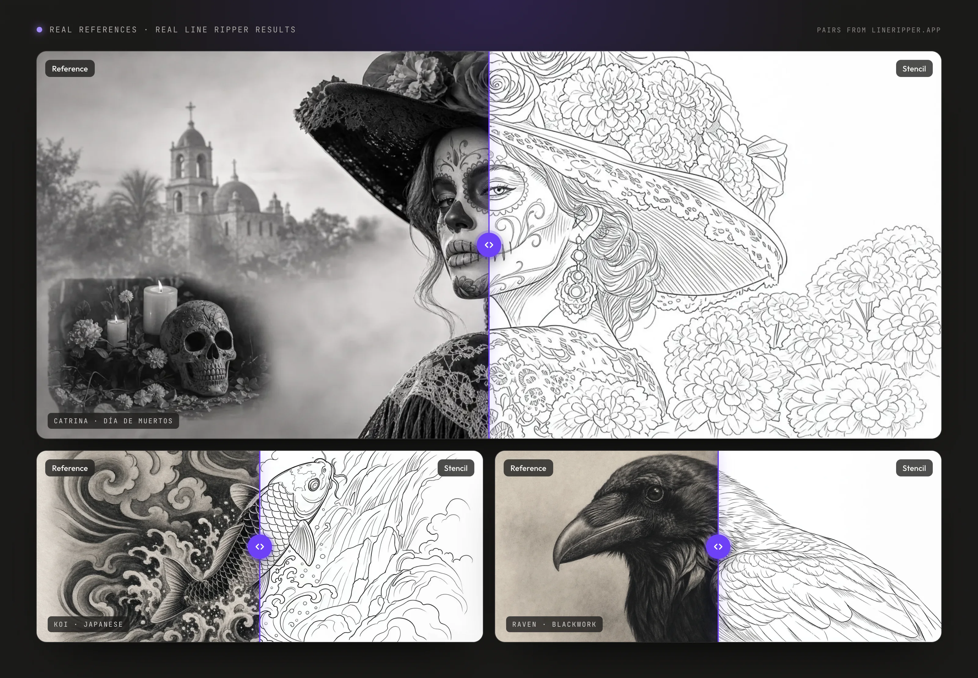
Line Ripper does the tracing. The artist brings the reference, a model trained for tattoo work finds the linework, and the Studio lets them adjust line weight, opacity and colour before they print. The artist still makes the final call.
The research pointed at the iPad early, and the strongest reason was structural. Procreate runs on iOS and nowhere else, so the incumbent workflow cannot happen on Android or Windows, and nobody draws a stencil on a phone. A discovery interview with a studio-owning tattoo artist and video research into how artists make stencils said the same. A walk around a tattoo convention after the soft launch confirmed it.
the strategy
File 001 · Scene 04
Two launches, in a deliberate order.
I sequenced the product in two launches. The web app went first, as the MVP, because it was the fastest path to revenue while we built the iPad and iPhone app properly. The native apps went second, designed for iPad and iPhone, with the iPad leading because that is where the evidence said artists work.
zero to one
File 001 · Scene 05
Nine months from the first commit to the App Store.
- Dec 2025Web MVP liveThe soft launch
- May 2026Design system beginsOne reference for web and iOS
- 3 Jun 2026Decision log opensEvery call written down
- 19 Jun 2026Design system v0.1.0The reference site's first release
- 21 Jul 2026Landscape iPad StudioIts own layout, beside the canvas
- 11 Aug 2026Subscriptions in the appThrough the App Store
- 15 Sep 2026On the App StoreThe hard launch, iPad and iPhone
- 9months, first commit to App Store
- December 2025 to 15 September 2026
- 3surfaces: web, iPad and iPhone
- One account and one gallery across all three
- ~10weeks to build the native front end
- Around 90 to 95% of it, built by me
- 77decisions logged as they were made
- June to August 2026, each with the option that lost
the business
File 001 · Scene 06
The web MVP proved artists would pay, and showed where they decide to.
By September 2026 the web MVP had earned about CA$45,000 and was bringing in about CA$6,500 a month from around 250 paying subscribers. Close to 13% of verified free customers had upgraded. All of that is the web app's. The native app launched too recently to have a number of its own, and I would rather leave it without one than lend it these.
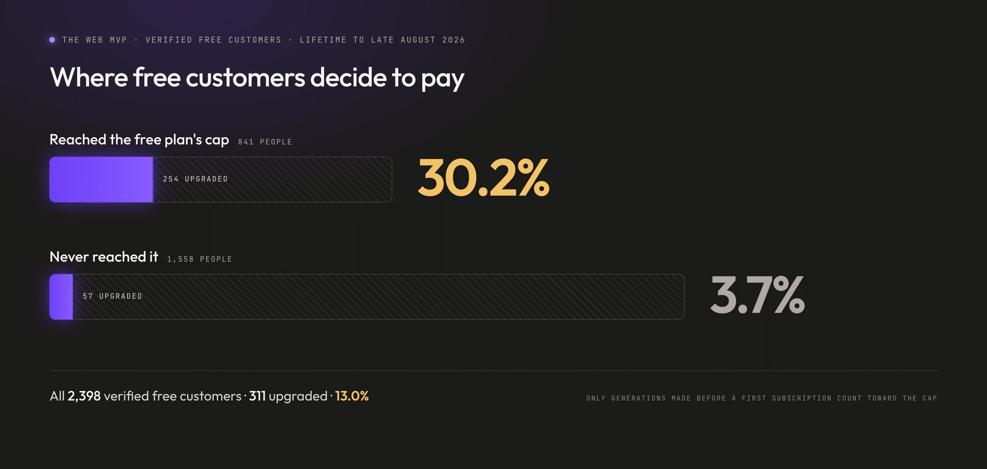
The more useful finding was where the money is decided. Free customers who reached their cap upgraded at 30.2%. Those who never reached it upgraded at 3.7%. Reaching a cap is partly a sign of intent, so the gap is not all the cap's doing. What survives that objection is enough to design against: the upgrade decision happens at the wall, and close to a third of the people who arrive there pay.
the platform
File 001 · Scene 07
Then iPad and iPhone, with the iPad leading.
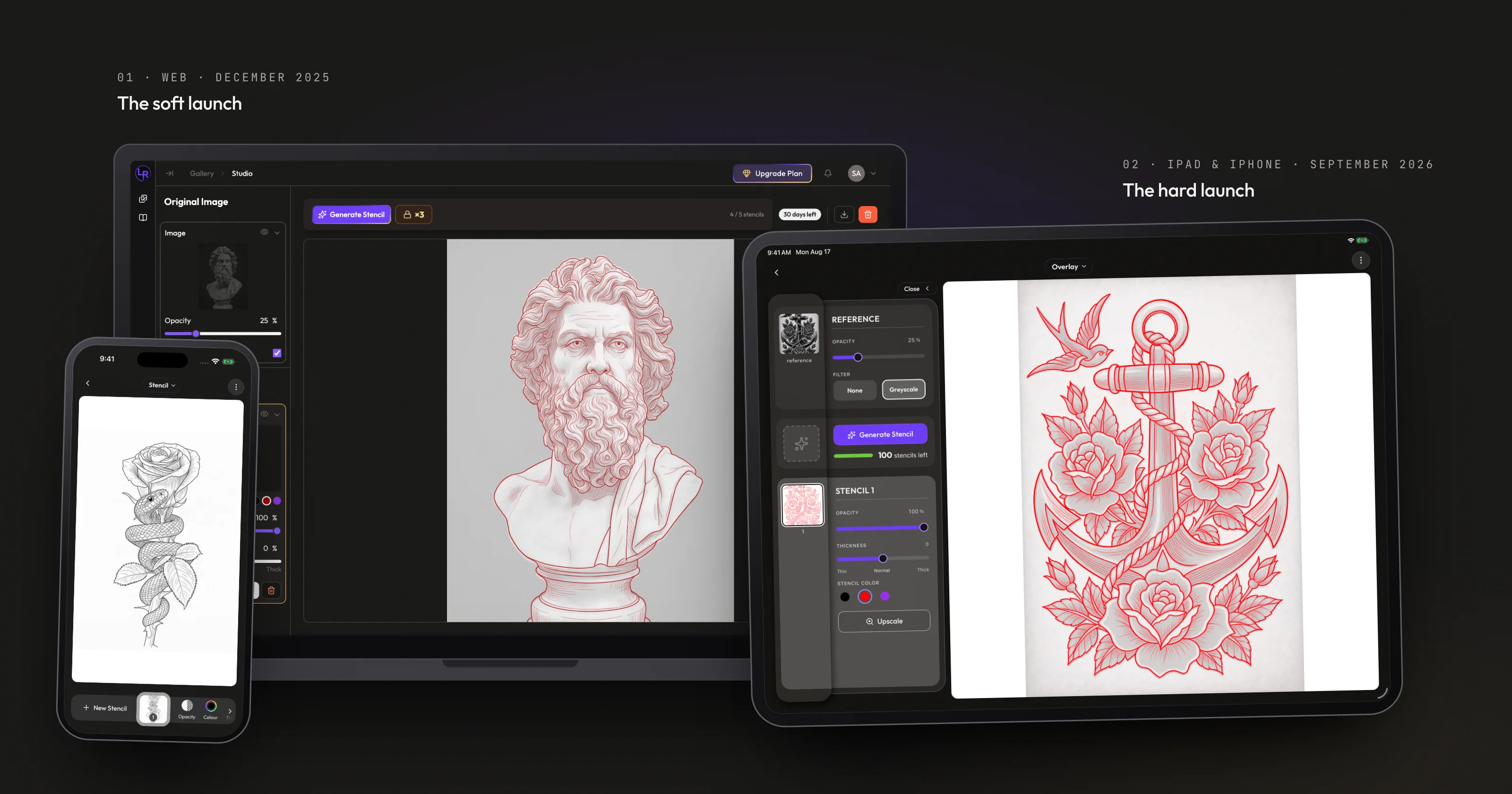
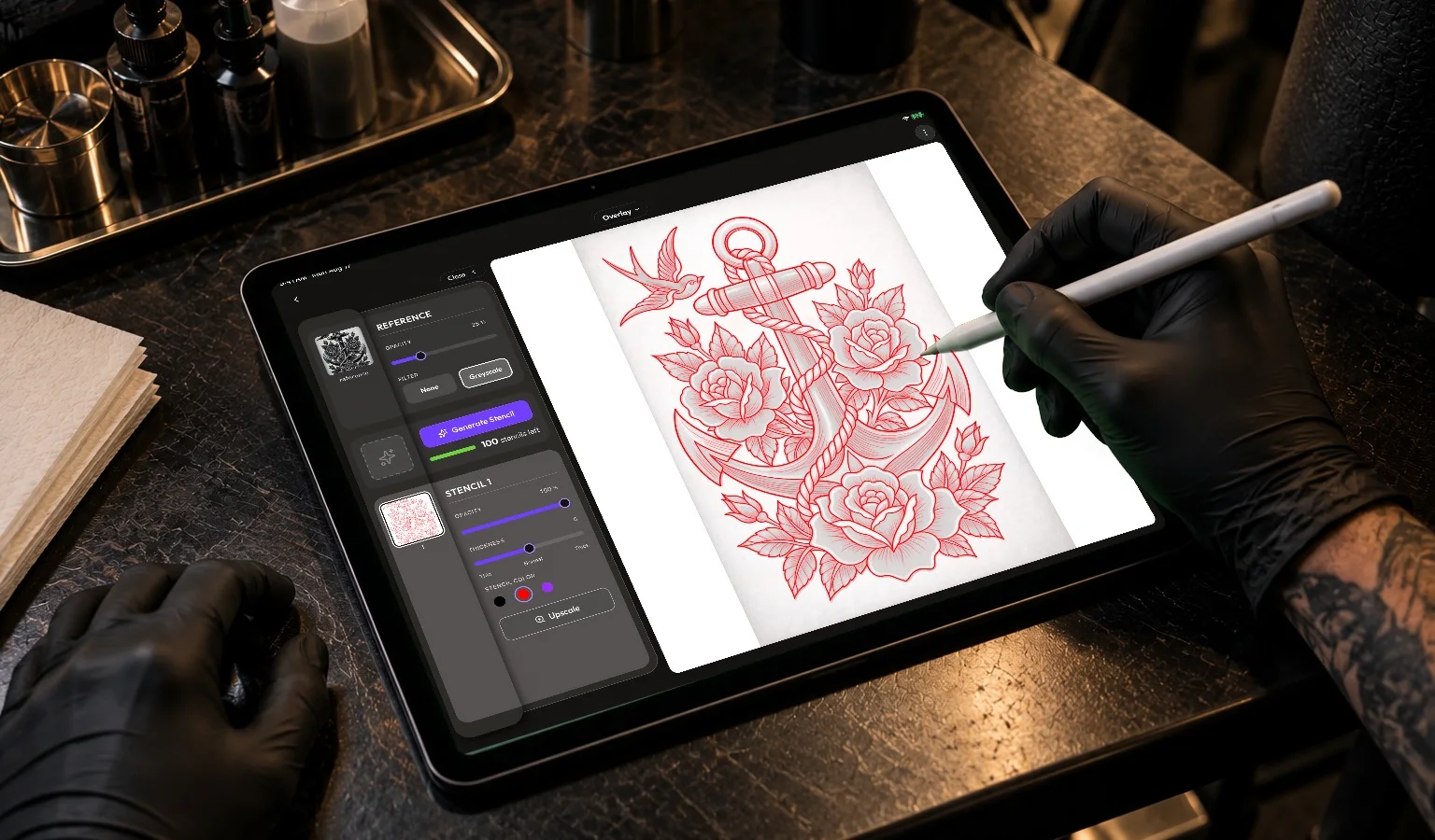
The native app is designed for the iPad first. Two rules carry that across every screen. Everything scales in proportion on any iPad, so type, padding and controls step up together instead of sitting phone-sized on a large screen. And only landscape rearranges. The phone's bottom toolbar exists to hide tools a narrow screen can't fit, so on a wide screen the Studio gets its own layout, with the canvas at full height and every control on view beside it.
the native app
File 001 · Scene 08
The web app's data made the native app's biggest calls.
Most of the native app's defining decisions answer something the web app measured. Three of them, briefly:
- Generate moves one tap in. Nine images in ten get exactly one stencil, so the headline action sits on a sheet with the count of what the plan has left, instead of permanently in the toolbar.
- The meter warns before the wall. The allowance bar turns gold at 75% spent and red at 90%, so a customer sees the cap coming while the decision to upgrade is still theirs to make calmly.
- Deleting says what it won't give back. The delete dialog leads with the customer's live meters and states that deleting frees storage and nothing else.
Each one has its reasoning and the option I rejected in Designing the Moment a Free Plan Runs Out, the deep-dive on the upgrade path.
the system
File 001 · Scene 09
Design system for web and iOS.
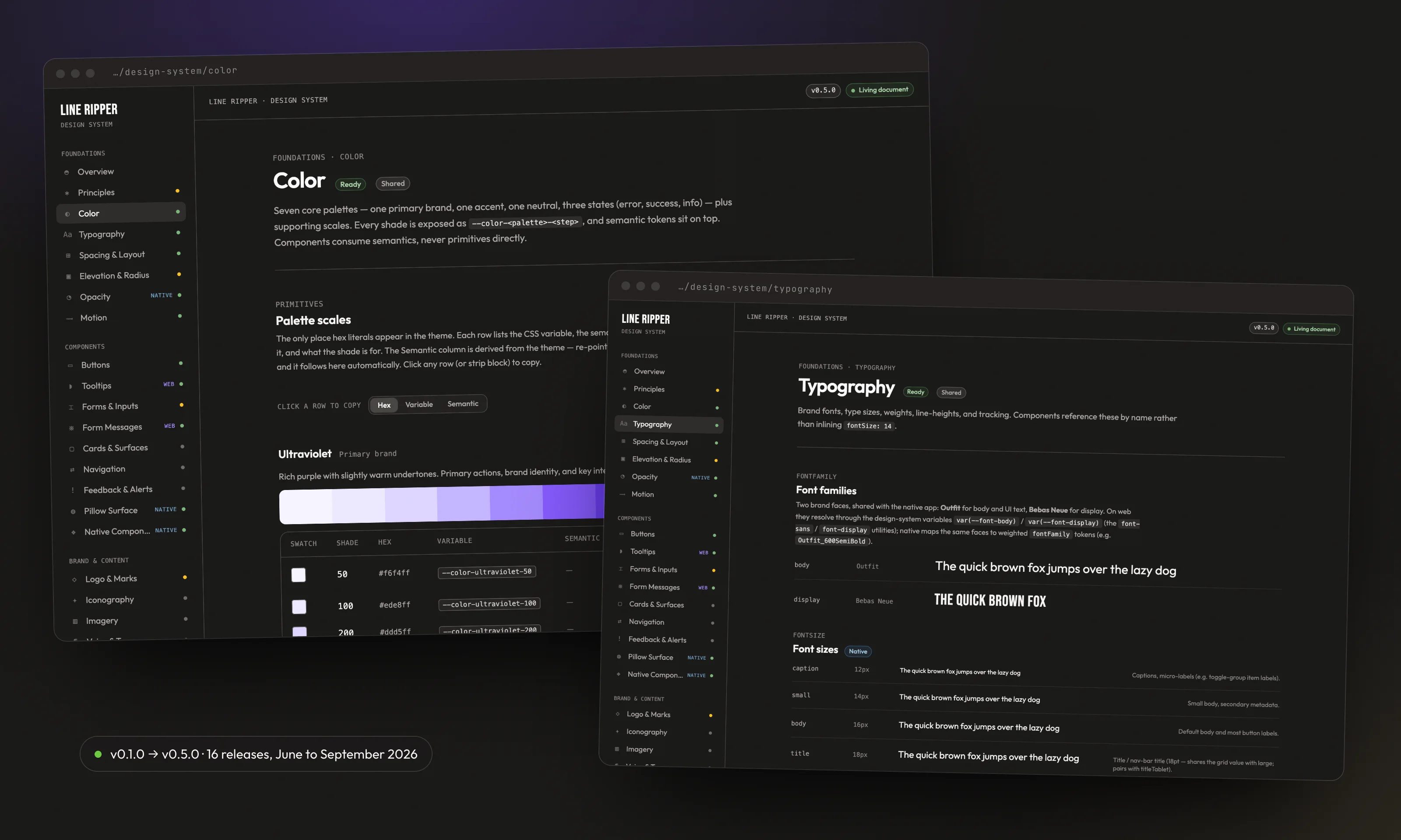
I created the brand identity and the design system under it: the LR mark, the Ultraviolet palette, Outfit and Bebas Neue, and the tokens every screen is built from. The tokens live in one package that both apps read, so a colour, a type size or a radius changes once and lands on the web and on iOS together.
- 81colour values in 8 families
- Every hex code in the theme, in one file
- 2platforms reading one token source
- The web through CSS variables, iOS through NativeWind
- 16releases of the reference site
- v0.1.0 on 19 June to v0.5.0 on 18 September 2026
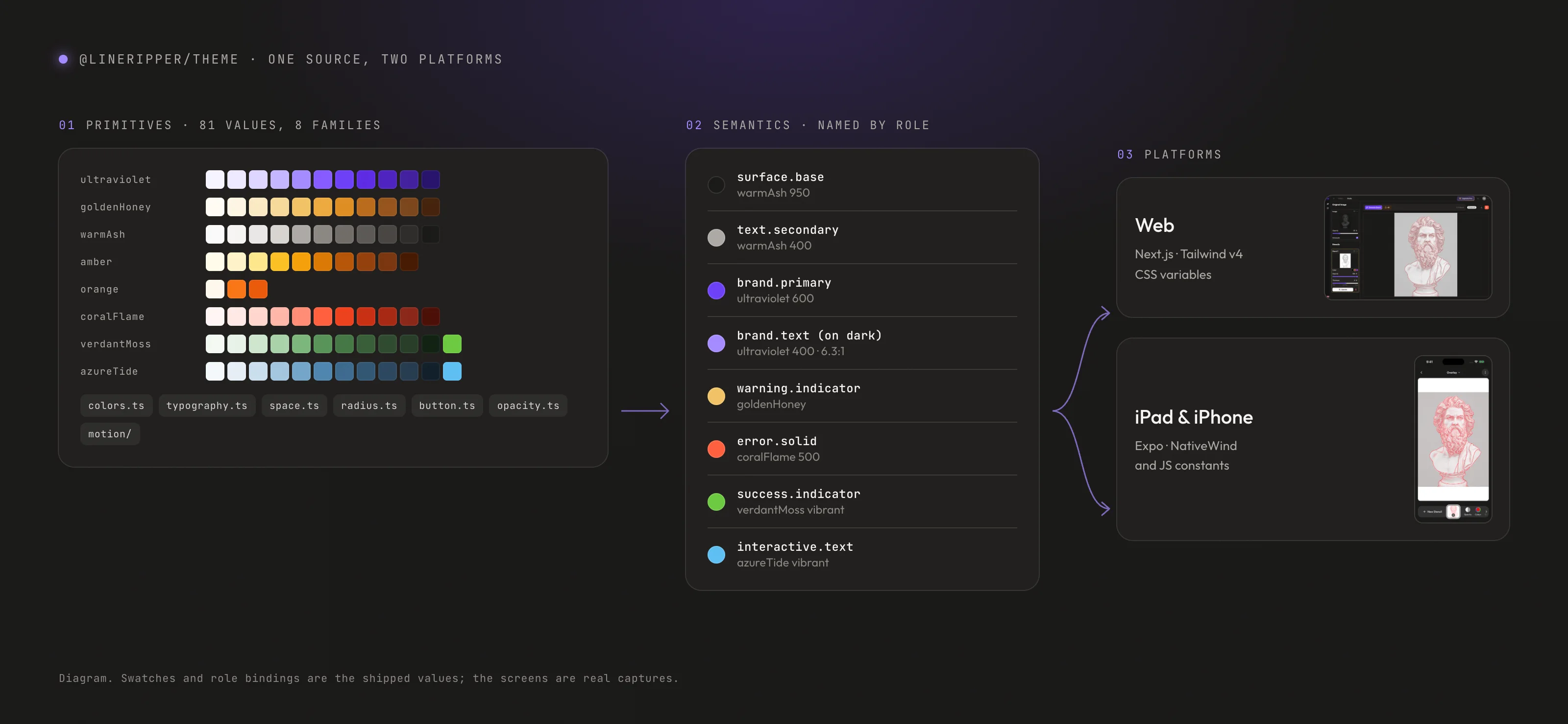
The rules are what make it a system. Tokens are named for the job they do, like warning.indicator or text.secondary, because a name that describes a colour stops being true the day the colour changes. Every size sits on an even grid, including where that means rounding Apple's own 15 and 17 point defaults. Contrast is documented token by token. And the reference site renders from the same code the apps use, under a rule written on its first page: if a page disagrees with the code, the page is wrong.
how I work
File 001 · Scene 10
Designing the native app, then building its front end myself.
On the native app I did both jobs. I designed it, then built around 90 to 95% of its front end in about ten weeks, working in Claude Code with several agents in parallel in Conductor. The developer built the backend, the infrastructure and the AI model underneath it.
That pace depended on writing the system down first. The design-system guide, the UX patterns, the product context and a set of prompt recipes are each written for two readers: a person joining the project, and an AI agent building a screen. An agent building a screen reads the same rules a designer would.
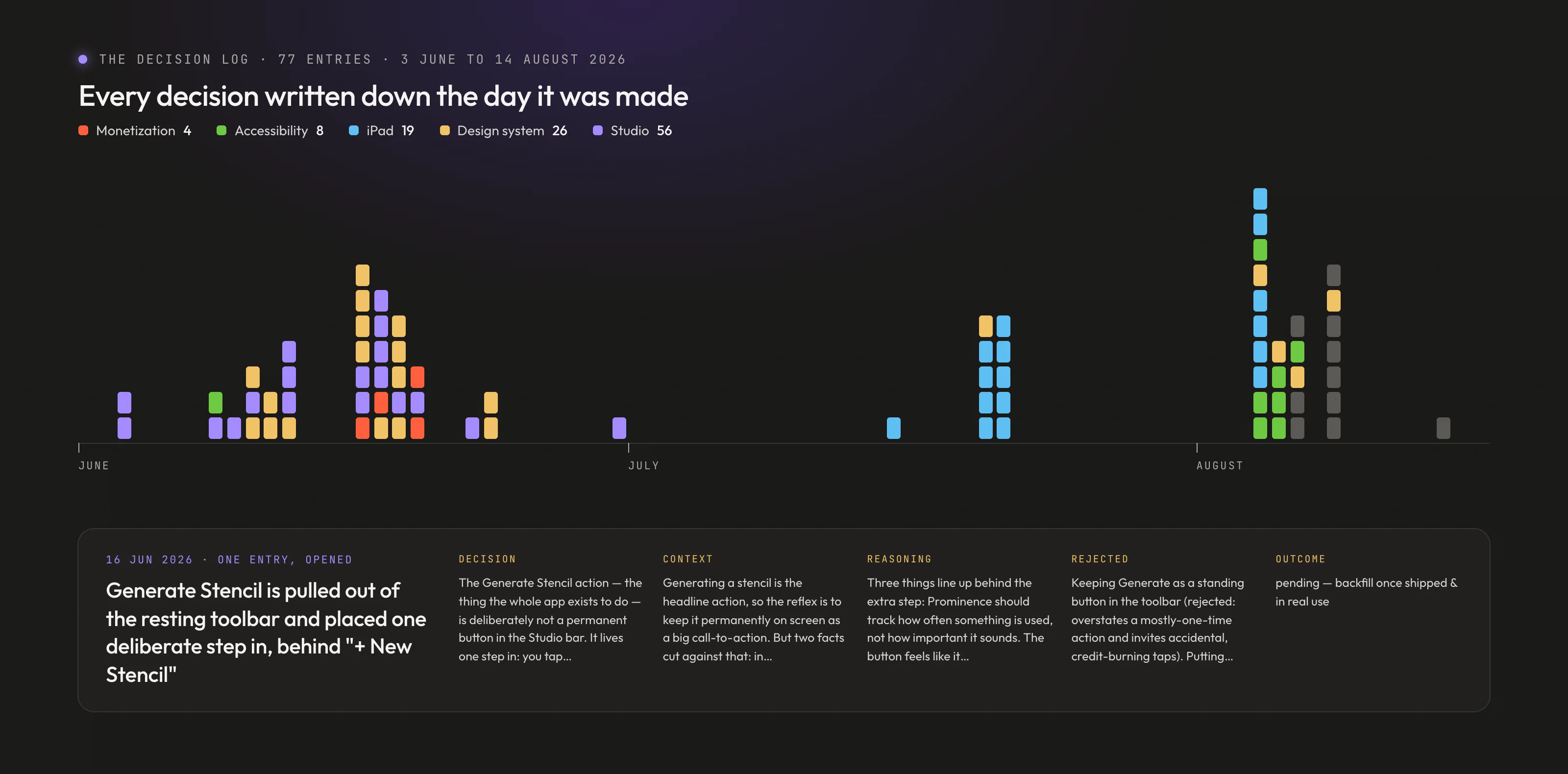
I also kept a decision log. With no design team around me, nothing else would hold the reasoning, so every decision went down the day it was made, in a fixed shape: the decision, its context, the reasoning, the options I rejected, and an outcome left pending until there is evidence for one. It reached 77 entries between June and August, and it is published in full.
what's next
File 001 · Scene 11
What the launch hasn't answered yet.
The App Store launch is too recent to have a result, and I would rather say so than borrow the web app's numbers for it. These are the questions I am working on next:
- Why 587 people left at the wall. Of the 841 free customers who reached the cap on the web, 587 did not upgrade. Whether the price, the moment or the product sent them away is the largest open question in the business, and it needs conversations more than another query.
- Whether new customers stay. On the web, 1,755 active free customers in their first billing cycle became 336 in their second. That drop is larger than anything the upgrade work touches.
- Whether the iPad bet holds. The web app tells people a desktop works best, so its device numbers can't test the bet. The native app is the first surface that can.
- The landscape Studio, finished. It shipped as an MVP against what I intended for it, and it is the layout customers will actually hold.