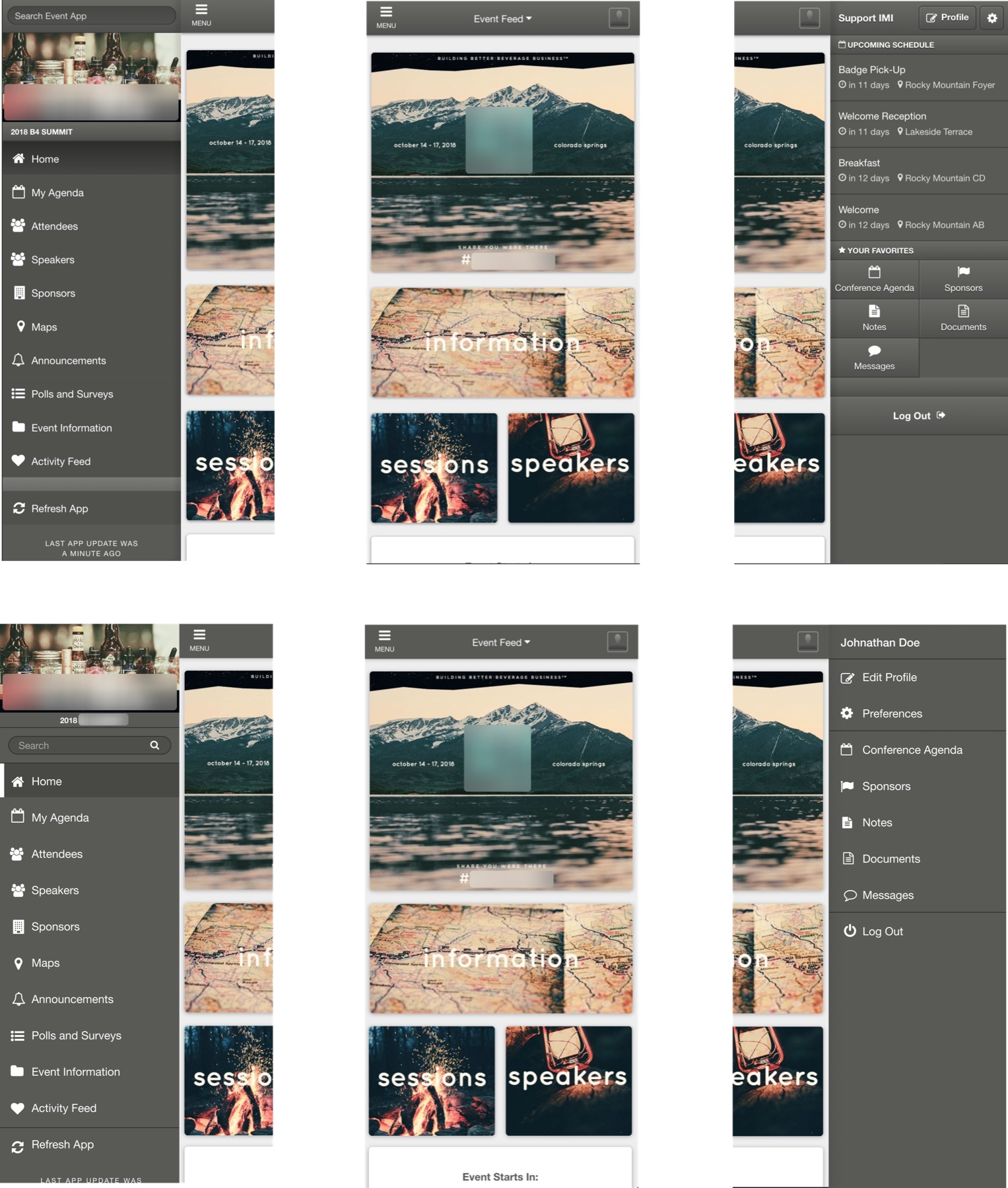
An outdated interface is a trust problem.
When I joined EventMobi, the event app hadn't seen a real redesign in eight years; the CMS, four. This isn't just a matter of delight — when a product looks dated, users quietly lose trust in it. That's a revenue argument, and it's how I framed modernization against the constant pull of new-feature work.
The highest-leverage cut: kill the dropshadows.
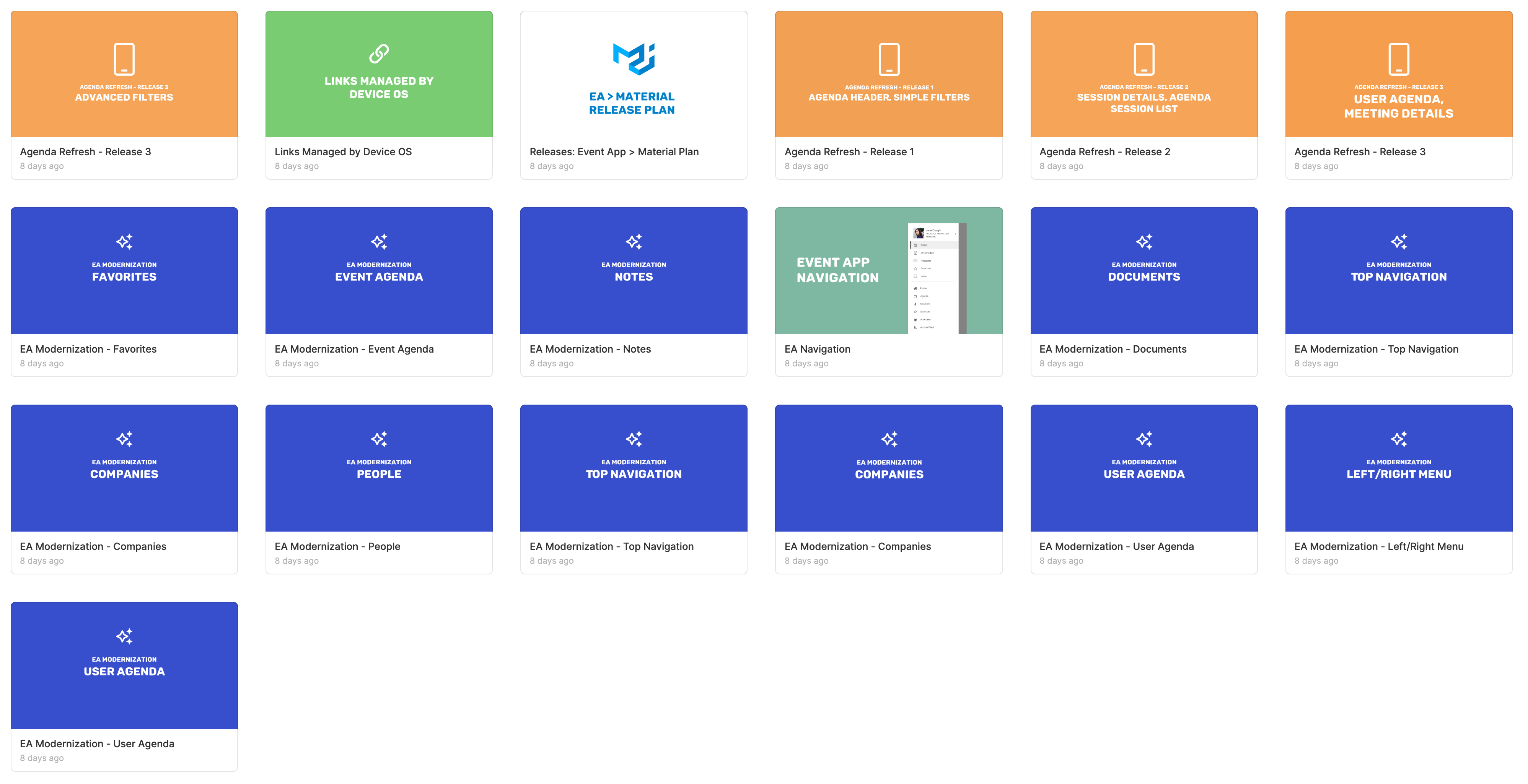
With large technical restraints and every sprint contested, the question wasn't 'what's the ideal redesign' but 'what's the largest visual gain for the smallest engineering spend.' The answer was almost embarrassing: remove the heavy dropshadows across the app. One disciplined cut, and the whole interface stepped forward five years.
The structural work, mapped and staged.
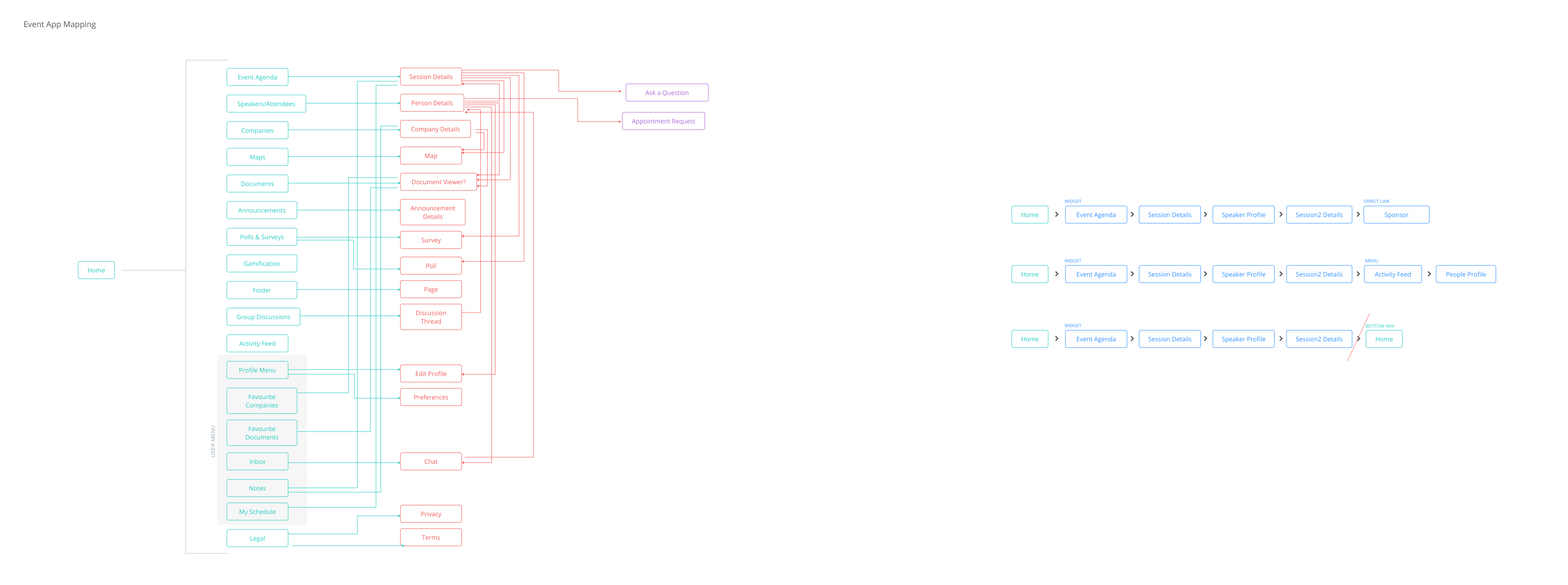
The deeper release was still being negotiated against technical and business restraints, but the certainties were established and evidenced: the confusing right-hand menu had to go (and its contents re-homed); login and onboarding needed a redesign — I'd watched people struggle with it first-hand while onsite at events; and the 'Back' button needed to become a true back button. It didn't take users back — it took them 'up' a level in the app's hierarchy, wherever that happened to be.