A database of record, maintained by hand.
Pharmacists have to stay current on drug data that changes year over year. At DRG, the 'database' behind that work was maintained by hand: visit each source website, hunt down the right page, download the file, open it, keyword-search to verify, then file it into a lattice of folders and Excel sheets. Hundreds — sometimes thousands — of files, across multiple people, annually.
The business had started automating before any designer was involved: MADA 1.0 scraped the websites and auto-matched new files to old ones. Real progress — and a new bottleneck. When I joined, I began with guerrilla-style ethnographic research: watching pharmacists and their assistants actually work, including how they'd done the job before 1.0 existed. Nothing in the interface explained the workflow as well as sitting beside the people living in it.
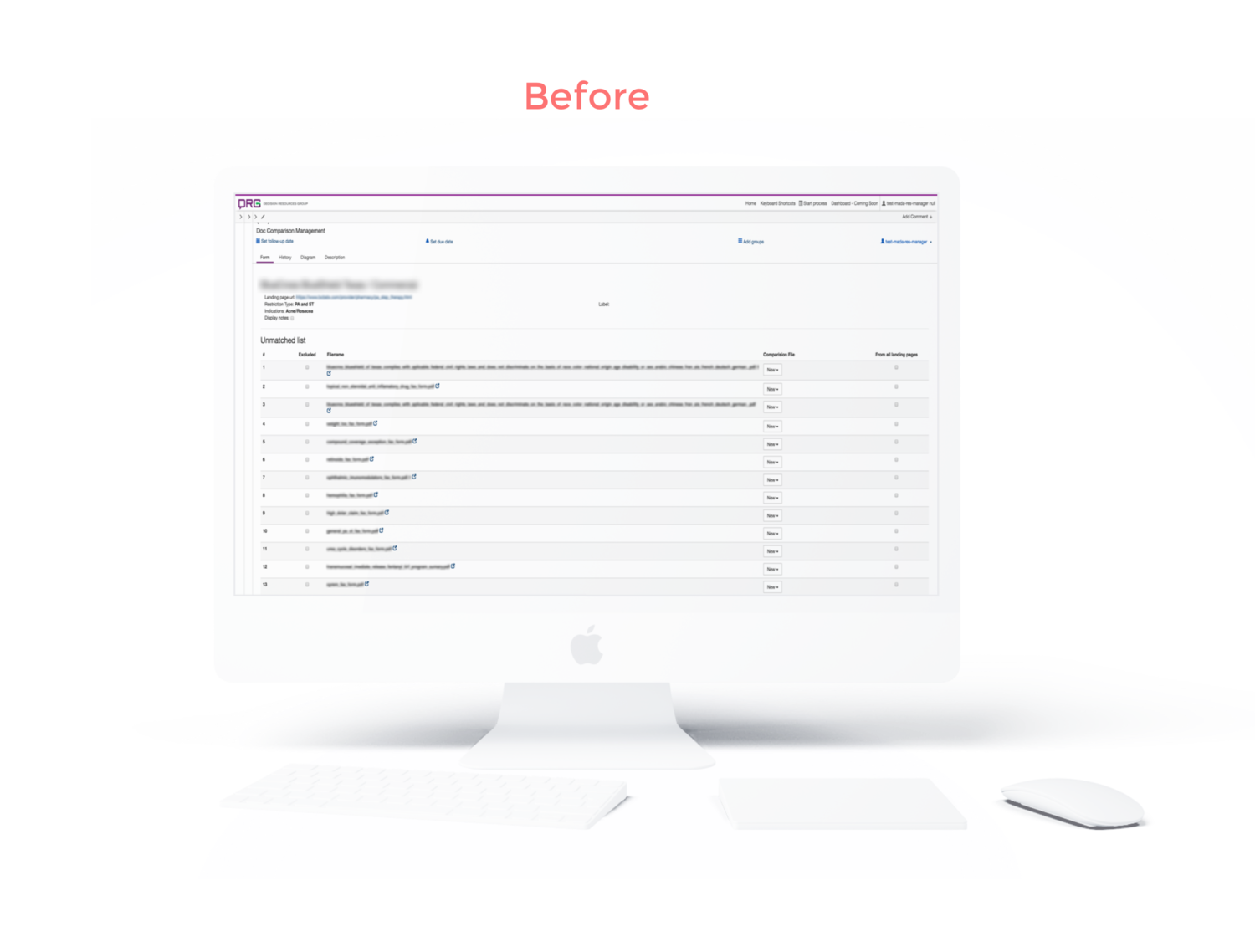
The bottleneck: files the system couldn't match — a brand-new drug has nothing to match to — piled into a list that ran to the hundreds or low thousands. For every one, a user had to open the file in a new tab, read it, verify it, then click a 'New' button that opened a dropdown barely wider than the button itself, and scroll it to find the right match among hundreds of candidates. Per file. Per person. Per year.
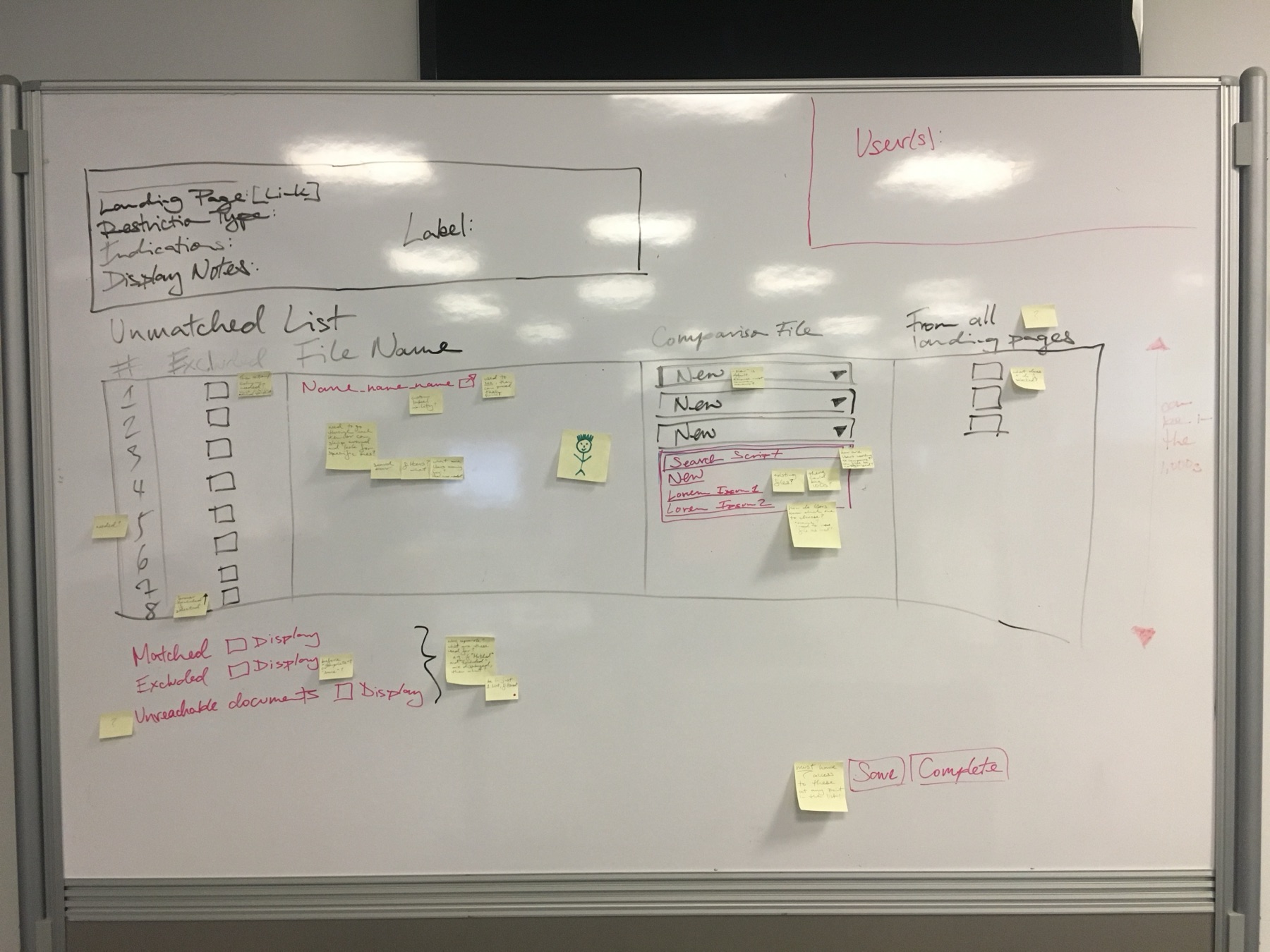
The best solution, and the one we could afford.
The optimal answer was clear: automate the matching itself. Every file followed a naming convention that had held for years — a script matching on names and version dates would collapse the queue almost entirely. We knew this because we'd talked to every user and read the files ourselves.
But sitting down with the lead engineer and the BA/PM, the truth was that full automation was too expensive for a high-priority fix that needed to ship now. So we sequenced instead of arguing: the script became the committed end-state for a future release, and I designed the interim that would give users back their time immediately.
When you can't ship the ideal, sequence toward it — and make the interim genuinely good, not merely less bad.
A split screen instead of a thousand dropdowns.
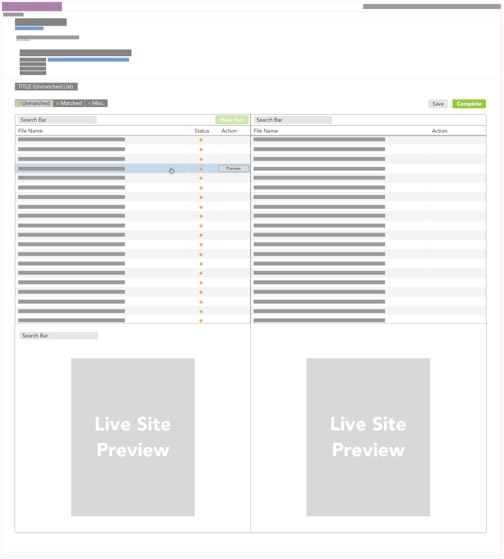
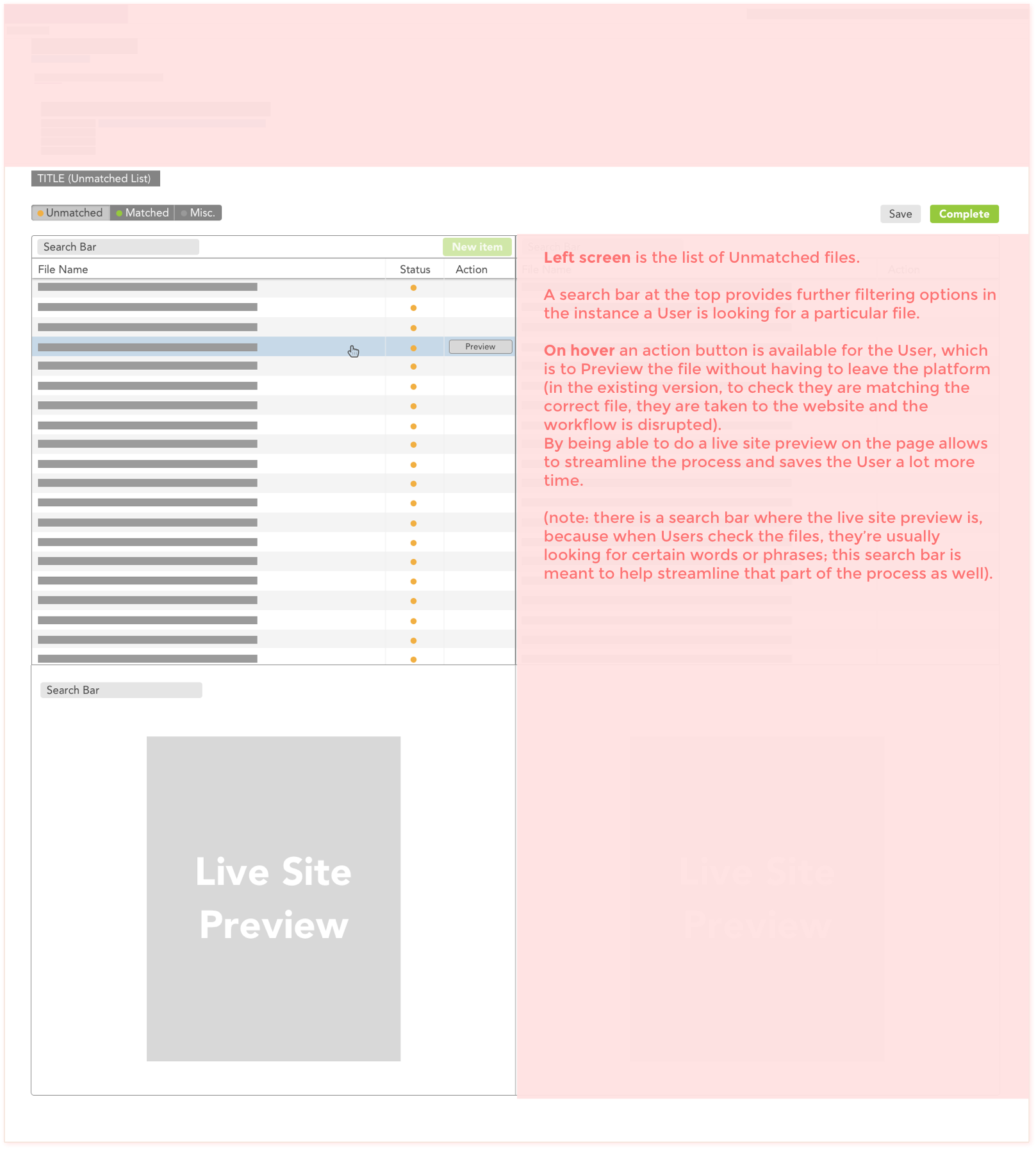
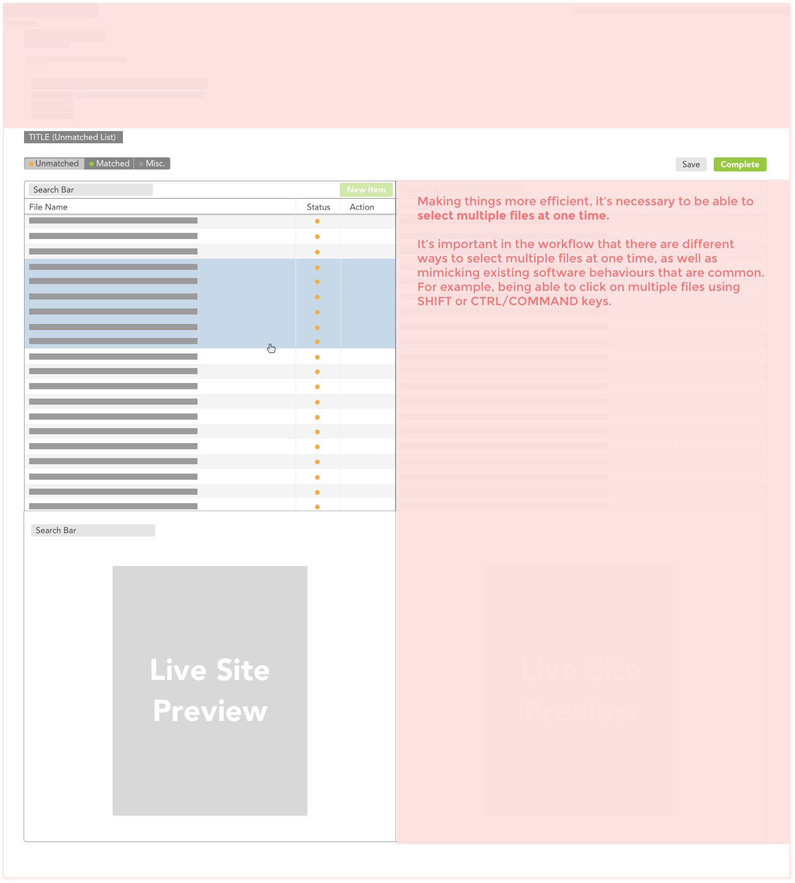
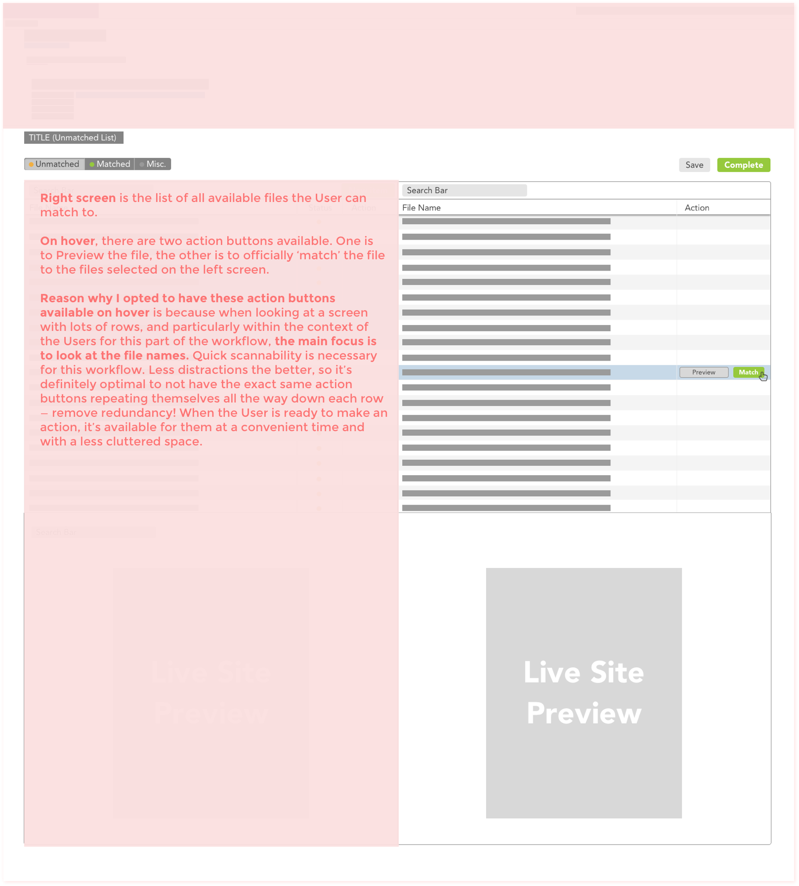
The redesign replaced the dropdown ritual with a split-screen review-and-match view: the unmatched file readable on one side, candidate matches navigable on the other — no new tabs, no blind scrolling, no re-finding your place. Eliminating the dropdown alone saved users thousands of clicks across a review cycle.