I found the problem during my own onboarding.
In my first weeks at EventMobi I turned my own onboarding into a usability test. Trying to complete real planner tasks in the Experience Manager, one thing became unmistakable: the product's information architecture — not any single screen — was the thing standing between users and finished jobs.
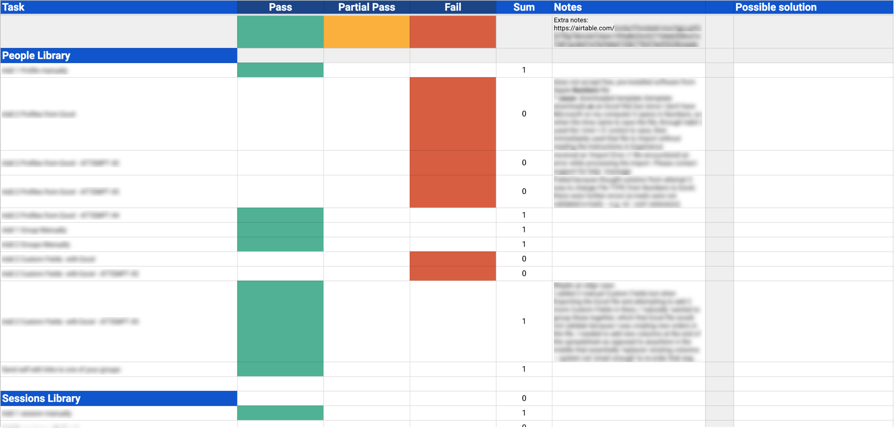
I brought the initial work to the VP of Product, who agreed it deserved investigation. The formal problem: the product didn't allow users to navigate and complete tasks in a manageable, intuitive flow — creating friction for planners and a heavier burden on Customer Support.
Context matters here: EventMobi lets event planners build their own event apps, which means the platform must serve a planner's full journey — pre-event, during-event, post-event. The pre-event hub, 'Libraries', was the biggest hurdle: reaching any section inside it required a very particular series of clicks with no relationship to how planners actually think about their workflows.
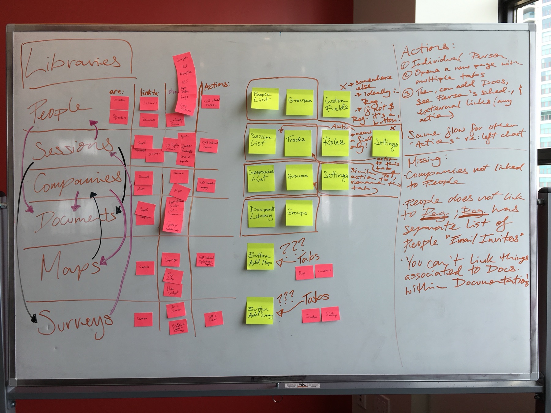
Mapping every link before moving a single one.
You can't restructure what you haven't mapped. I initiated a full breakdown of the platform's linkage — myself and the other product designer tracing how every screen connected to every other. It was tedious, and it was the foundation for everything that followed.
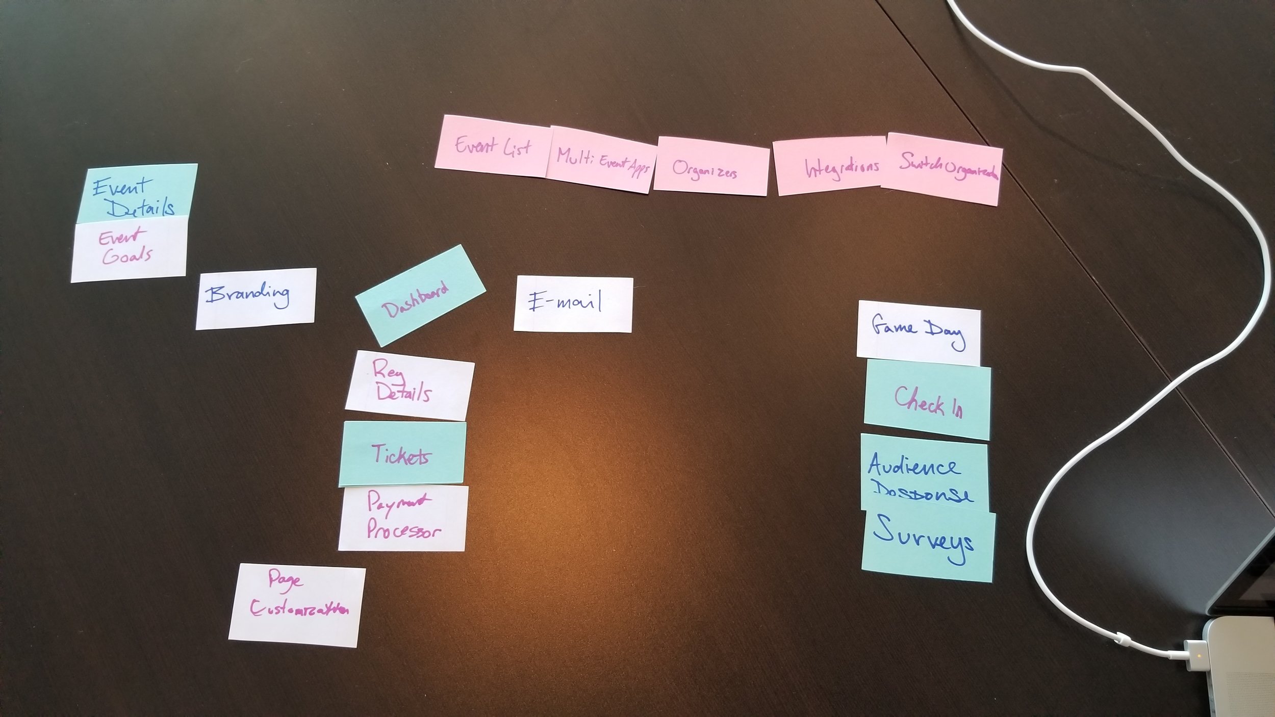
From there: a card-sorting exercise to rediscover natural groupings, first between the two of us, then opened to the product team — the VP of Product and both senior PMs — so the re-organization was argued about with cards on a table rather than opinions in a meeting.
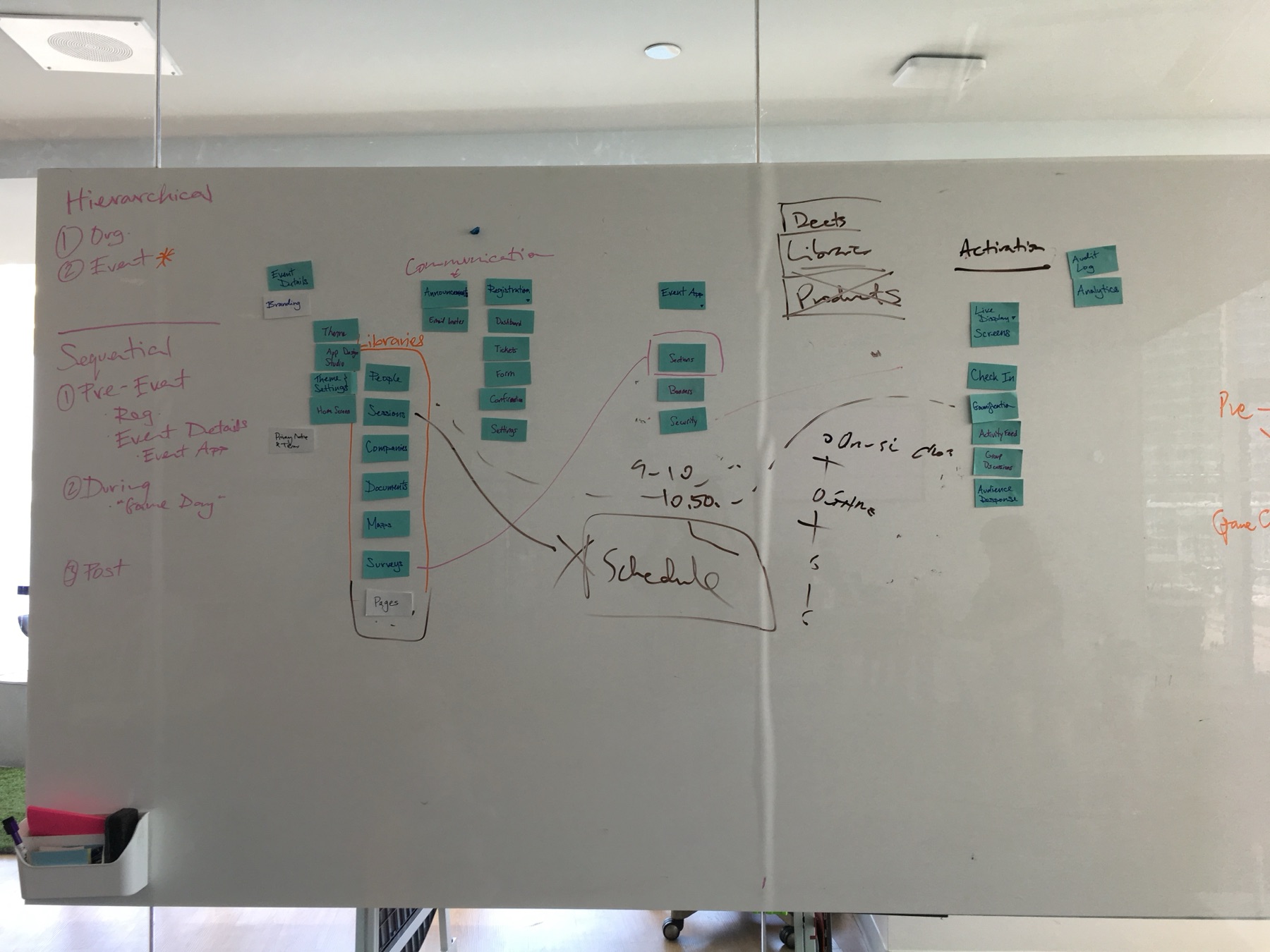
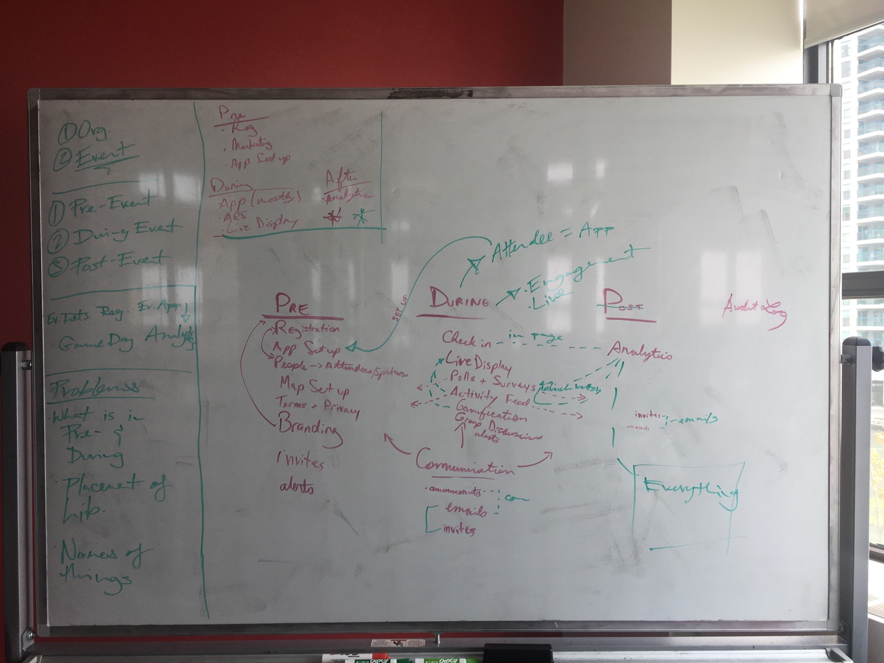
From structure to navigation.
With the journey and groupings stabilizing, we sketched how a new navigation could be introduced without rupturing the product — lo-fi first, then a proposal I presented to internal stakeholders, walking them through the same exercises that had convinced us.
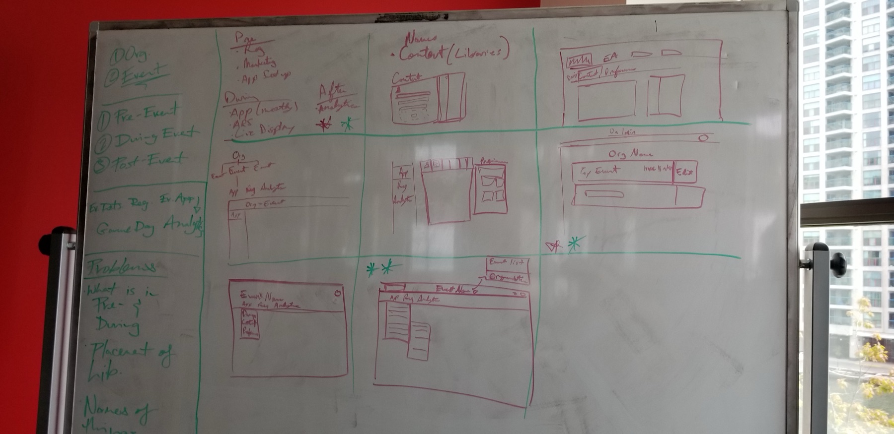
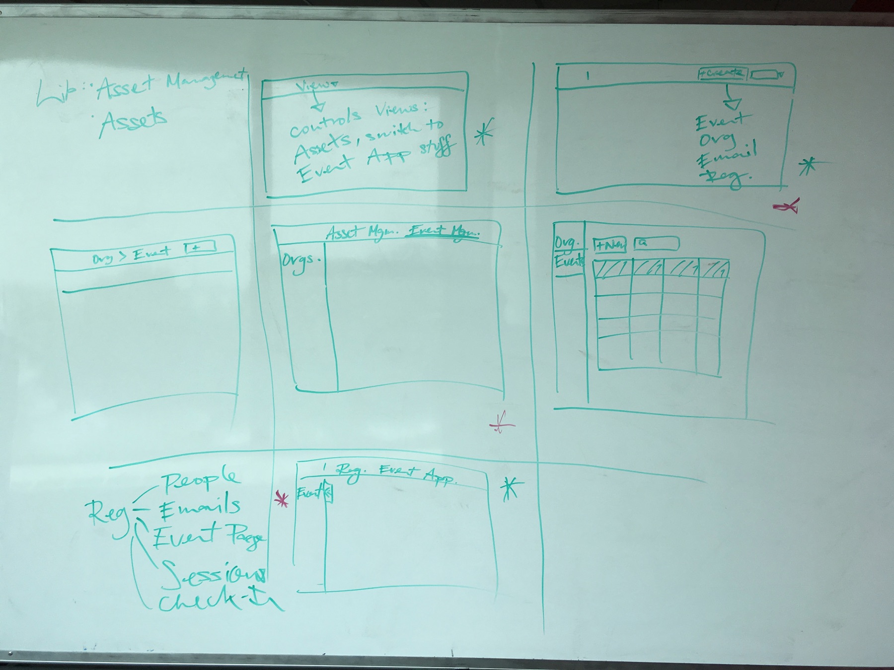

The senior call: not yet.
The VP of Product and the team agreed the overhaul mattered. And still — when we weighed the engineering cost against nearer-term revenue work, the honest answer was that the ROI wasn't there yet. We shelved it, deliberately and with the groundwork banked: the linkage map, the card-sort data, and the journey model remained the reference for every navigation decision that followed.
Knowing when a good idea is not yet the right investment is part of the design job — advocacy and judgment are not opposites.